

Client
UEPS - Association for Serbian Market Communications
Deliverables
Brand identity
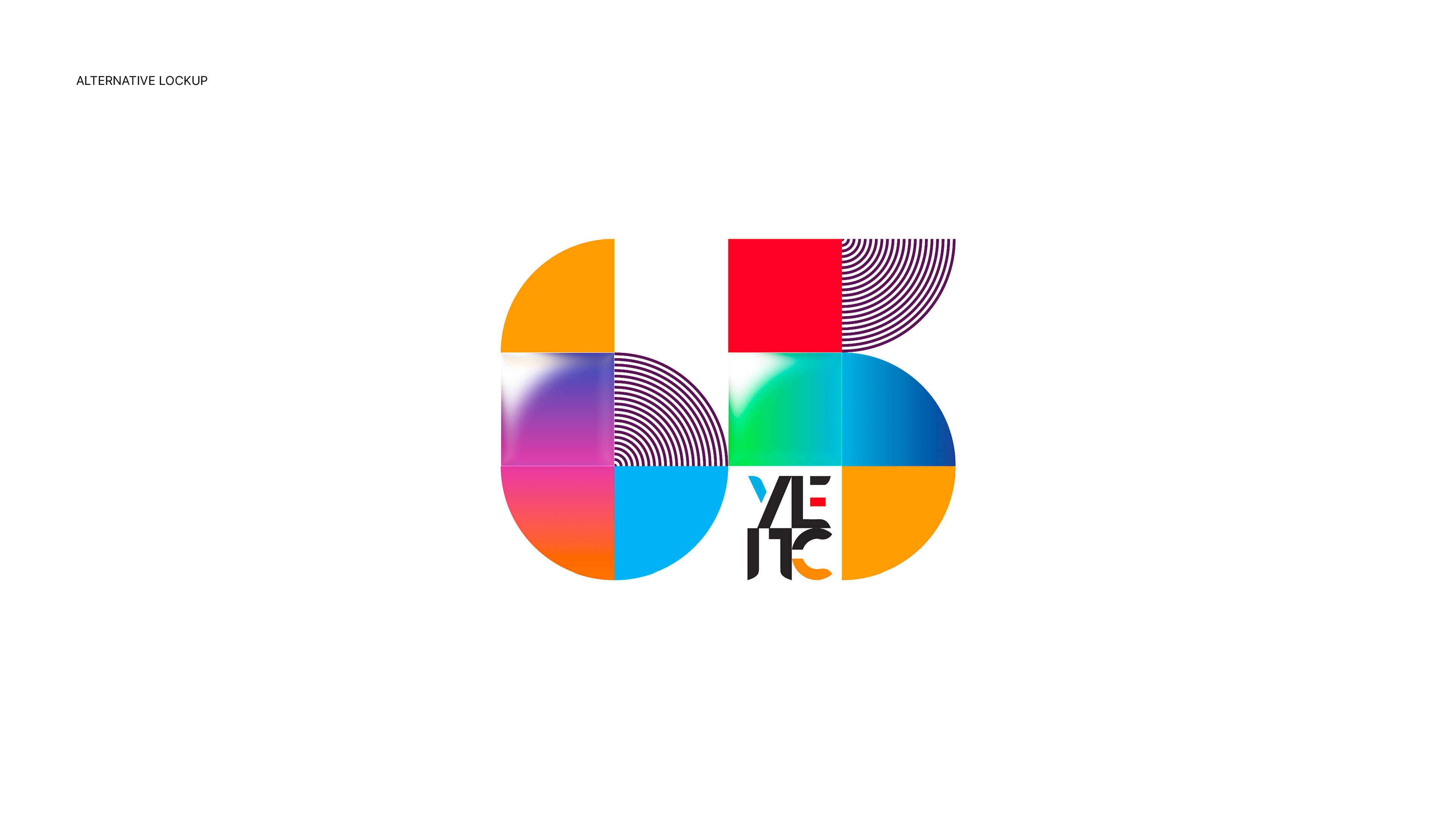
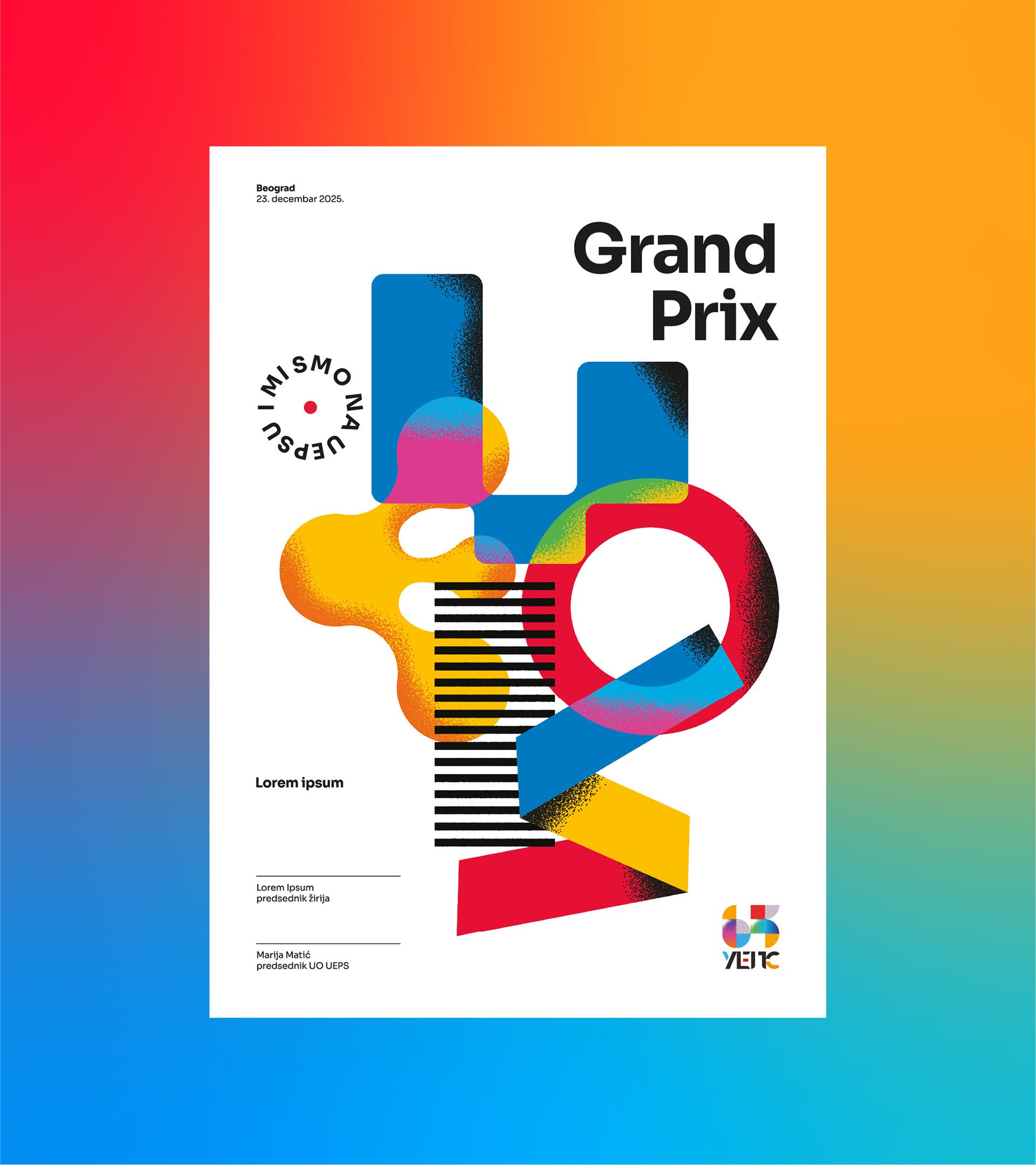
Winner of the UEPS 65th anniversary logo competition. A modular 65 turns history into a flexible system that honors the past and signals what's next.
UEPS (Association for Serbian Market Communications) announced a competition to create the anniversary logo for its 65th year. The jury featured leading figures in Serbian graphic design: Slavimir Stojanović Futro, Jana Oršolić, Ivan Aran, Isidora Nikolić, and Lazar Bodroža.
My concept was selected as the winner. The brief was to design a jubilee mark that honors the legacy and feels distinctly contemporary.
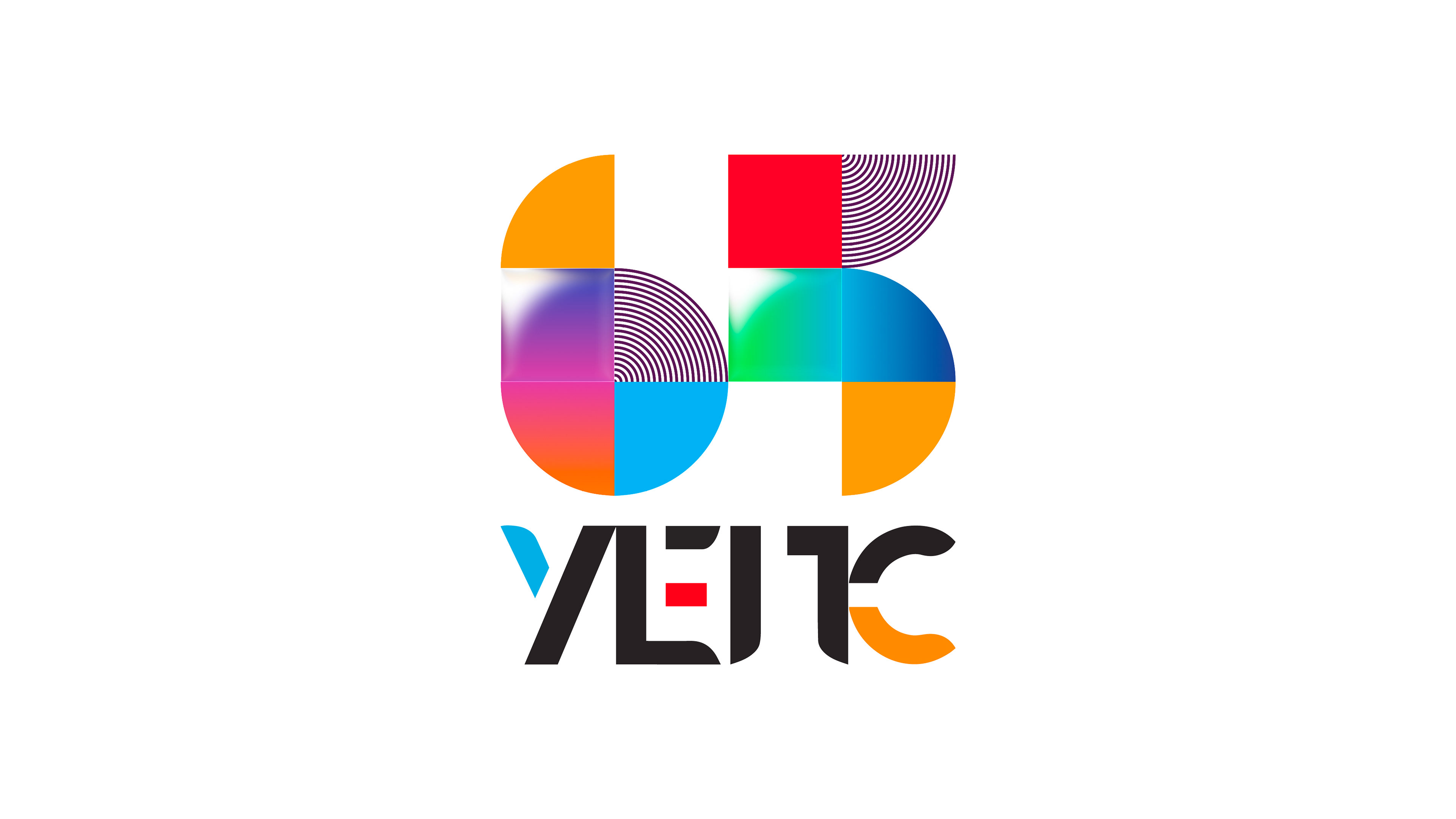
History, trends, and the industry in one system
Built from modular units that form the number 65, with each module carrying a story from UEPS history. It functions as a visual timeline of design and marketing trends - moving from early solid fills, through pattern and gradients, to today’s liquid-glass effect, while also echoing key industry dimensions like advertising, communication, design, and innovation. Individually, modules speak. Together, they create a single, confident voice.
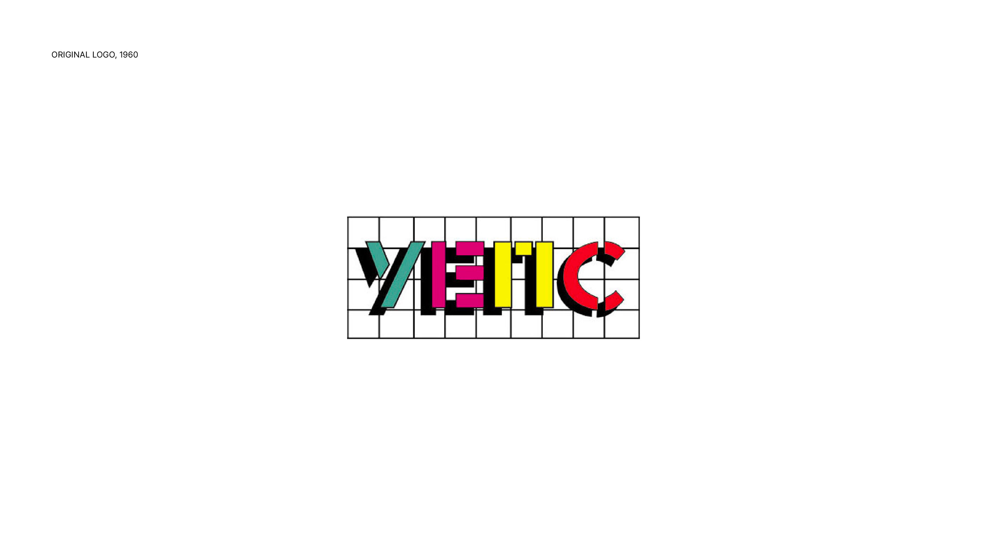
Rooted in the 1960 original
Concept starts from UEPS’s first logo from 1960. Its modular spirit and bold color presence shaped the new structure, grounding the anniversary mark in the brand’s roots. I wanted to look back to those roots because an anniversary is not only a celebration of the present, but also a reminder of the beginning. Color and form were modernized and aligned with the current UEPS aesthetic, connecting heritage with a contemporary expression that scales across formats.
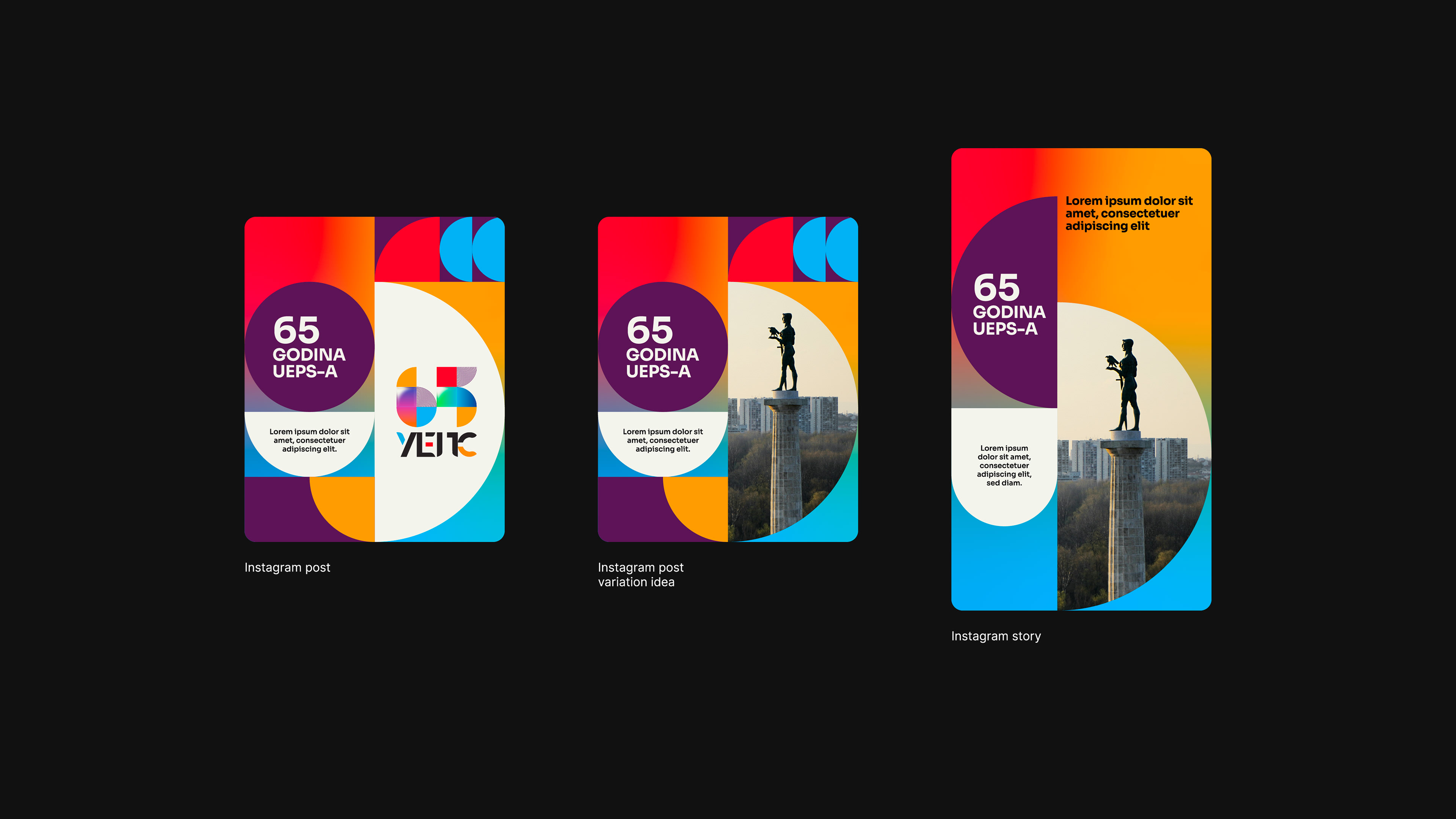
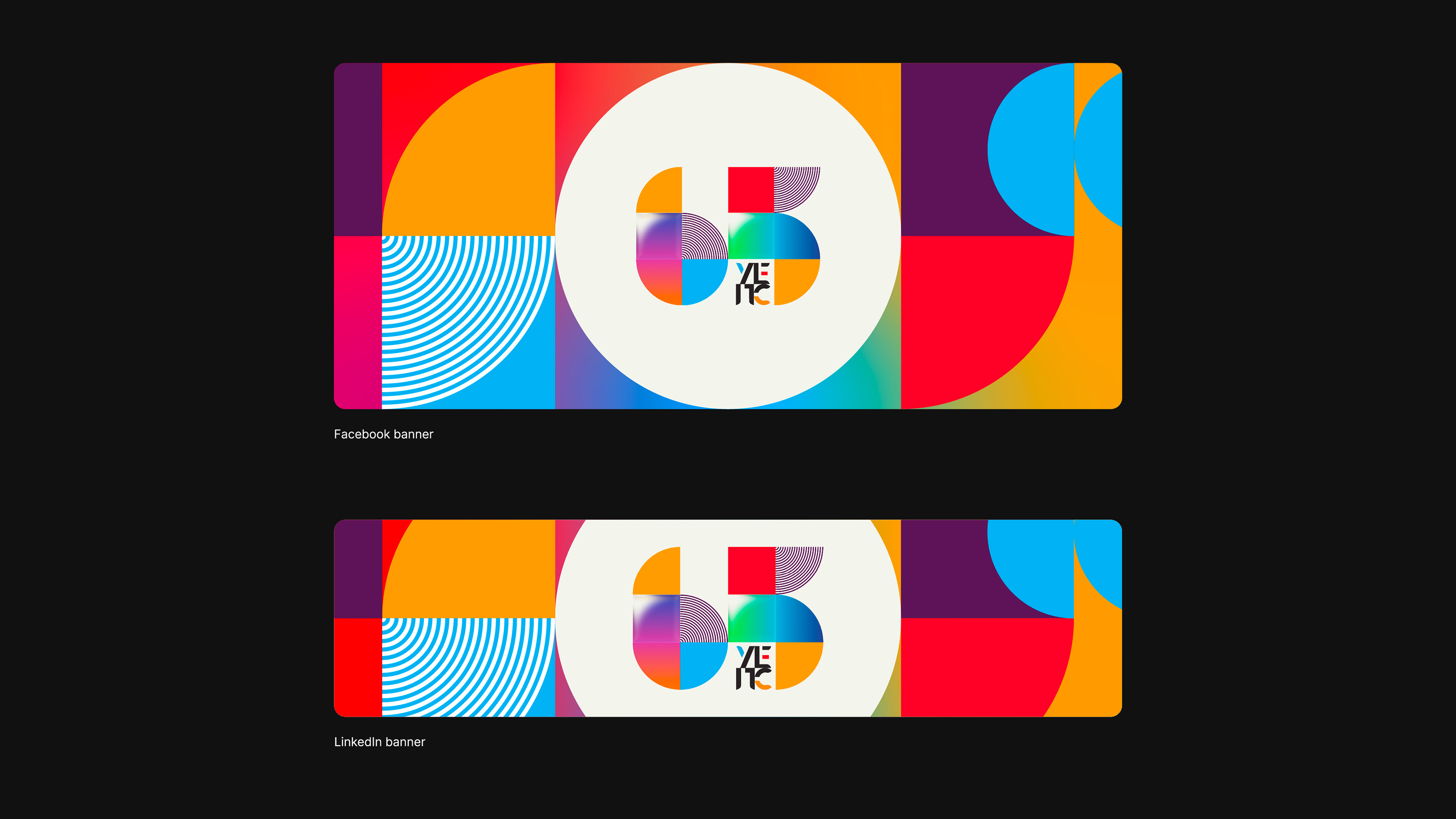
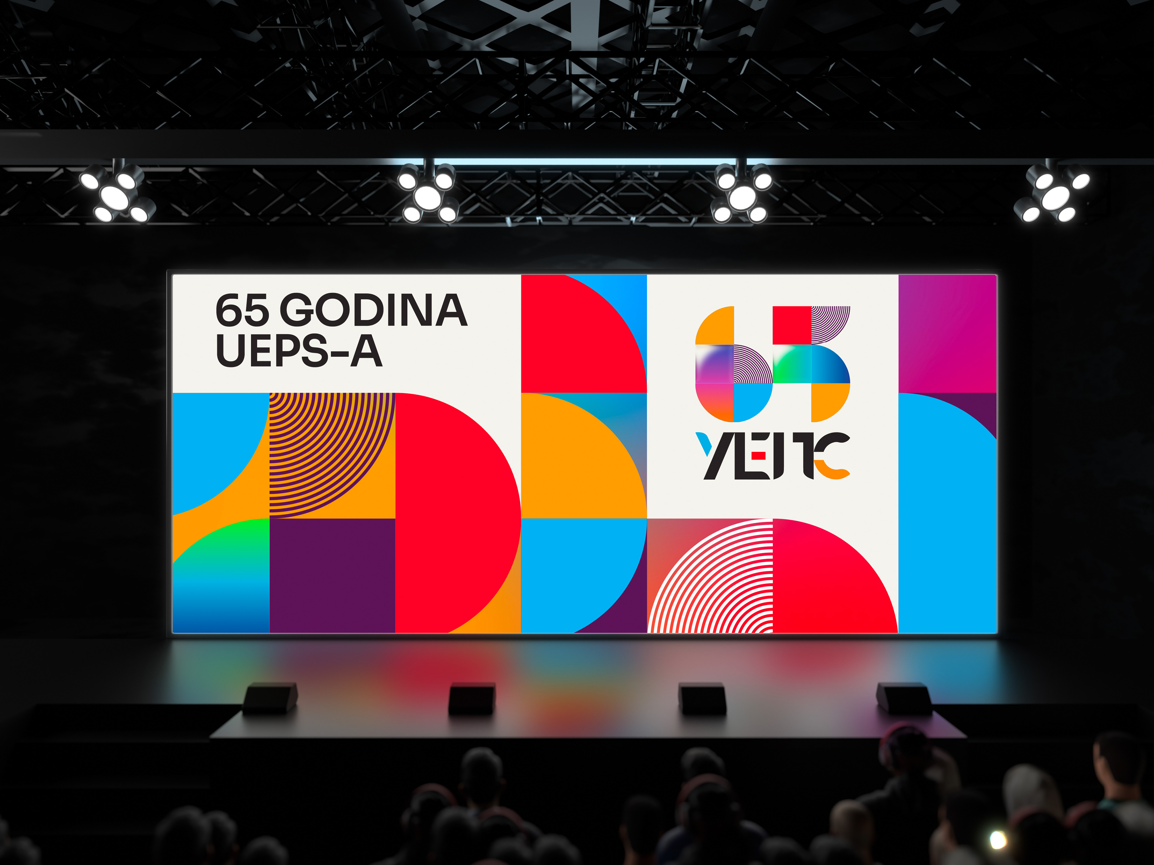
Identity in action
The system adapts easily for event visuals, social graphics, press materials, and large-format applications while maintaining clarity and recognition.

An identity beyond the logo
To expand the identity beyond the wordmark, I created an abstract illustration that subtly reads as UEPS. Inspired by the same eclectic visual language, it became a distinctive brand asset used throughout the system and was later featured on official diplomas.