Client
SID Group

Deliverables
Brand identity​​​​​​​
SID Group needed a brand as sharp as their code. The goal was clear. A sleek identity rooted in meaning, without unnecessary extras. Just precision, clarity, and impact.

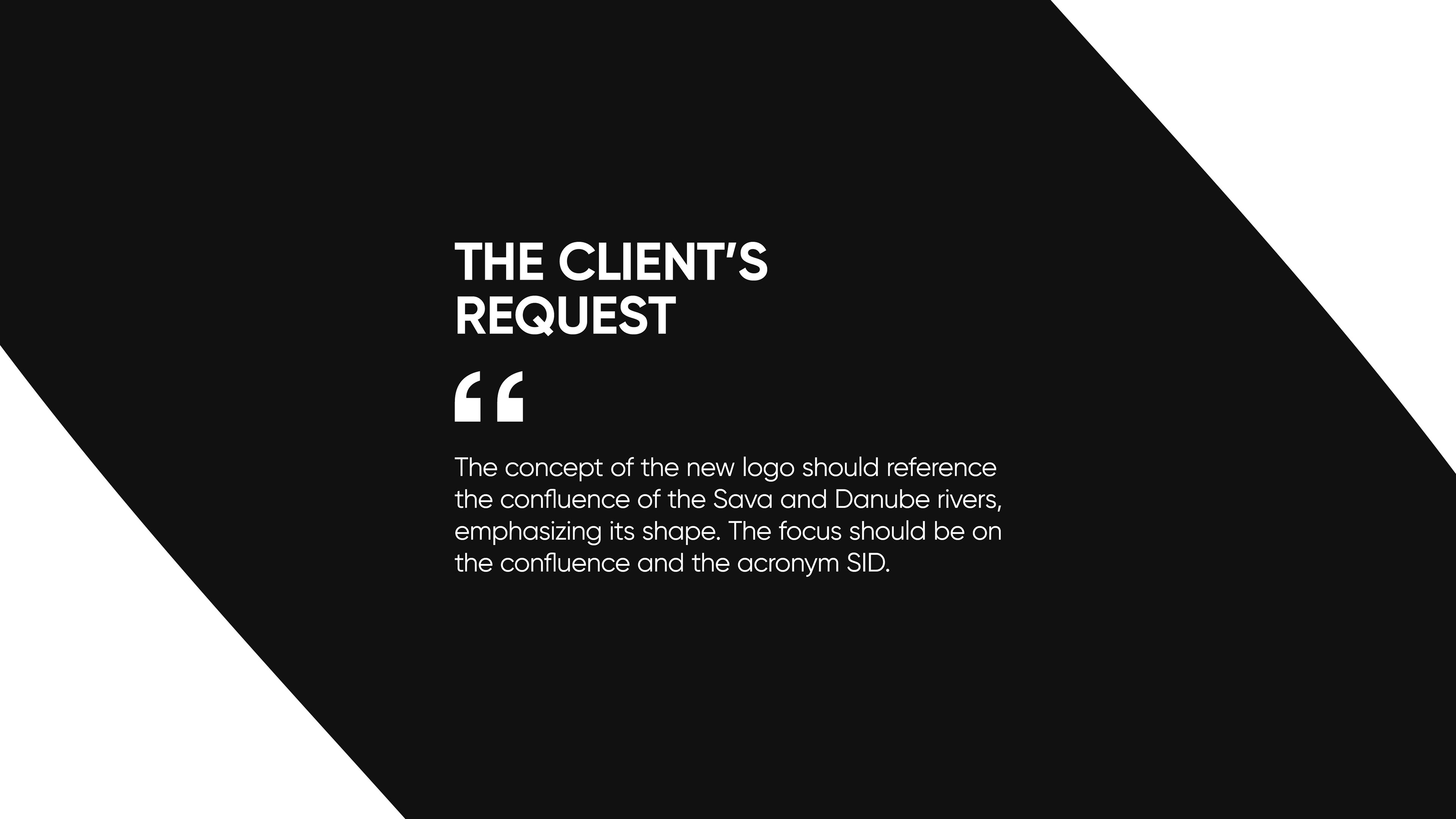
SID Group was founded by a team of software engineers, building everything from web apps to full-scale IT solutions. Their name comes from the meeting of two rivers, the Sava and Danube, a symbol of connection and flow, just like their work.

But their old branding did not match their vision. It was time for something bold, structured, and instantly recognizable.
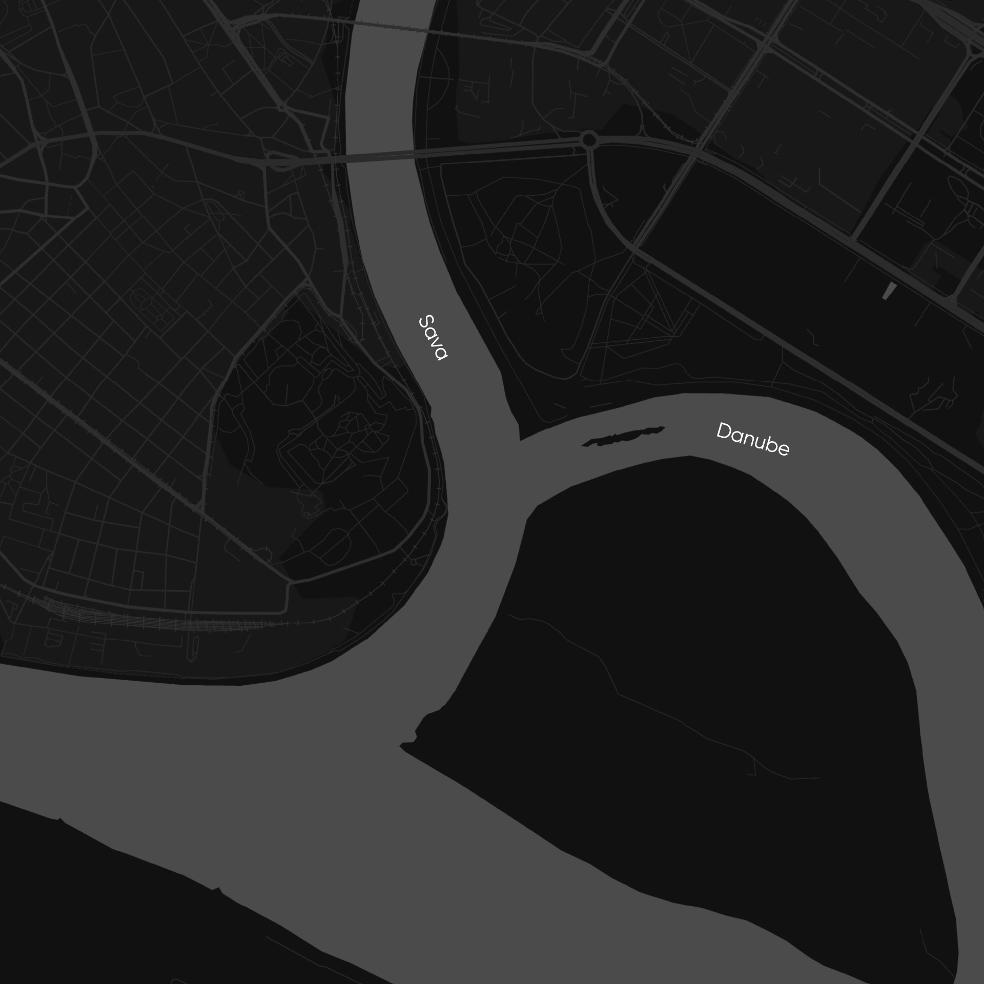
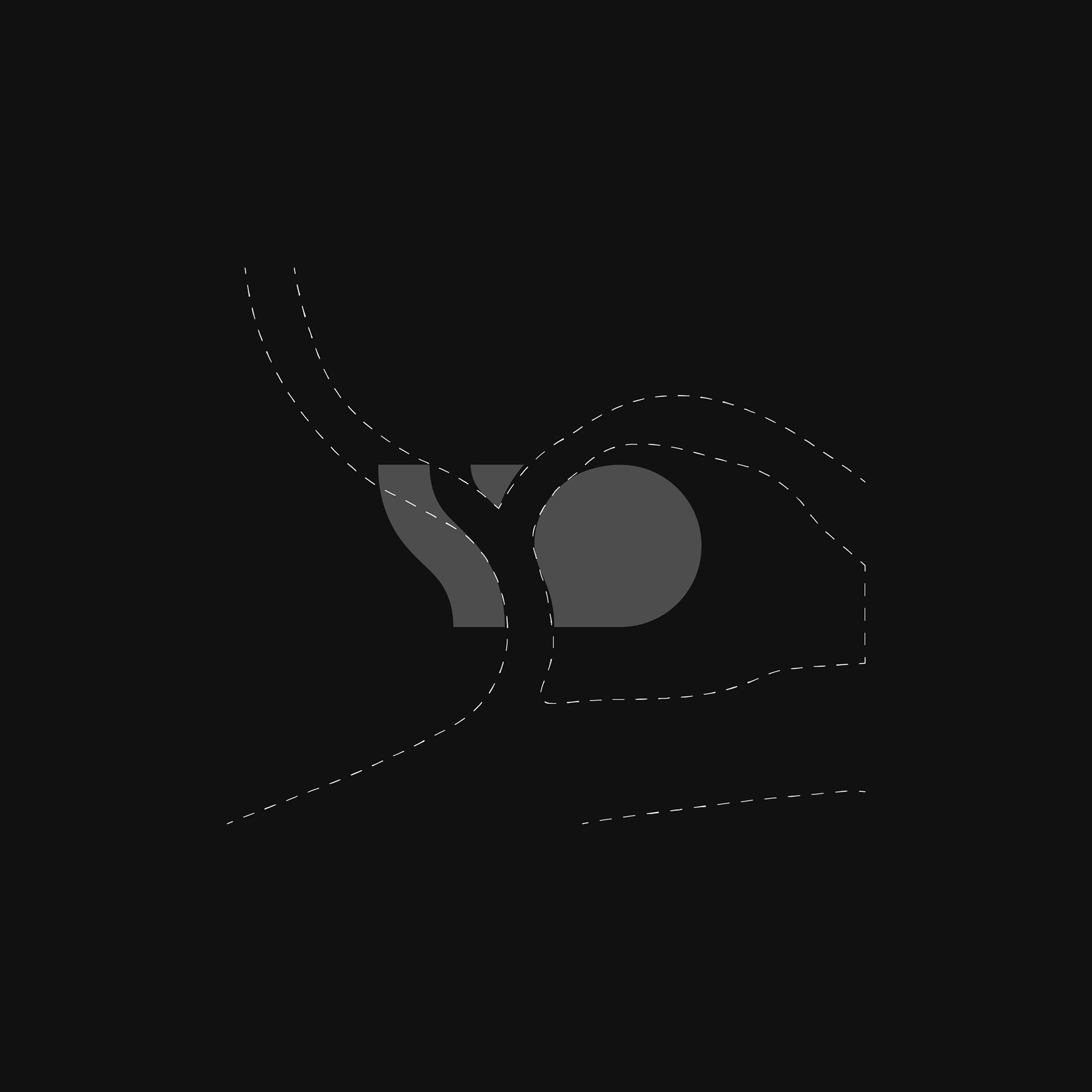
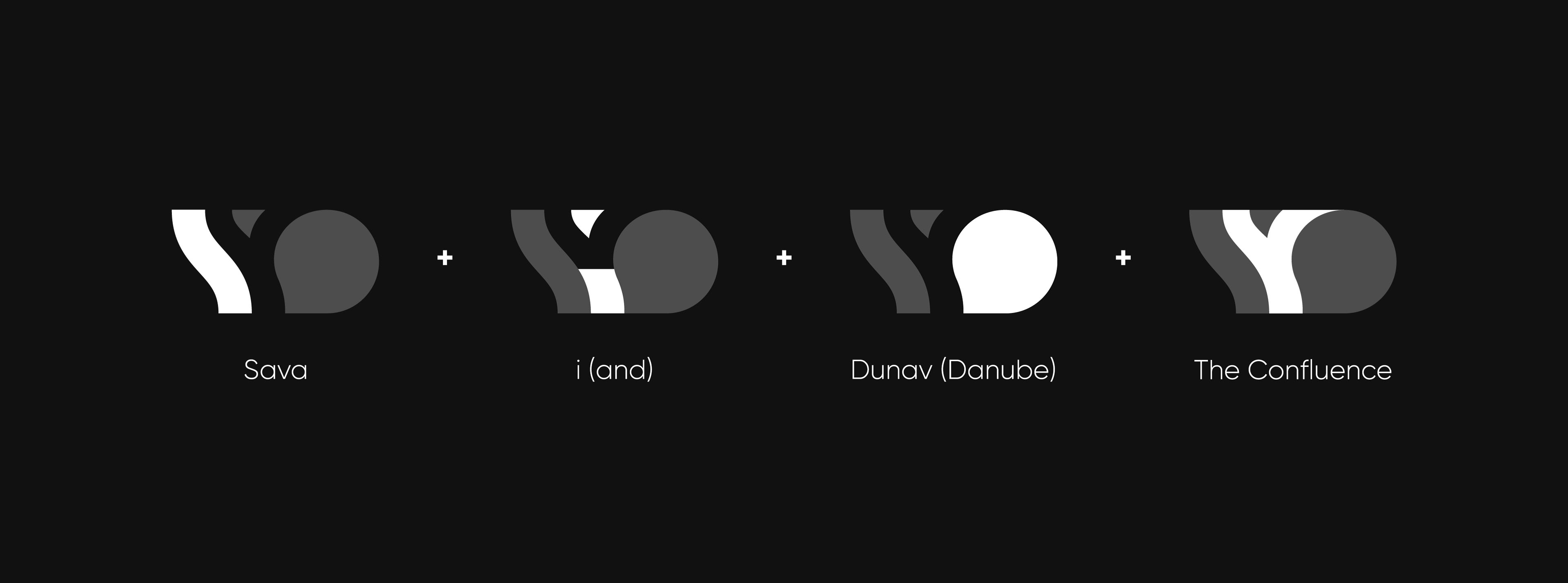
Shaping the confluence
The logo is a direct reflection of SID Group’s origins. I designed it using negative space to represent both the merging of two rivers and the letter “I” within the acronym. This approach keeps the design minimal yet deeply intentional. Every detail serves a purpose.
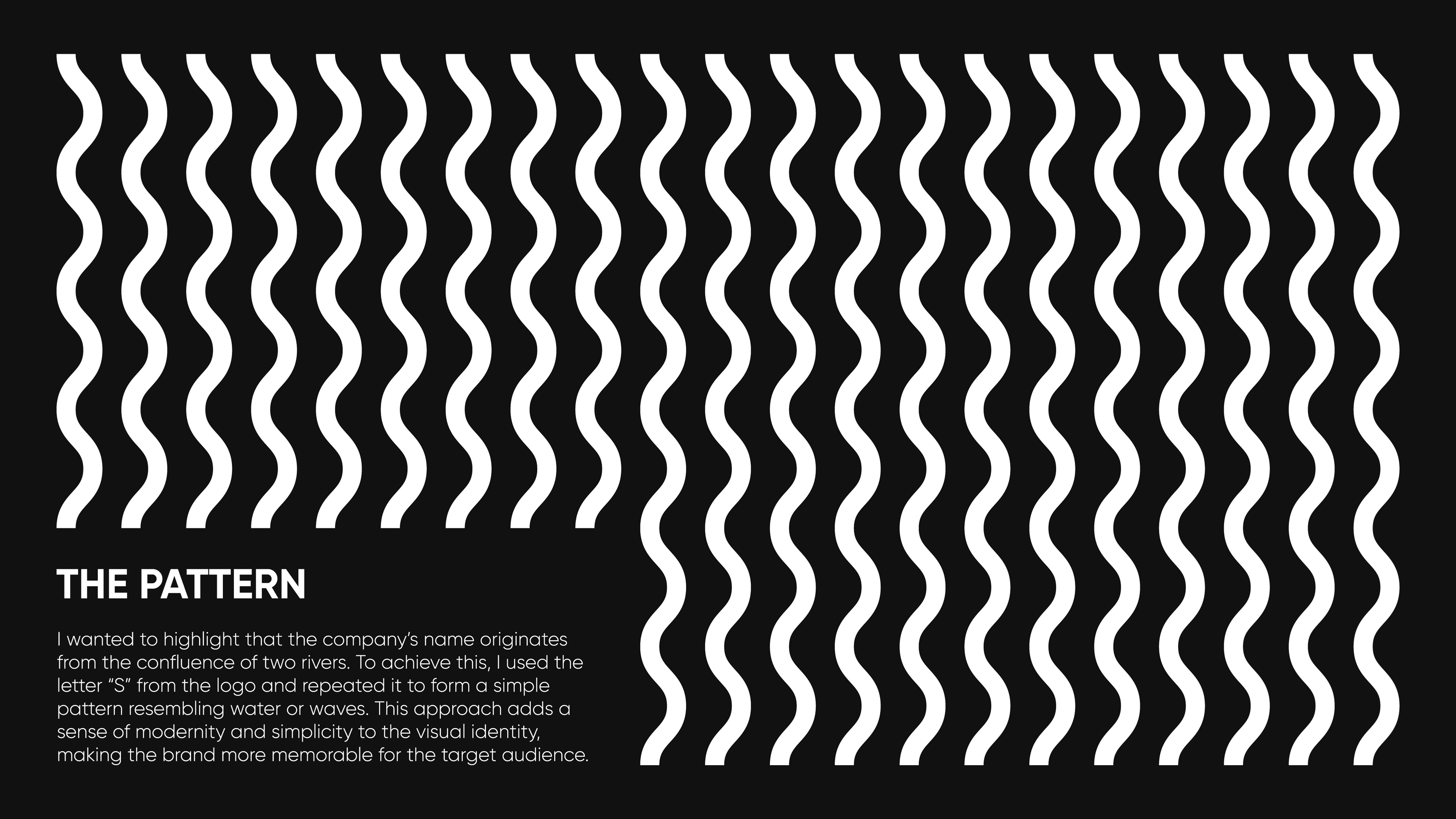
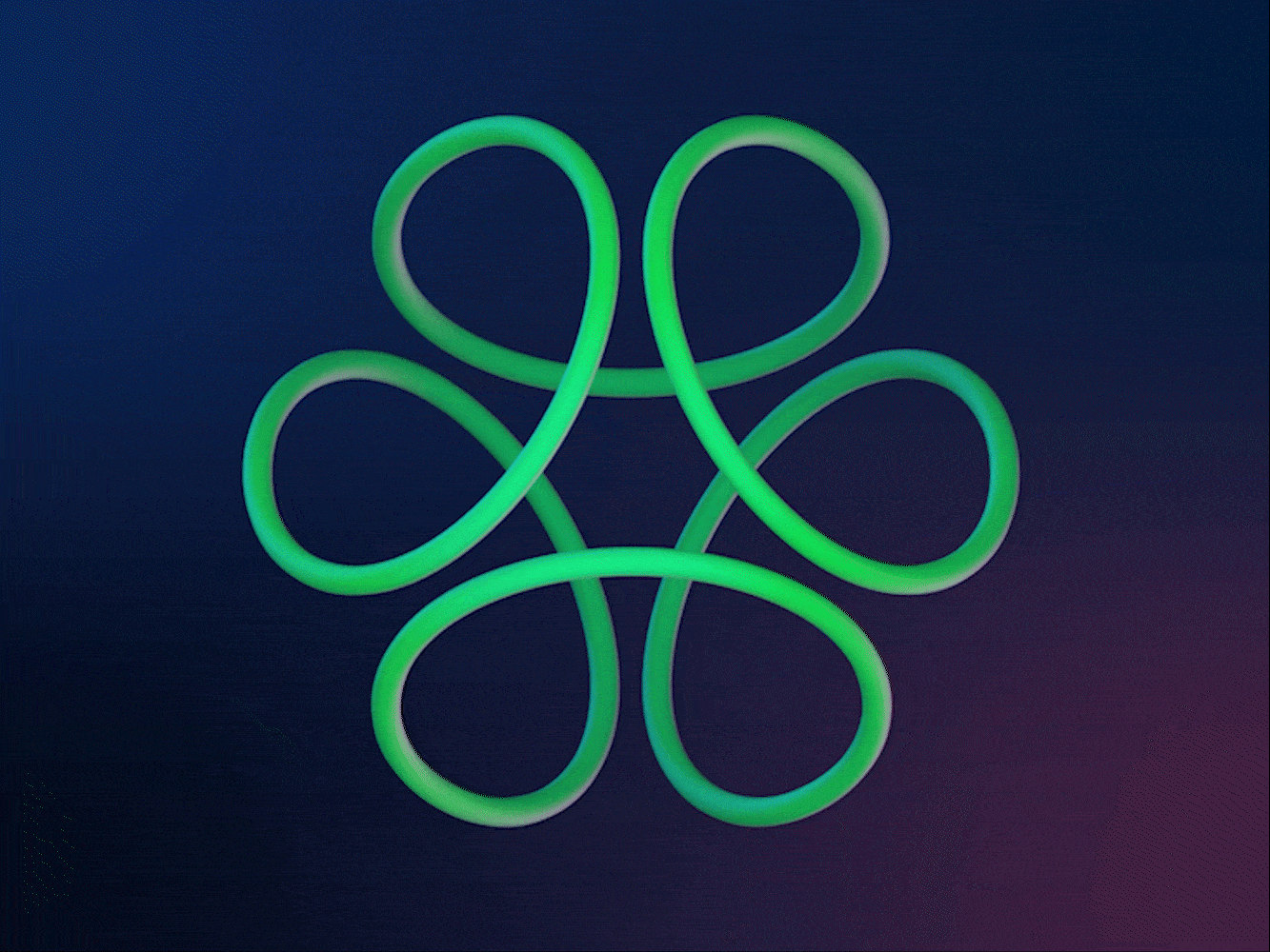
A pattern that moves
To extend the identity, I created a repeating pattern using the “S” from the logo. The result is a dynamic, wave-like texture that hints at both water and digital fluidity. It is clean, modern, and adaptable across different applications.

You may also like

Pinty
Full case study coming soon!
Brand identity, Packaging
Sawy
Sawy needed a brand that made learning data science feel fun, exciting, and accessible.
Naming, Brand strategy, Brand identity, Website UI/UX​​​​​​​
Timber Apps
From solid to standout. A brand refresh that keeps its roots but sharpens every detail.
Brand identity
Remarket Space
Rebranding Twin Cities Auctions into Remarket Space, a modern car auction platform with a colorful identity and a cleaner, easier buying experience.
Brand identity, Website UI/UX​​​​​​​
Solix AG Robotics
Refreshing Solix with a cleaner identity system, industrial tech visual direction, and a more focused UI for managing autonomous farming robots.
Brand identity, App UI, Website UI
Mages Studio
Ditching the generic tech look, the rebrand crafts a bold identity that feels as innovative and dynamic as Mages Studio’s work.
Brand strategy, Brand identity, Website UI/UX​​​​​​​
Nikola Tesla Institute
Nikola Tesla Institute needed a new logo that was clear, consistent, and recognizable in both Cyrillic and Latin scripts. The old identity was fragmented and confusing. The new symbol had to bring it all together.
Brand identity
Personal brand
A fusion of Swiss modernism and brutalist experimentation that turns minimalism into a statement.
Brand identity
UEPS 65
Awarded first prize, a modular 65 honors UEPS’s past while scaling as a clean, modern system.
Brand identity
ØOMO
Winning ØOMO cup design contest created for their techno events, using oversized typography, and an experimental rave-inspired composition.
Packaging