
Client
Nikola Tesla Institute
Deliverables
Brand identity
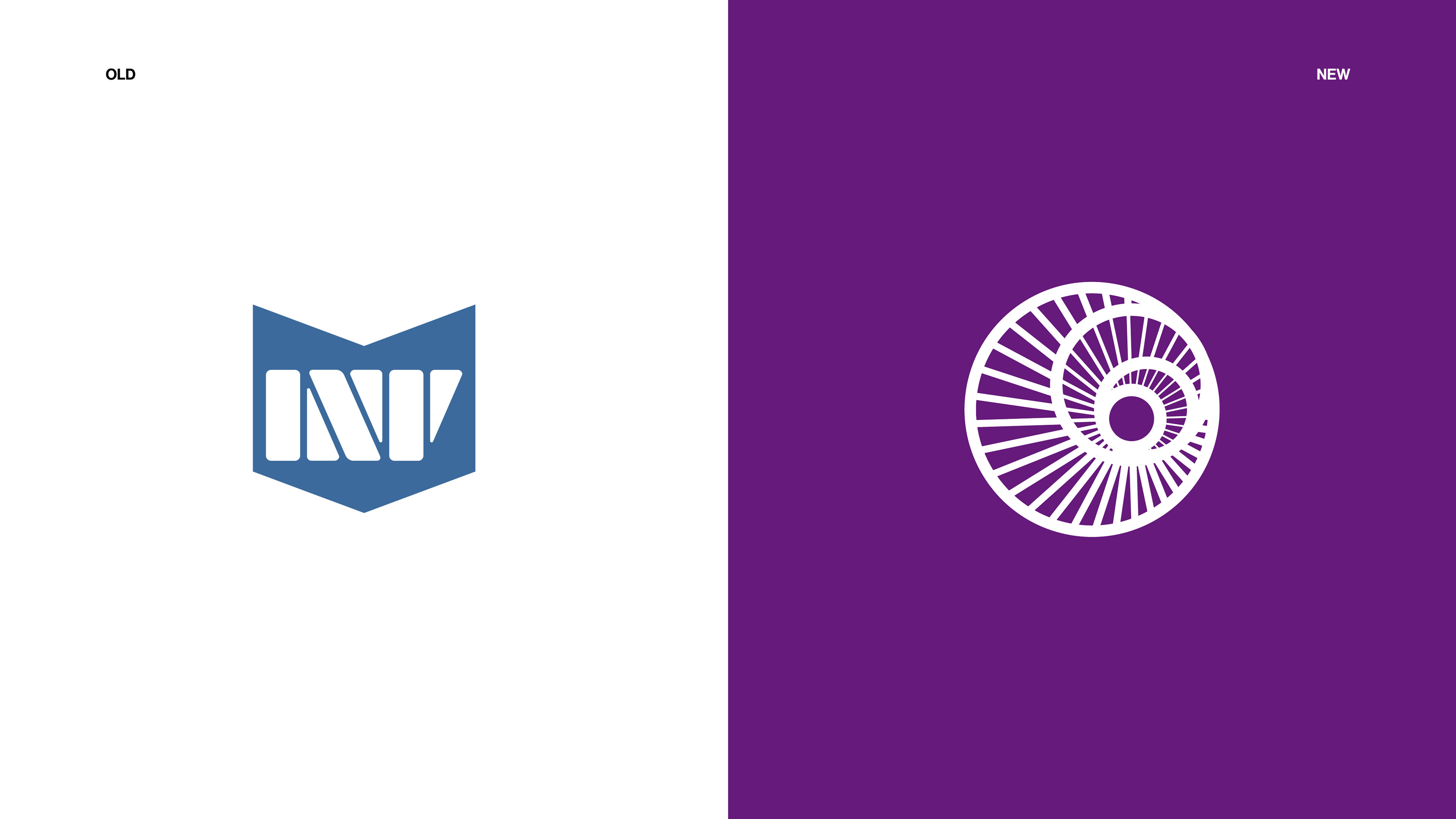
Nikola Tesla Institute needed a new logo. Something recognizable in both Cyrillic and Latin scripts. The old abbreviation was confusing. The identity lacked consistency, clarity, and presence. It needed a symbol that could unify it all.
The Nikola Tesla Institute is the leading scientific and research center in Serbia focused on power engineering. It’s the only institute in the world with Tesla’s personal written consent to carry his name. A place with real legacy and future-facing work. But visually, it didn’t show. The design system was missing the authority and innovation the name deserved.
From abbreviation to symbol
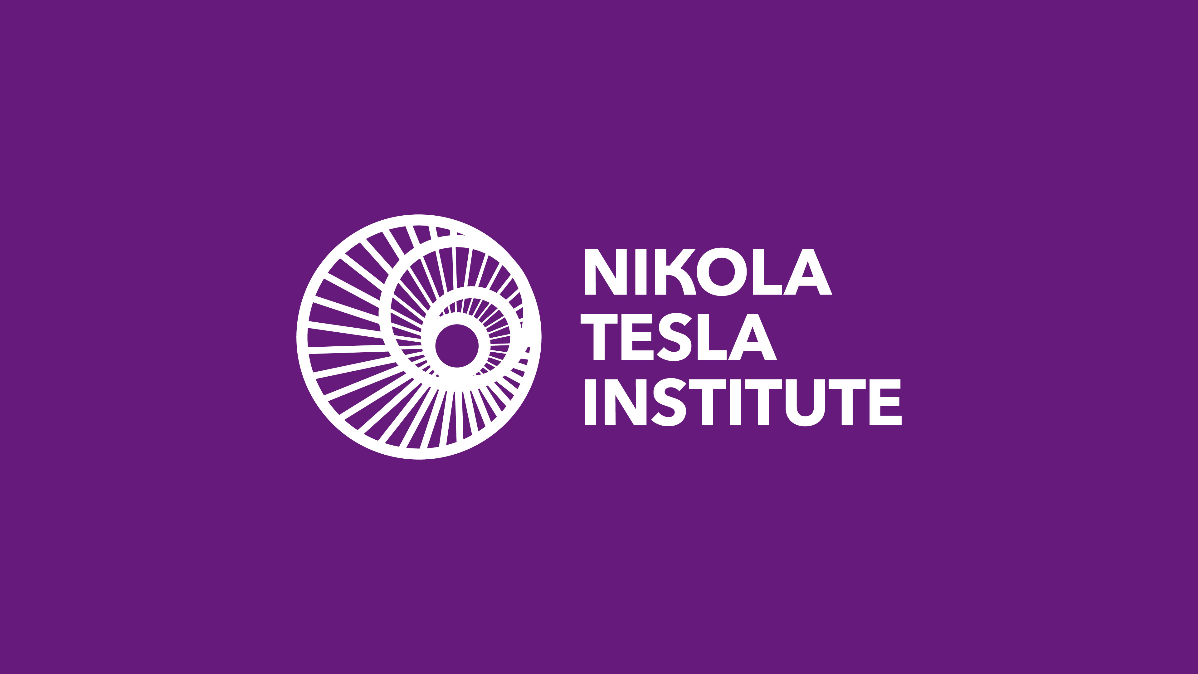
The previous logo wasn’t holding its weight. Switching between languages only made things harder, with the abbreviation being inconsistent across both scripts. In Serbian, it read INT. In English, it became NTI. On top of that, the letter T often looked like a V. Rather than tweaking the broken abbreviation, I replaced it with a symbol inspired by Tesla’s plasma globe. It’s instantly familiar to the public and a subtle tribute to our greatest inventor.
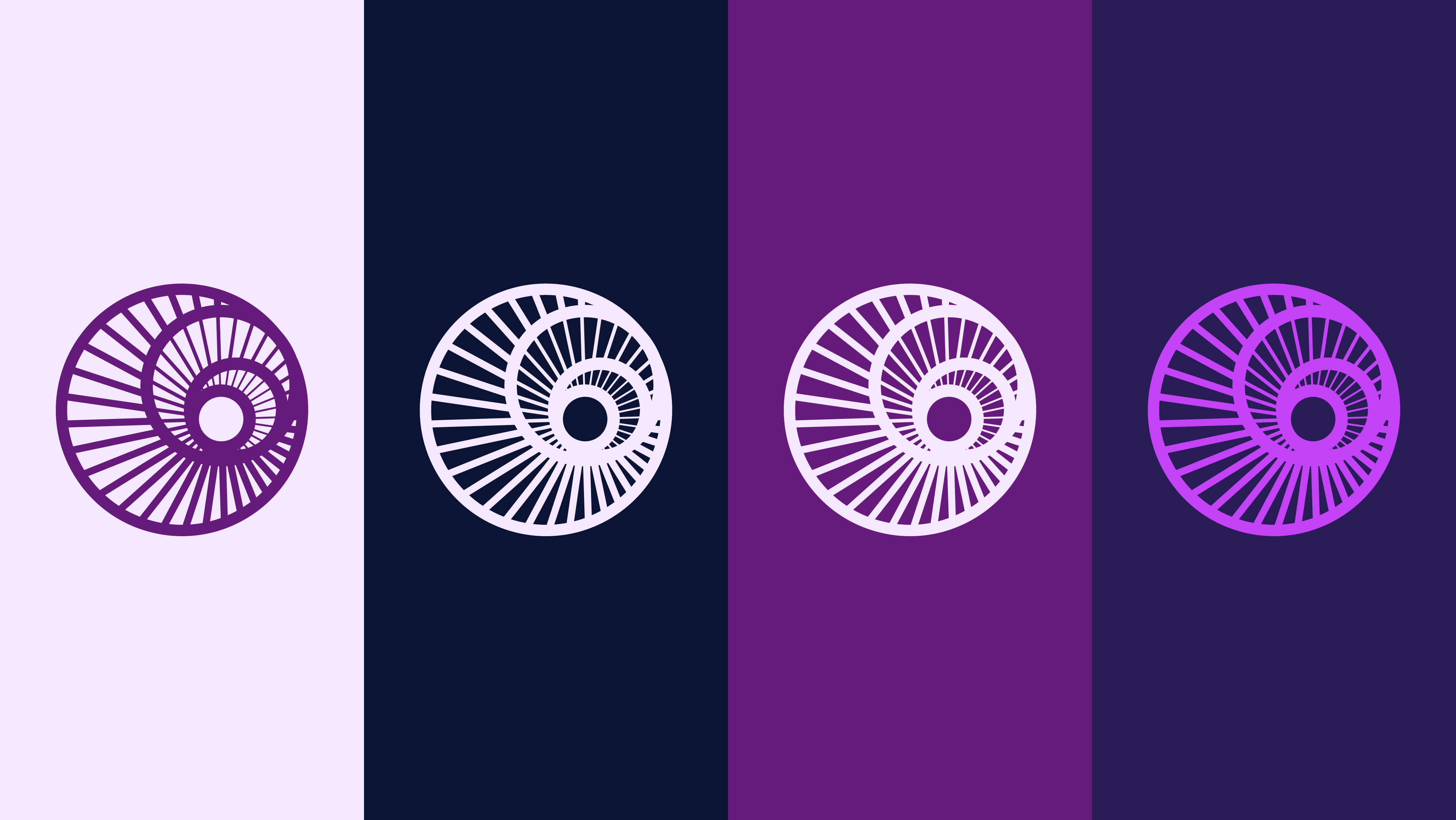
Precision in numbers
The new logo is constructed using the golden ratio, representing harmony, precision, and timeless design. It features 36 lines radiating from the center, inspired by Tesla’s fascination with the numbers 3, 6, and 9. These numbers are central to Tesla’s 369 theory, where any number can be reduced to a single digit by adding its digits together - for example, 3+6+9 becomes 9. Tesla believed these numbers held the key to understanding the universe. The expanding lines visualize this energy, growth, and constant progress.
Purple: A Tribute to Tesla
Purple became the foundation, chosen not only for its visual impact but also as a nod to Tesla’s legacy. It’s made by combining red and blue — two opposites. Blue stands for the Institute’s tradition and depth, while red adds energy and curiosity. Together, they form purple, a color that symbolizes innovation and mystery, much like Tesla himself. The balance between heritage and progress in the color speaks to the Institute’s forward-thinking approach, grounded in the genius of Tesla’s work.
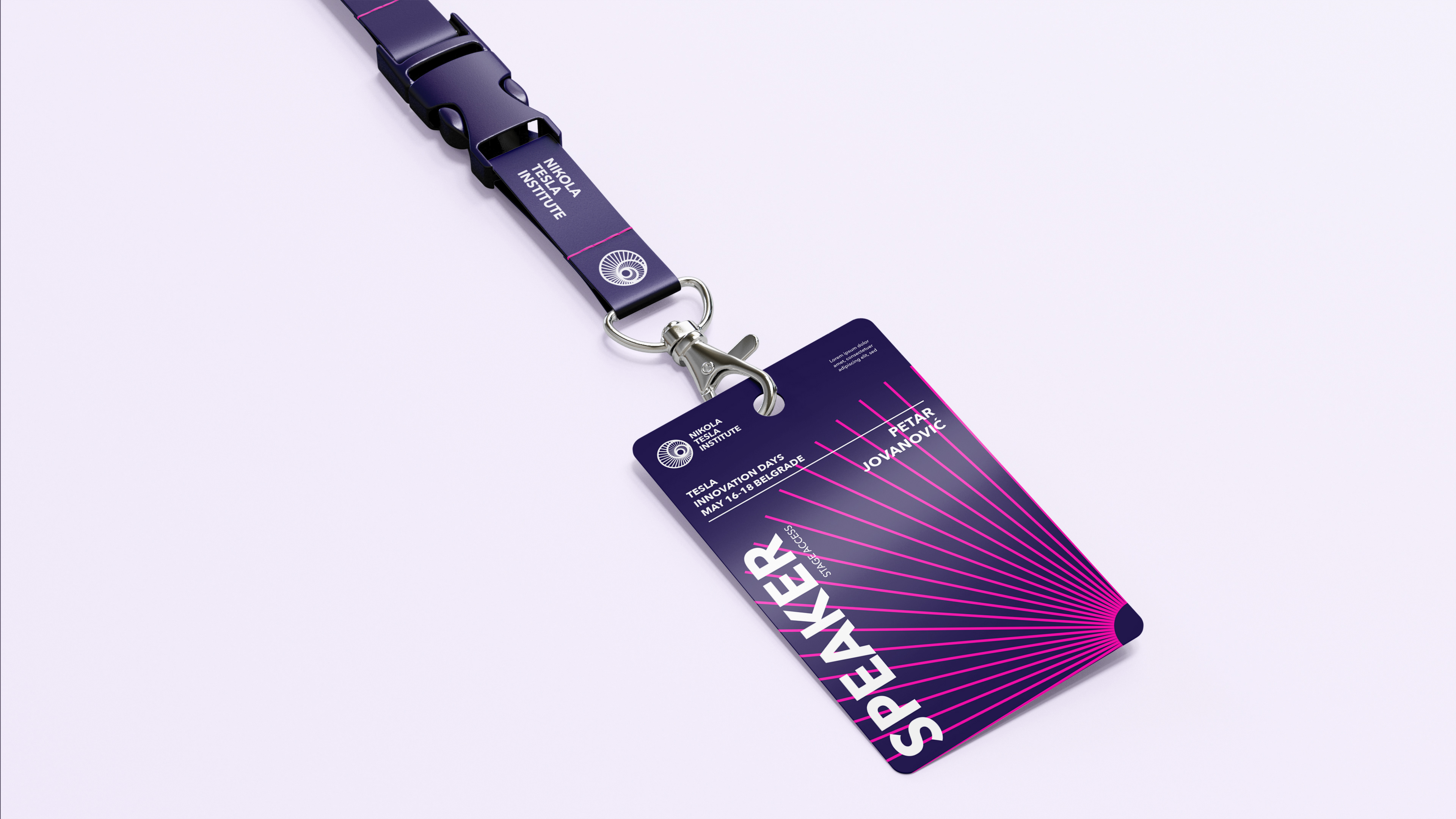

Energy in motion
The identity system includes a custom pattern based on the waveform of alternating current, Tesla’s most iconic invention. It flows quietly through the visuals, bringing rhythm and movement. A subtle signal of what drives the Institute forward.