
Client
Timber Apps
Deliverables
Brand identity
Timber Apps didn't need a new identity. They needed clarity. The core idea was there, it just wasn't doing enough. The goal was to keep what worked and rebuild the rest with more precision, more presence, and a sharper point of view.
Timber Apps is built on simplicity. The brand focuses on creating reliable, easy-to-use tools that put function first. There’s no noise, no gimmicks, just well-made products that do what they promise. As the company grew and entered new markets, the need for a more polished and unified identity became clear.
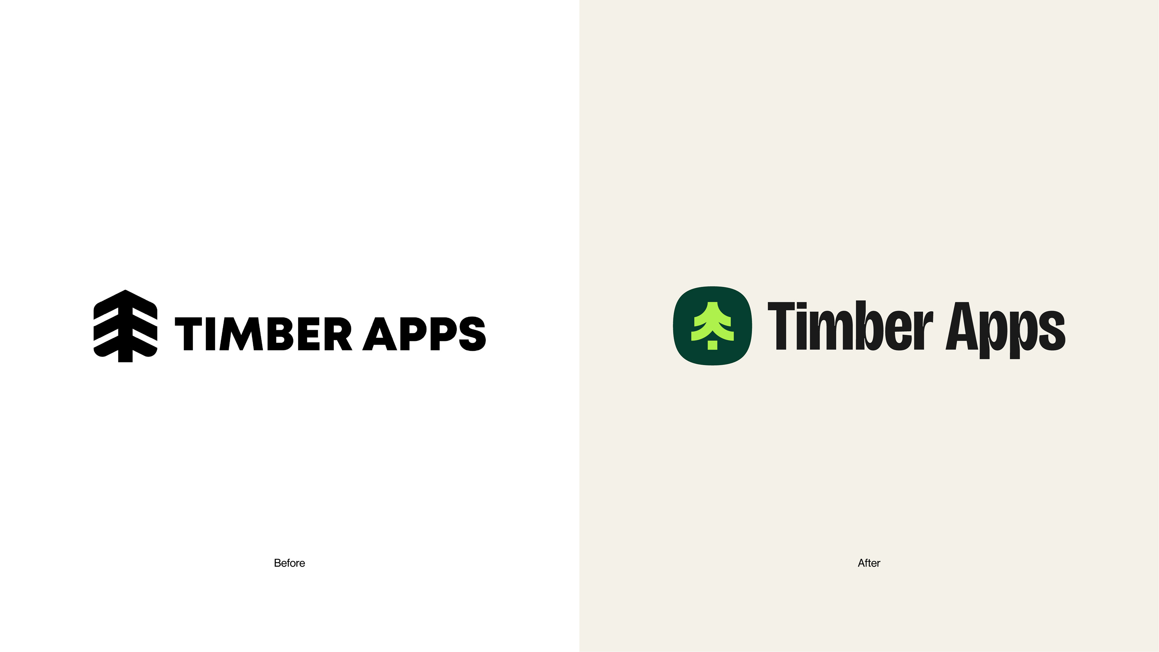
The old look wasn’t broken, but it played it safe. It lacked personality and didn’t reflect the warmth or trust they wanted users to feel. The goal was to bring in more clarity, more structure, and a friendlier tone that could carry the brand forward.
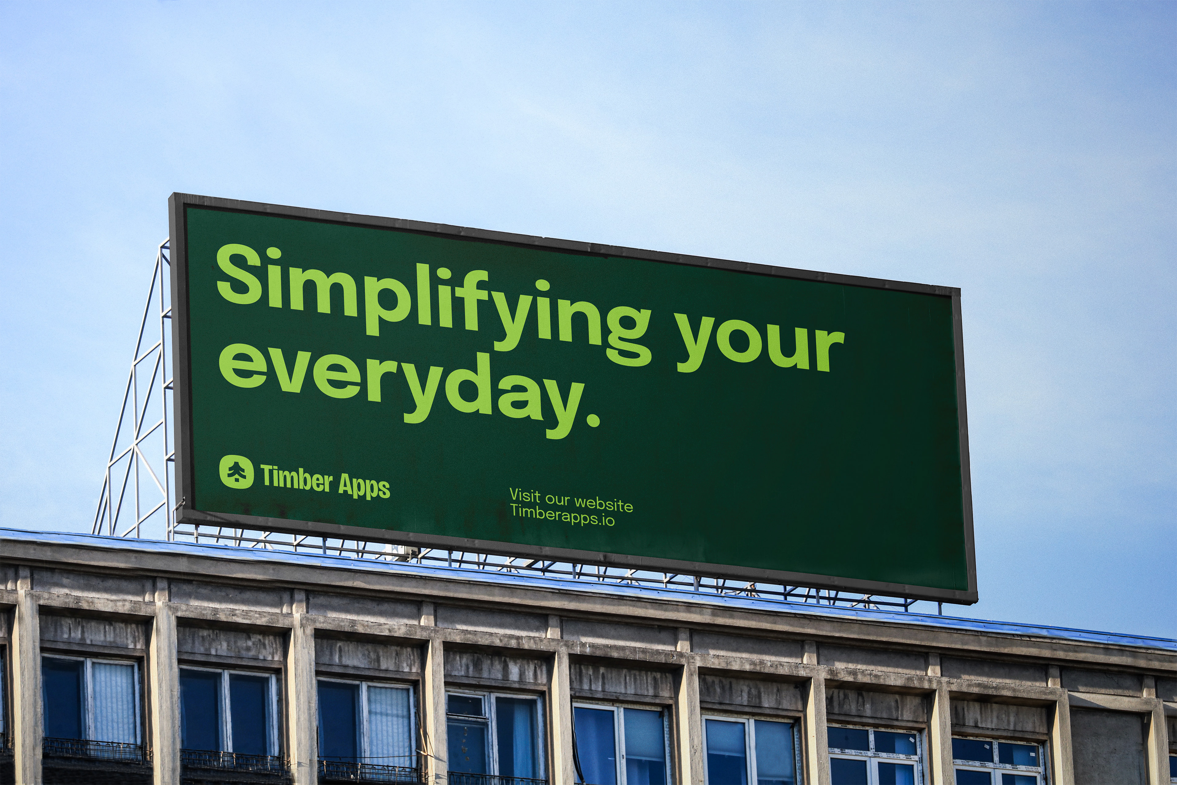
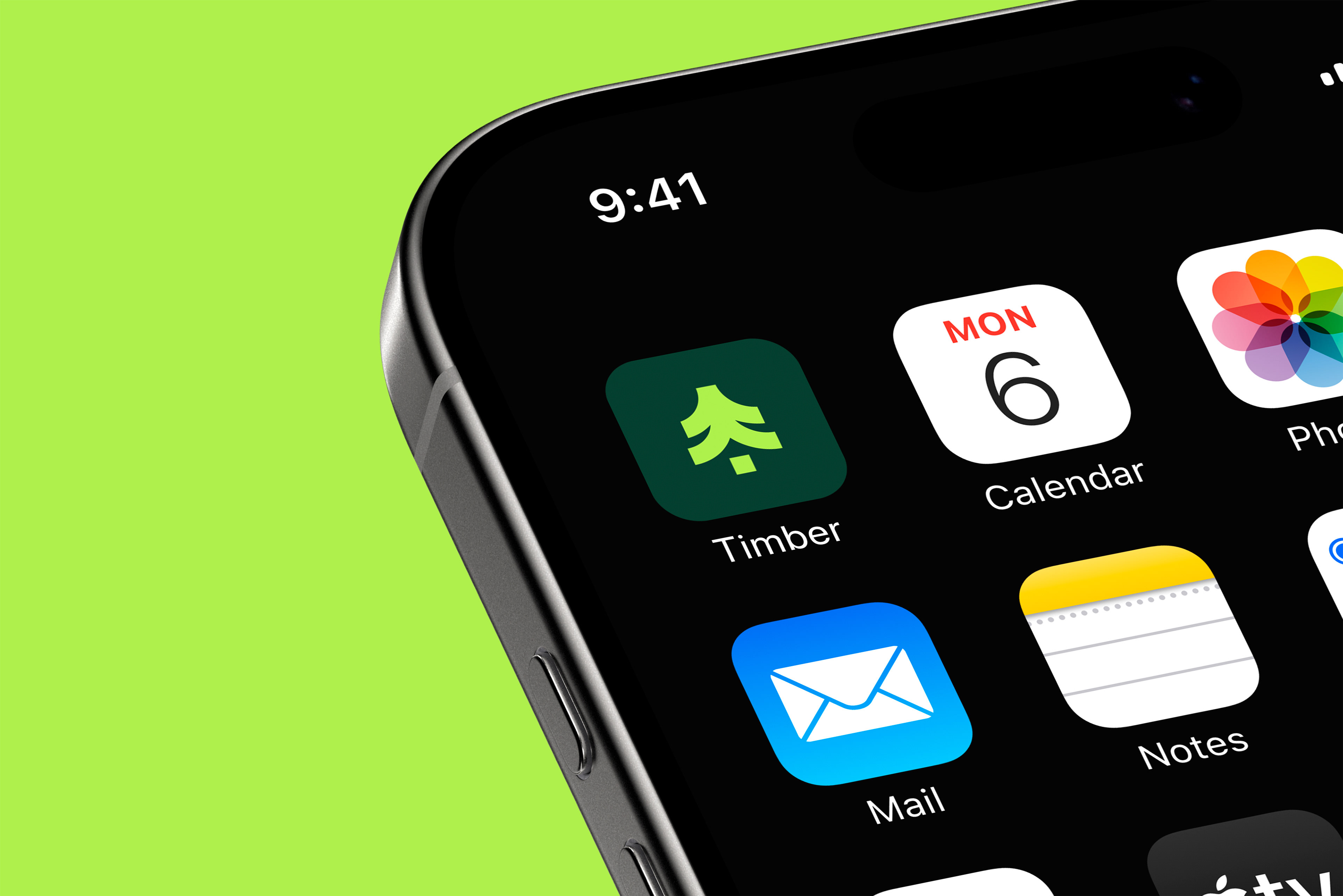
Always in season
The original logo featured a bold tree shape, but its rounded edges and stacked form made it feel more like a leaf than a lasting mark. It was recognisable, but it lacked clarity and depth.
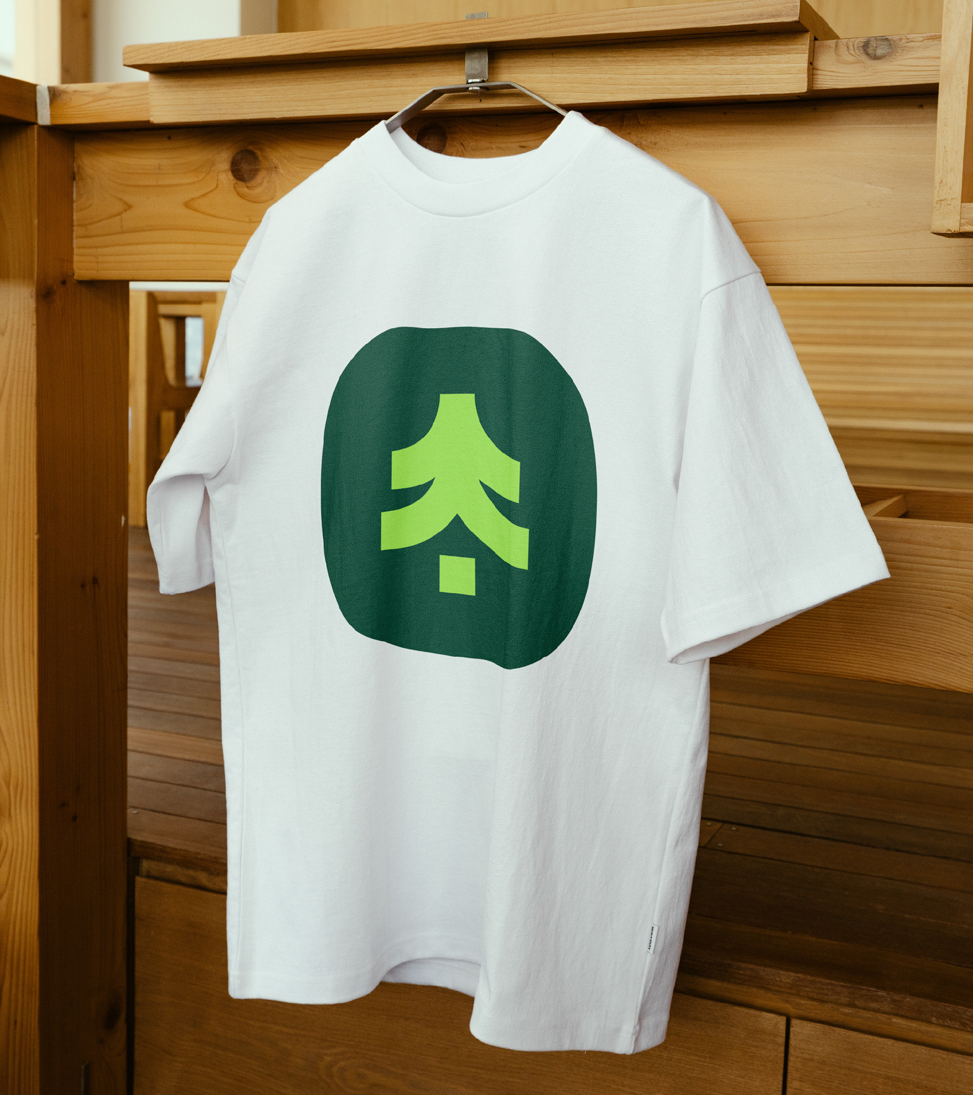
The new design refines that idea into an evergreen tree - a symbol of something useful, constant, and built to endure. The icon is cleaner and more geometric, introducing structure and upward movement. Paired with softer, humanist typography, the updated system balances precision with personality. It feels intentional, approachable, and ready to grow with the brand.

Craftsmanship
Built on a precise grid, the icon is clean, balanced, and made to scale across any format. Every curve has a purpose. Nothing is accidental.
Rooted in nature
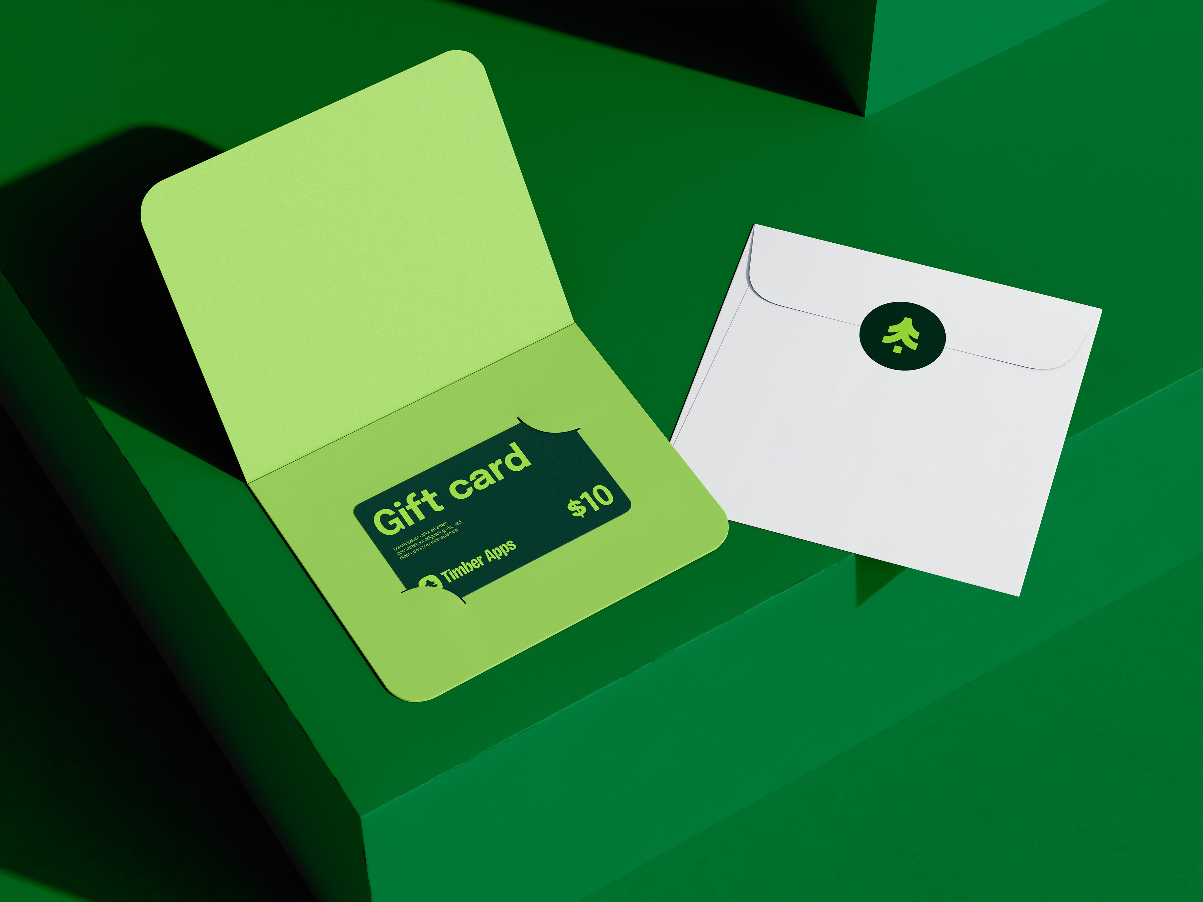
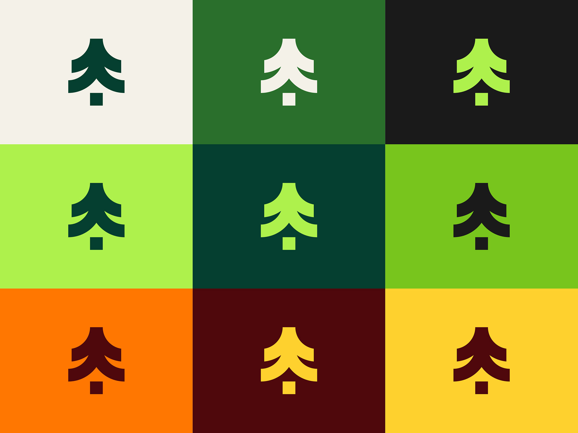
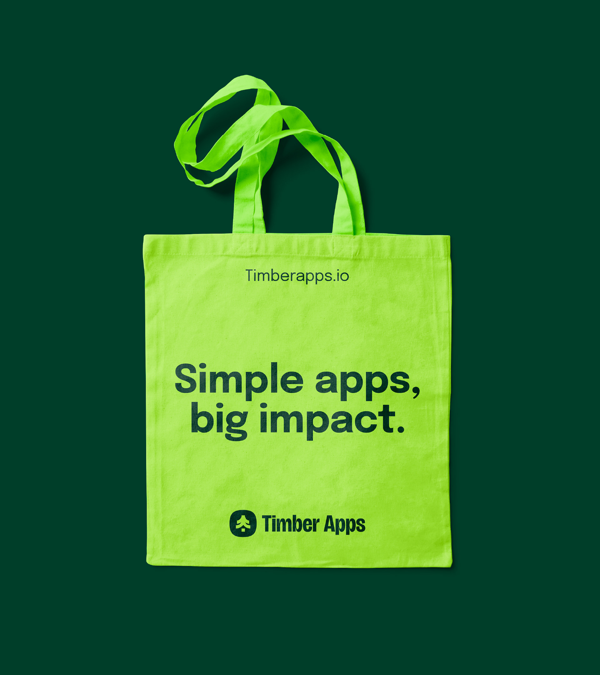
The palette is inspired by trees and the natural world. Bright green adds energy and visibility, while deeper tones bring calm and balance. The extended palette introduces fall-inspired colors for more flexibility and range.
Designed to hold
The identity was tested across real use. The icon stays sharp at small sizes, the typography holds up in layout, and the colors stay consistent everywhere. It’s a system that works wherever it needs to go.