Client
Sawy

Deliverables
Naming
Brand strategy
Brand identity
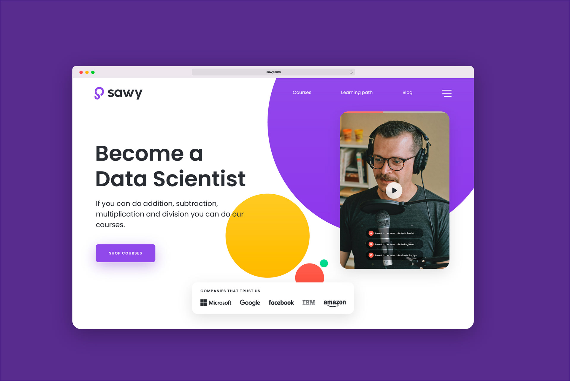
Website UI/UX​​​​​​​
Data science isn't just numbers and code. It's about discovery, problem-solving, and creativity. Sawy needed a brand that made learning data science feel fun, exciting, and accessible.

As a mentor-driven educational platform, Sawy’s mission is to bridge the gap between theory and industry-relevant skills. They wanted a name, brand identity, and website that reflected this approach. Something fresh, inviting, and professional without feeling overly academic or intimidating.
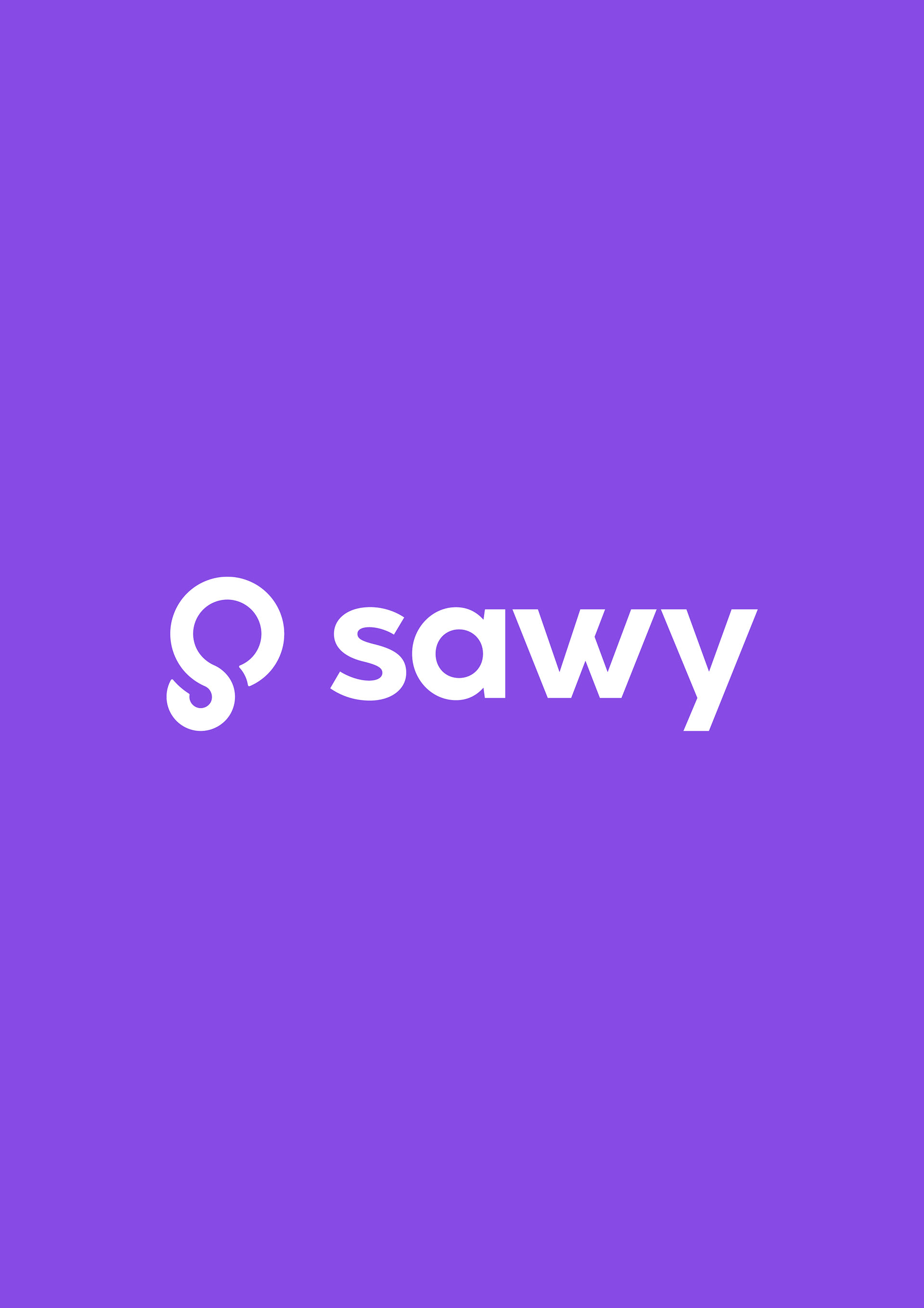
Visualizing limitless learning
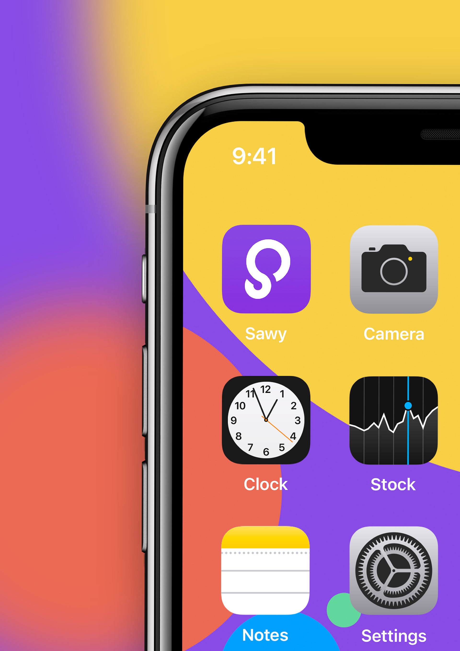
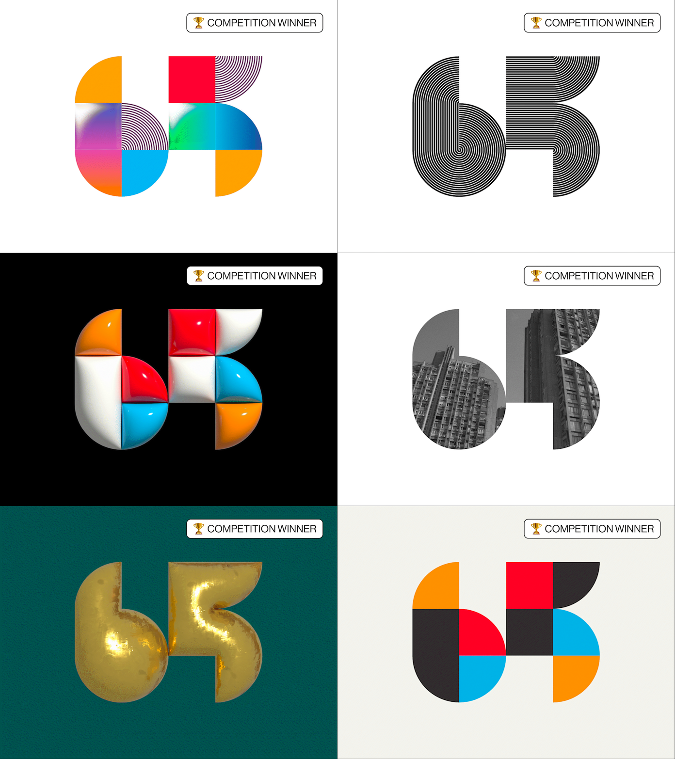
The logo blends three key ideas: the letter “S,” an infinity symbol, and a light bulb. This combination represents limitless ideas, continuous learning, and the spark of innovation. It’s a visual metaphor for the endless opportunities that data science offers, reinforcing the brand’s forward-thinking approach.
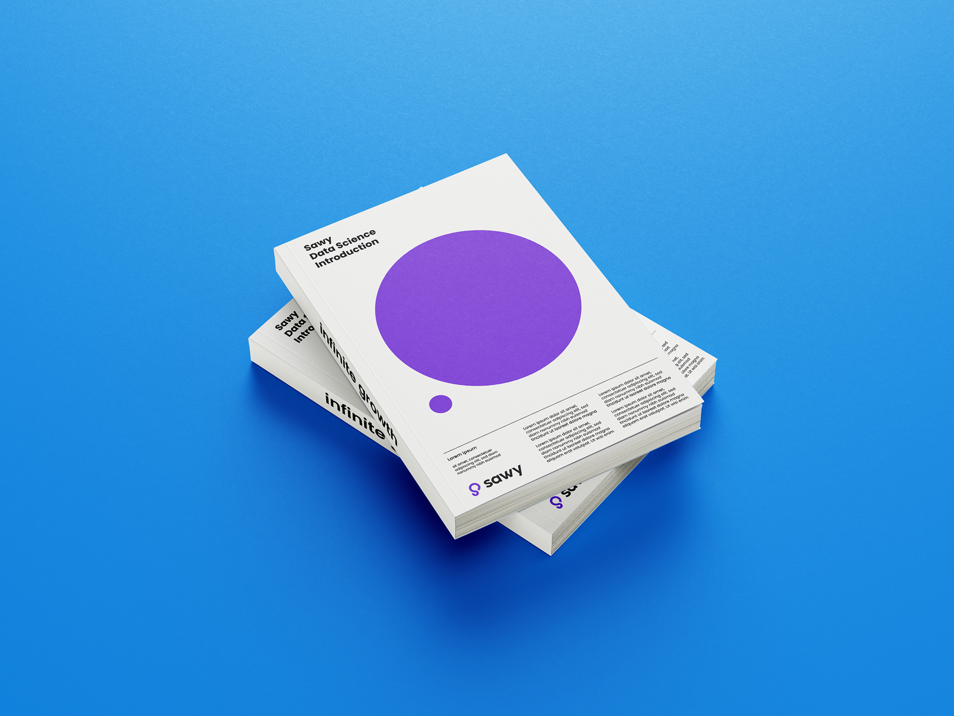
Naming the future of data science
The name “Sawy” was chosen to reflect practical knowledge and real-world understanding. It speaks to the brand’s core mission of equipping learners with hands-on skills they can apply in real-world scenarios. Simple, memorable, and approachable, it sets the tone for a brand that makes complex topics easier to grasp.
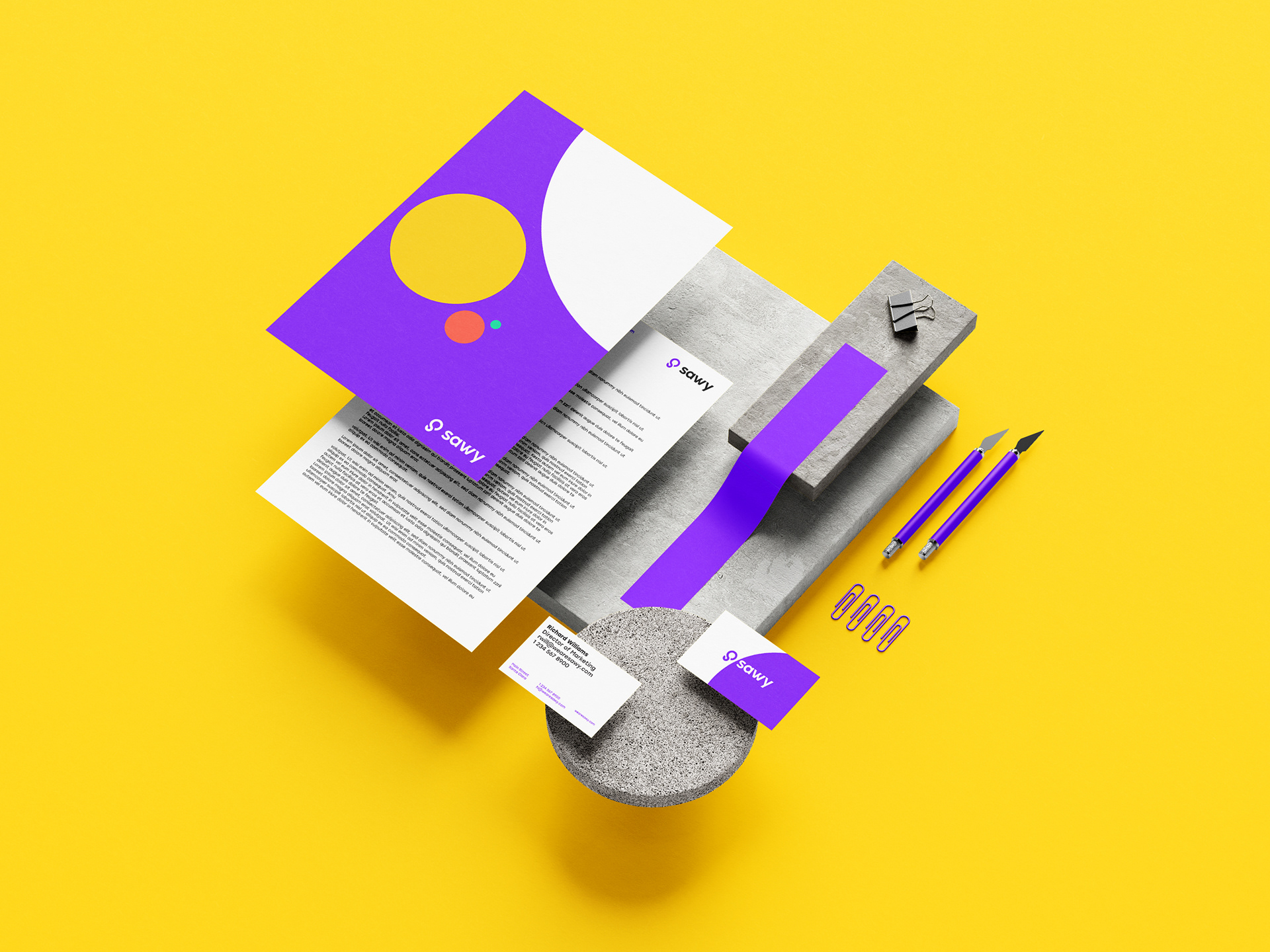
Building an identity that speaks to everyone
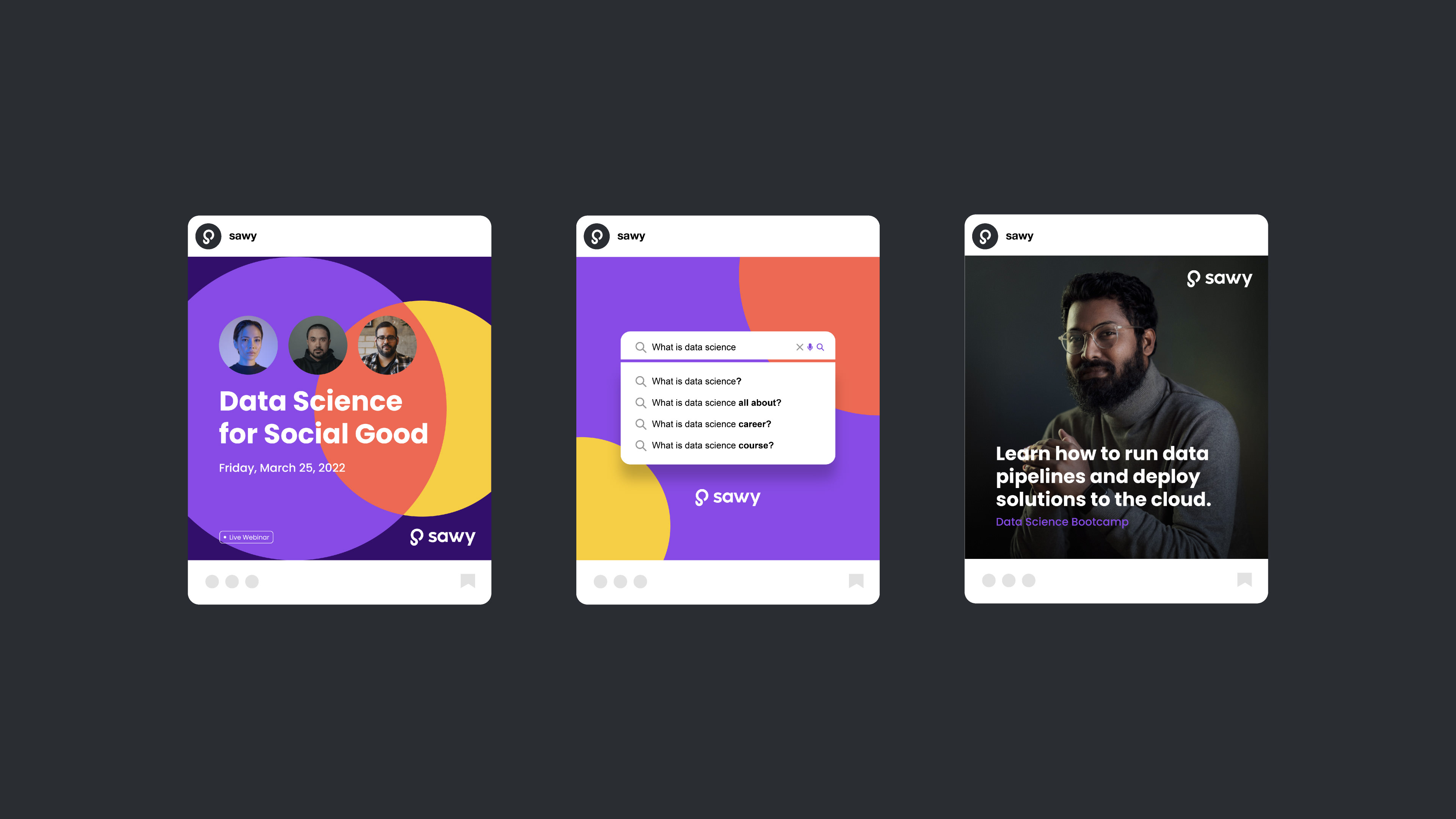
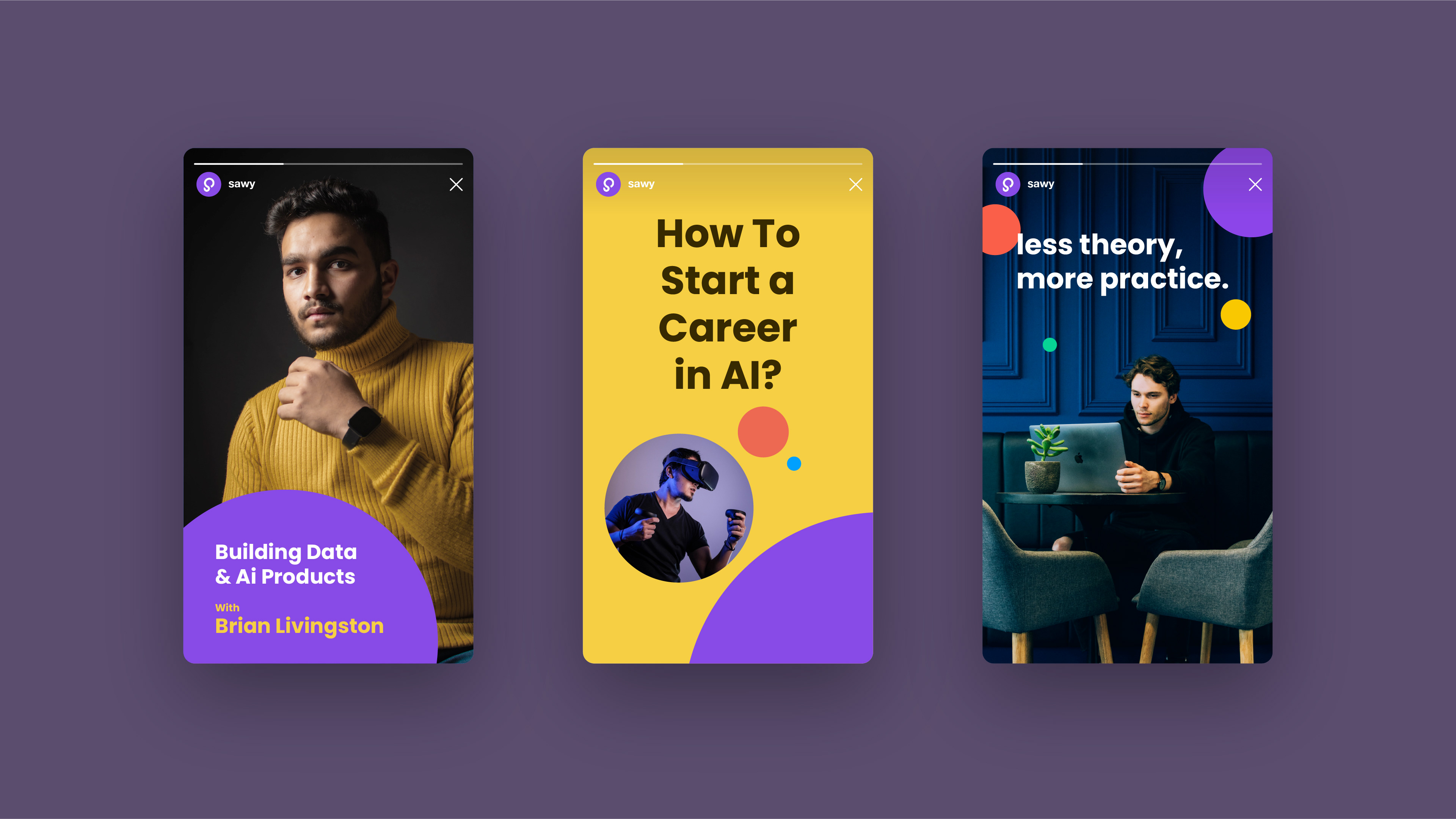
Sawy’s branding challenges the stereotype that data science is only for math geniuses or tech elites. The design balances playfulness and professionalism, making it approachable for students while maintaining the credibility needed to attract investors. With a clean aesthetic and engaging visuals, the identity makes data science feel both fun and valuable.
You may also like

Timber Apps
From solid to standout. A brand refresh that keeps its roots but sharpens every detail.
Brand identity
Pinty
Full case study coming soon!
Brand identity, Packaging
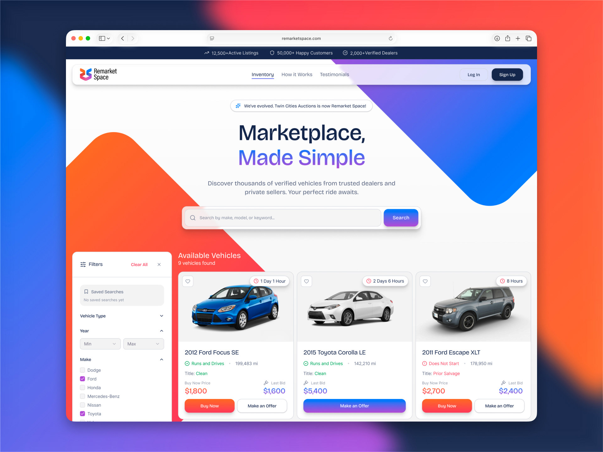
Remarket Space
Rebranding Twin Cities Auctions into Remarket Space, a modern car auction platform with a colorful identity and a cleaner, easier buying experience.
Brand identity, Website UI/UX​​​​​​​
Soil Action & SAM
Creating a rugged industrial identity for Soil Action and SAM, built to stand out in the field, on machinery, and in software.
Brand strategy, Brand identity
Solix AG Robotics
Refreshing Solix with a cleaner identity system, industrial tech visual direction, and a more focused UI for managing autonomous farming robots.
Brand identity, App UI, Website UI
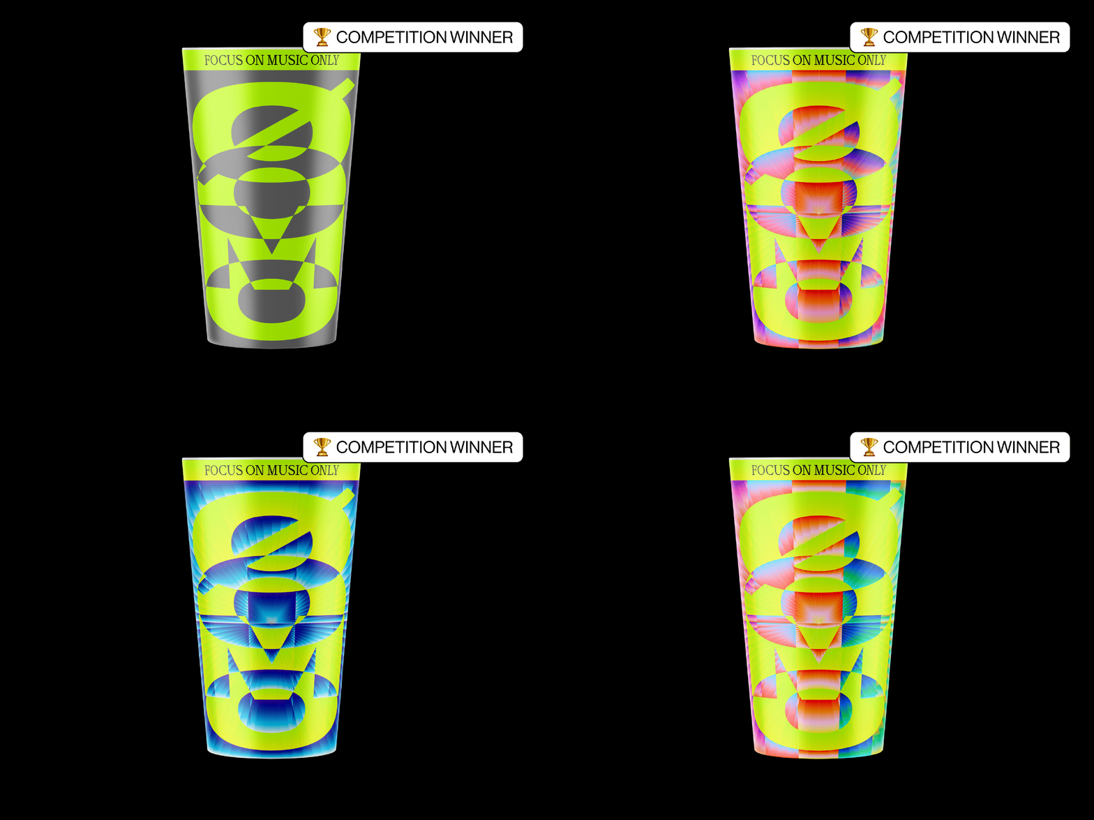
ØOMO
Award-winning reusable cup design for ØOMO, created for their techno events using oversized typography, bold color, and a rave-inspired visual direction.
Packaging
SID Group
The SID Group identity captures the seamless flow of innovation, with a sharp, modern logo and dynamic patterns that reinforce its connection to the rivers that inspired its name.
Brand identity
Nikola Tesla Institute
Nikola Tesla Institute needed a new logo that was clear, consistent, and recognizable in both Cyrillic and Latin scripts. The old identity was fragmented and confusing. The new symbol had to bring it all together.
Brand identity
Mages Studio
Ditching the generic tech look, the rebrand crafts a bold identity that feels as innovative and dynamic as Mages Studio’s work.
Brand strategy, Brand identity, Website UI/UX​​​​​​​
Personal brand
A fusion of Swiss modernism and brutalist experimentation that turns minimalism into a statement.
Brand identity