
Client
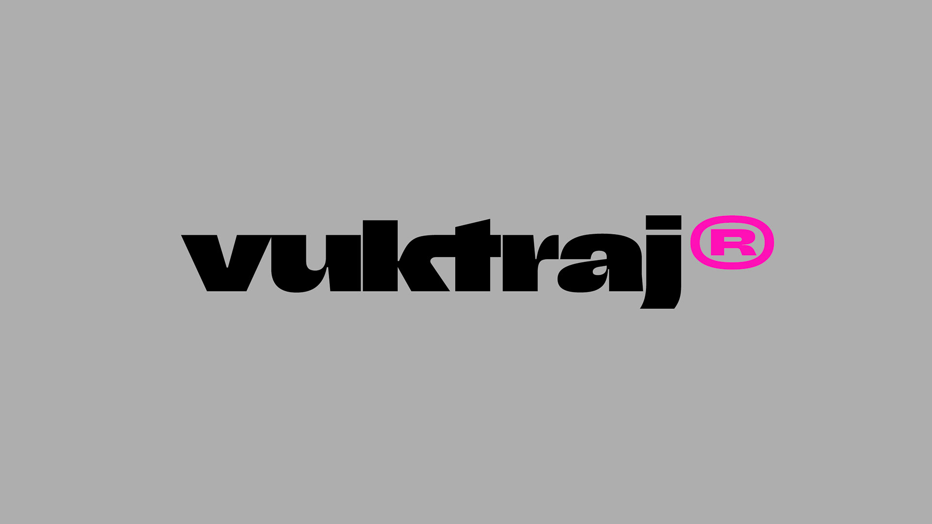
Vuk Traj
Deliverables
Brand identity
A fusion of Swiss modernism and brutalist experimentation that turns minimalism into a statement. It's bold, it's structured, and it knows exactly when to break the rules.
Bold minimalism is a mindset, not just an aesthetic. It’s about precision with attitude, clarity with an edge. Every element has a reason to exist. Every distortion serves a purpose.
Traditional minimalism can feel sterile, while brutalism often lacks refinement. I wanted to bridge that gap. The goal was to create a design language that feels intentional yet unpredictable, polished yet raw. A system where structure meets chaos.
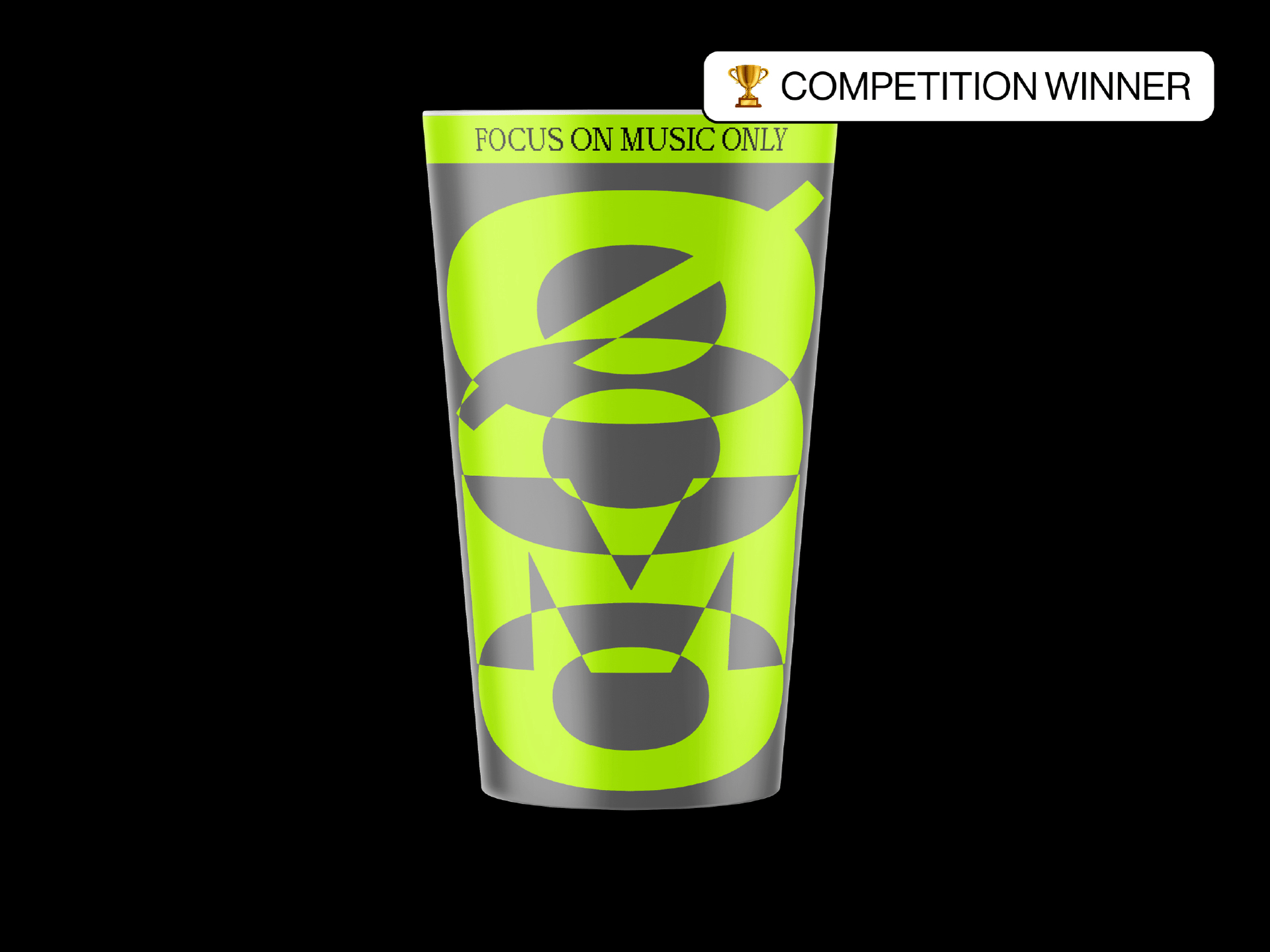
Typography as a weapon
Typography isn’t just letters. It’s voice, attitude, and precision. Custom letterforms, sharp cuts, and unexpected ligatures create a balance between order and disruption. It’s about making type do more than communicate. It needs to provoke.
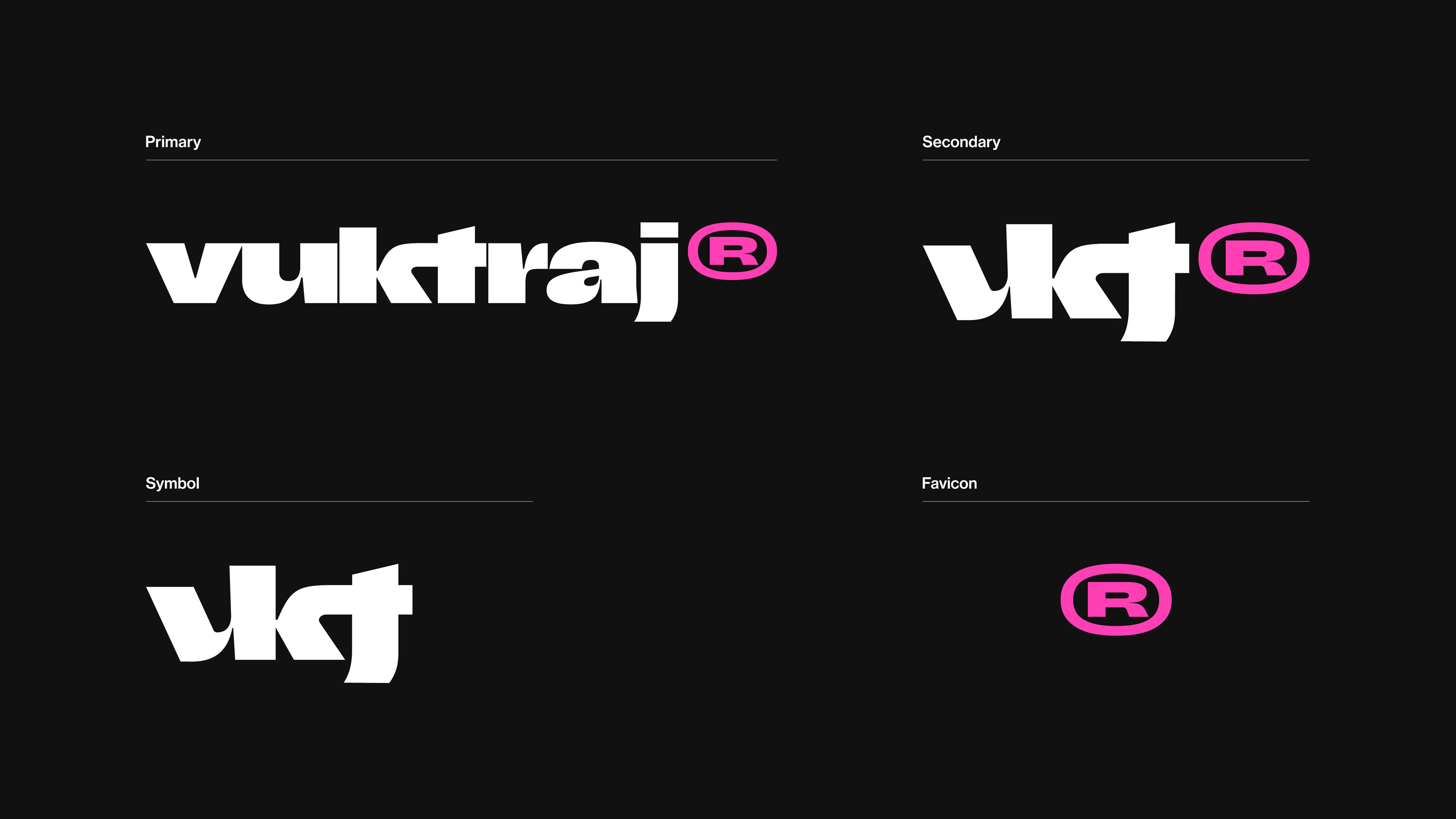
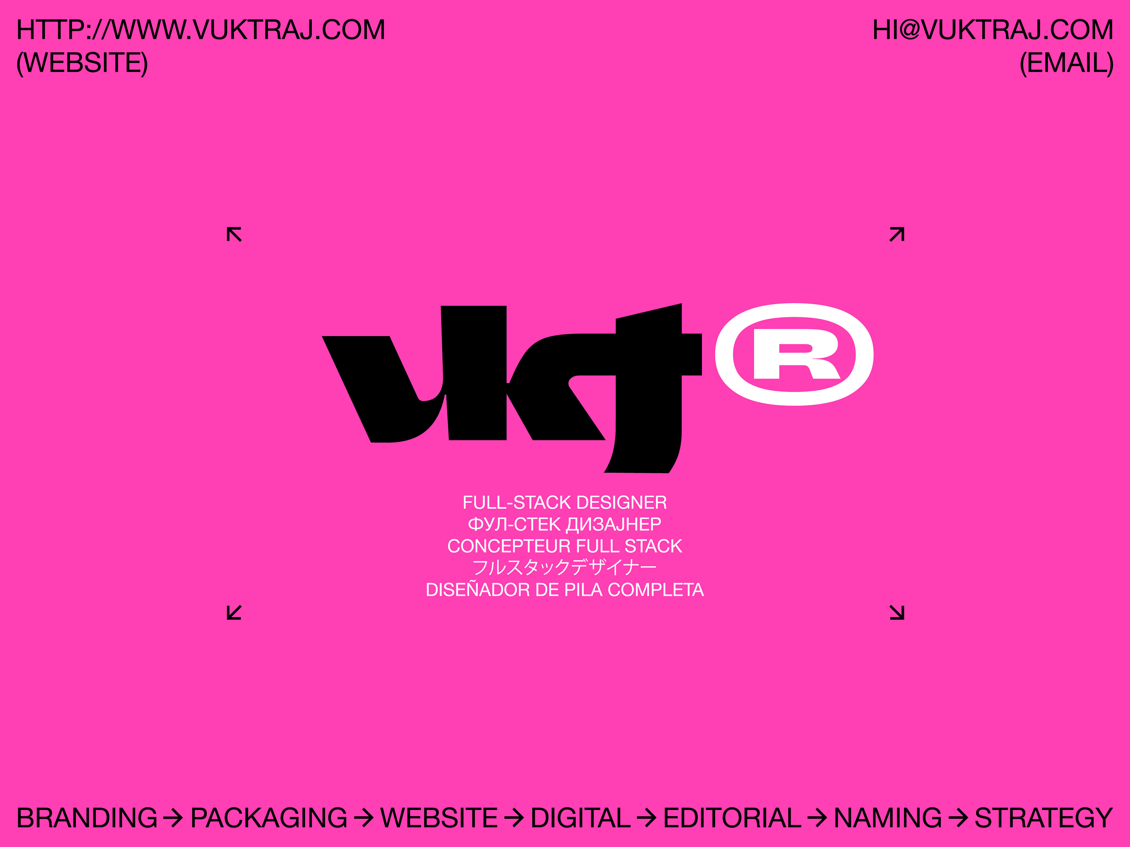
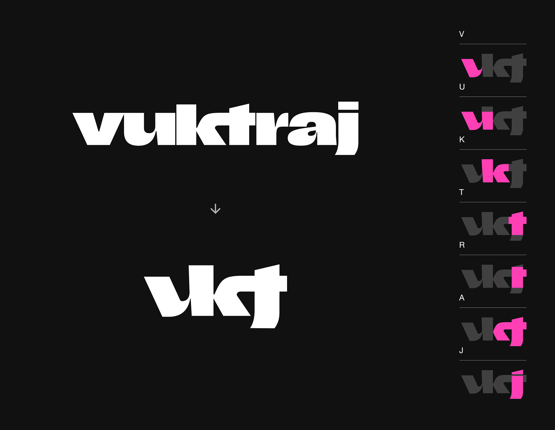
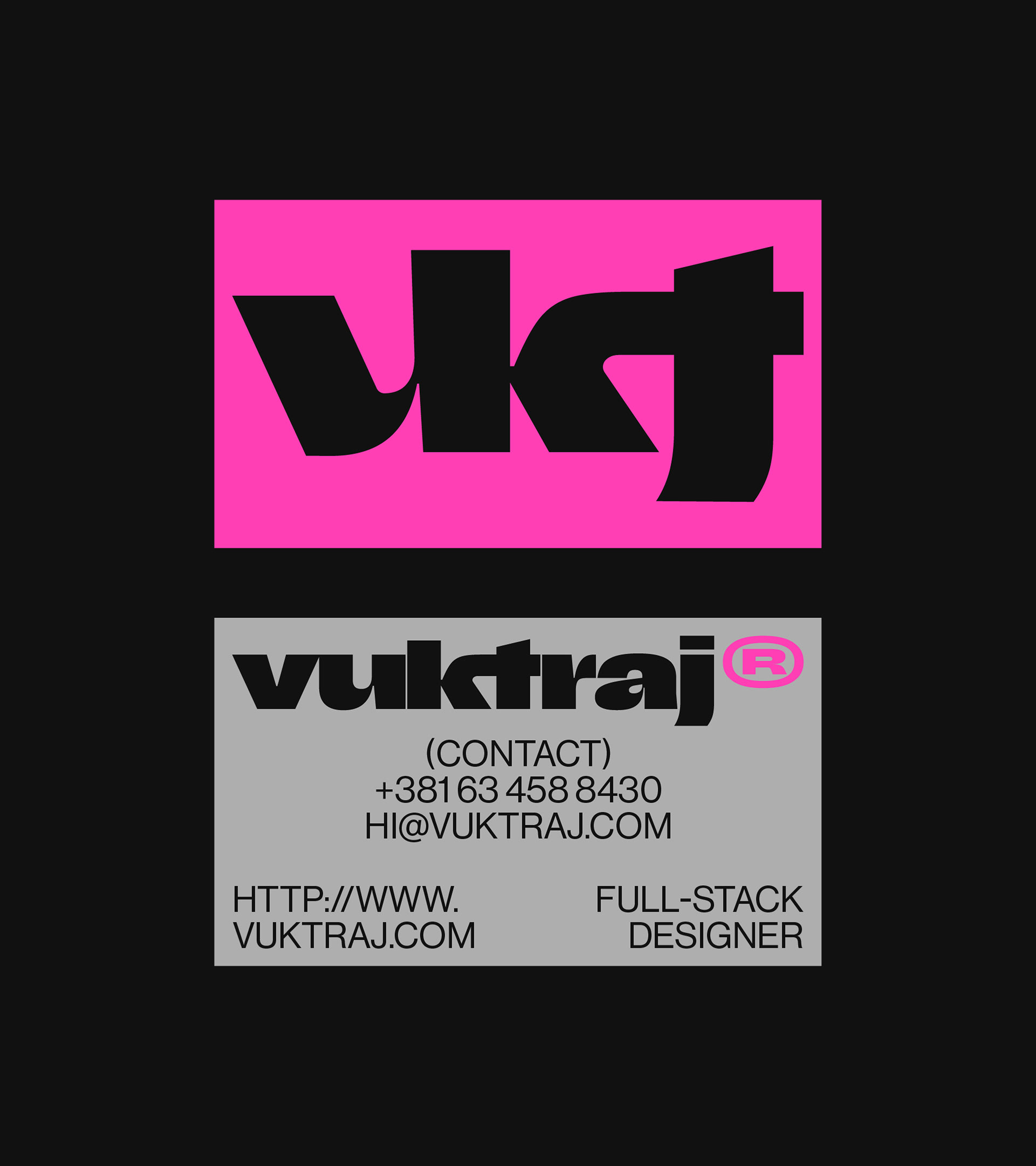
A logo that lives, breaks, and rebuilds
A brand isn’t a static mark. It’s a system. The logo adapts, shifts, and deconstructs while staying recognizable. Modularity is the key. Branding that evolves rather than staying locked in a box.

Beyond black and white
Pink disrupts the monochrome, acting as an intentional statement. It’s a refusal to be predictable. A push against the expected. Every hue has a reason. It’s not decoration. It’s part of the message.

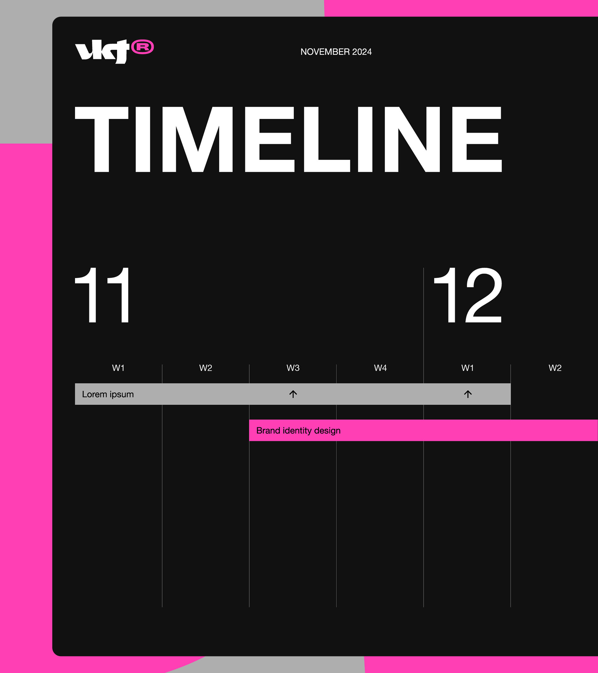
The grid that refuses to sit still
Structure is key, but so is movement. Rigid layouts get an anarchic twist. Oversized elements, unconventional spacing, and dynamic compositions. It’s a controlled rebellion. A system that flexes without falling apart.