
Client
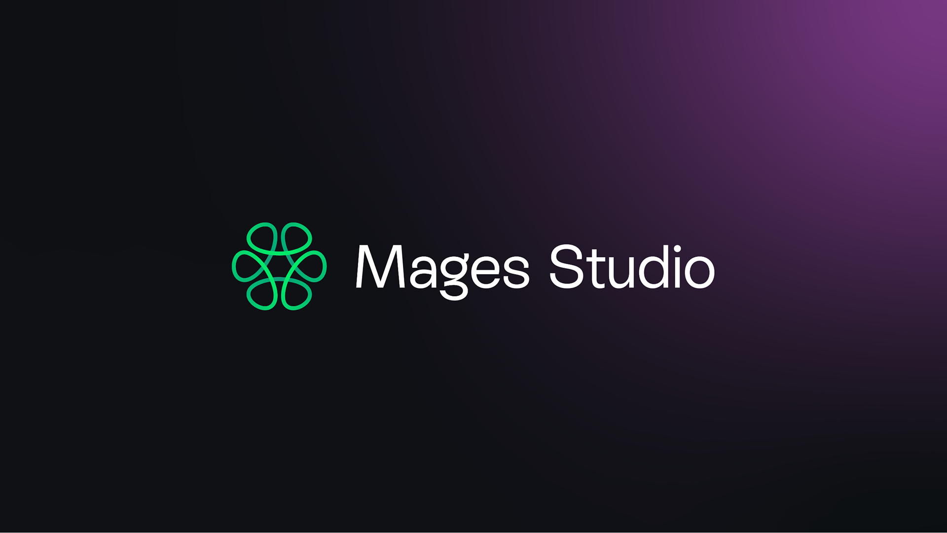
Mages Studio
Deliverables
Brand strategy
Brand identity
Website UI/UX
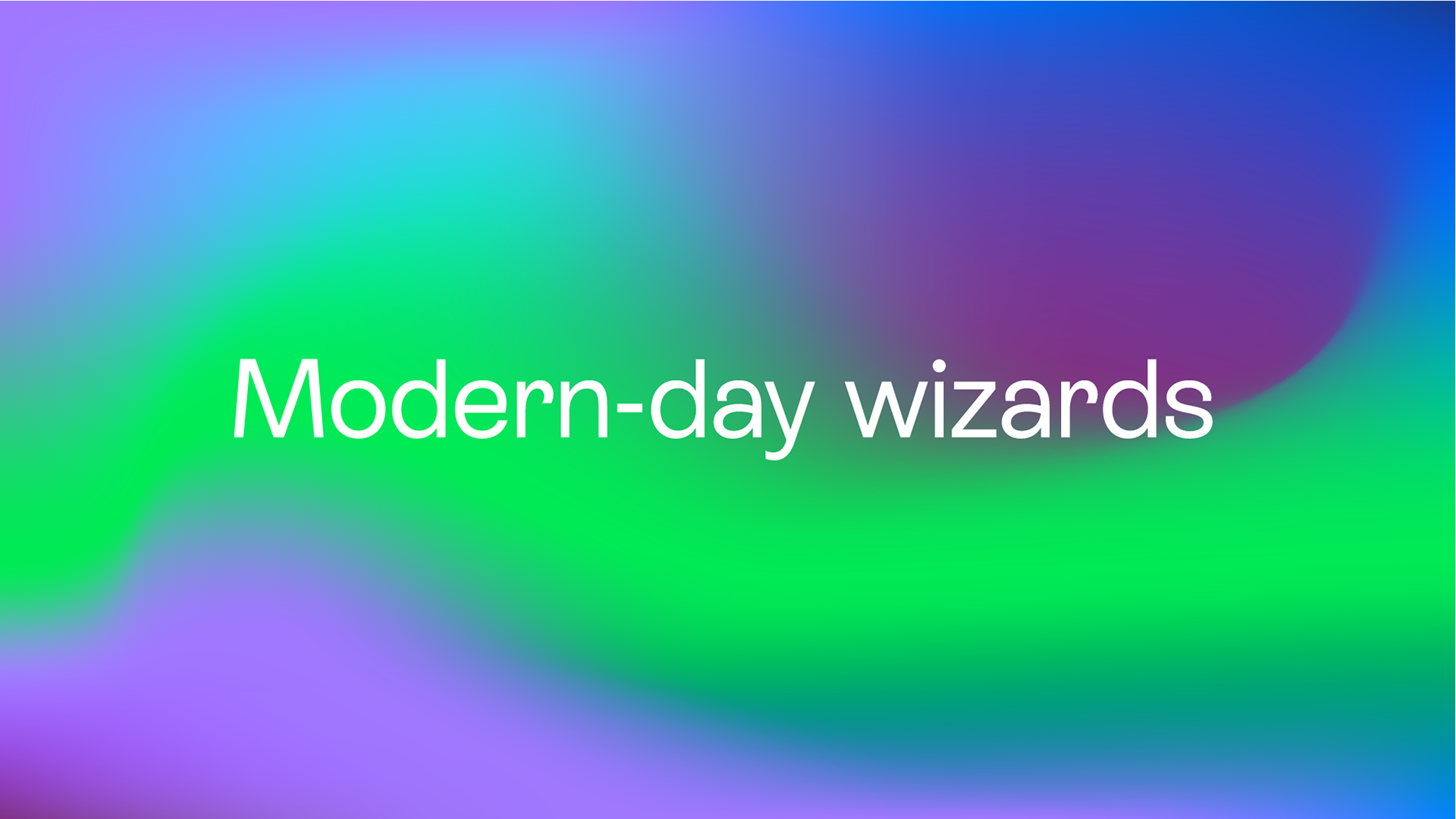
Mages Studio wanted to level up their brand and ditch the predictable tech look. My strategy? Make them the modern-day wizards of innovation → because solving complex problems should look as cool as it sounds.
Their expertise in AR, VR, AI, and gamification wasn’t just about tech. It was about creating real impact, building learning experiences that stick, and crafting solutions that feel almost magical.
But their old identity felt too safe and too expected. They needed something bold, something that made people stop and look. That’s where the modern wizard concept came in. A brand that truly reflected their innovative problem-solving.
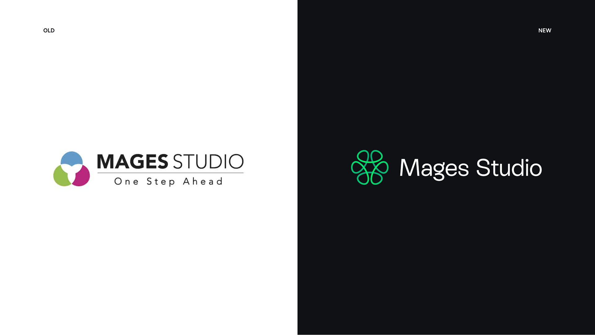
Reimagining the existing
Rather than completely overhauling the logo, I focused on reimagining the existing design. As an established company, changing their logo too drastically could have hurt their reputation. The goal was to enhance their identity, adding depth and personality while staying true to what they’ve built.
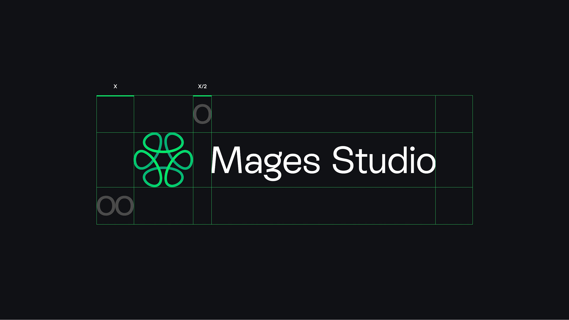
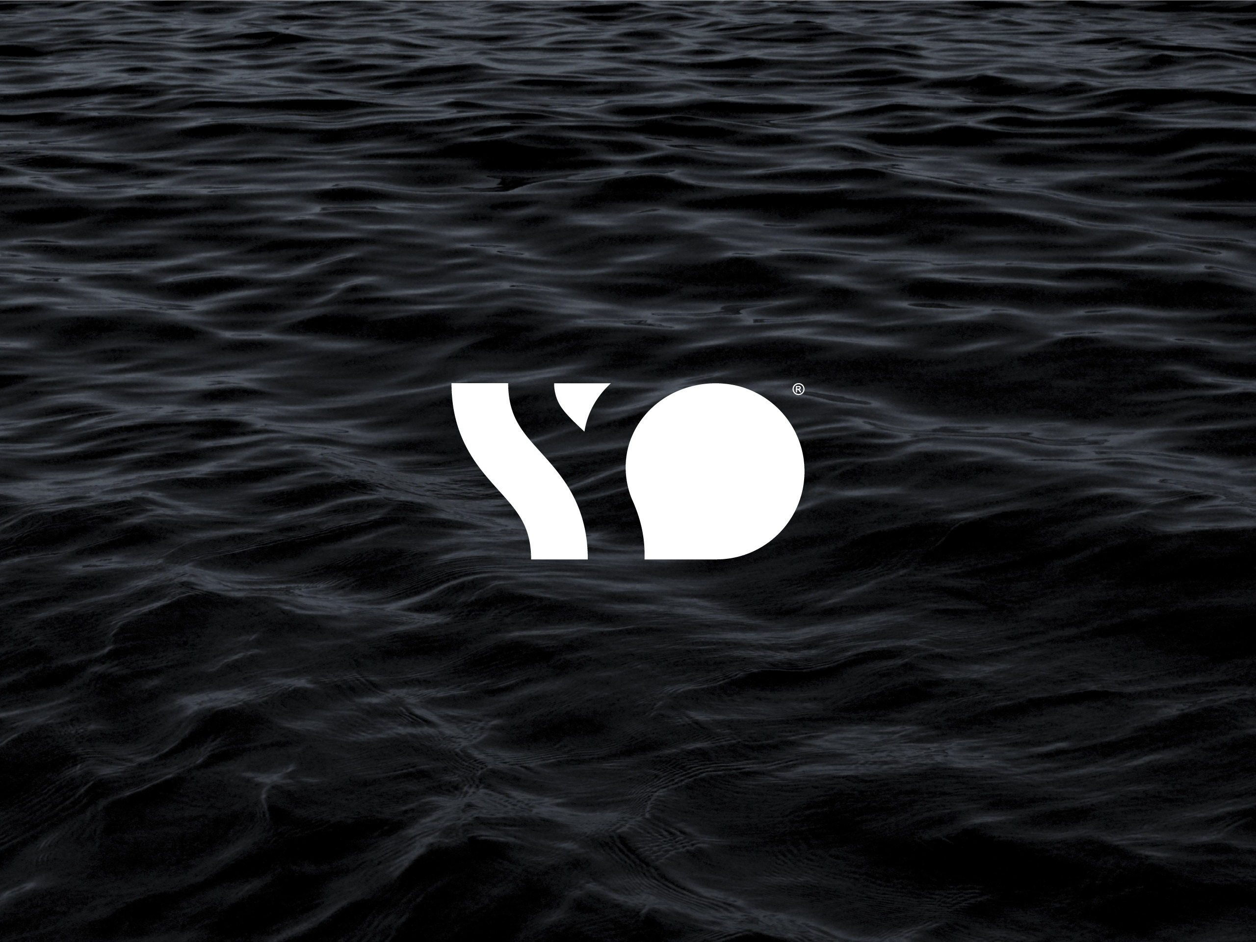
Bringing the logo to life in 3D
Since the company specializes in virtual reality, I wanted their logo to reflect that expertise. I designed it to be viewable in 3D, allowing it to come to life in both virtual and augmented reality. This design emphasizes their ability to solve complex problems from multiple angles, symbolizing how the right perspective can reveal harmony in even the most intricate challenges.
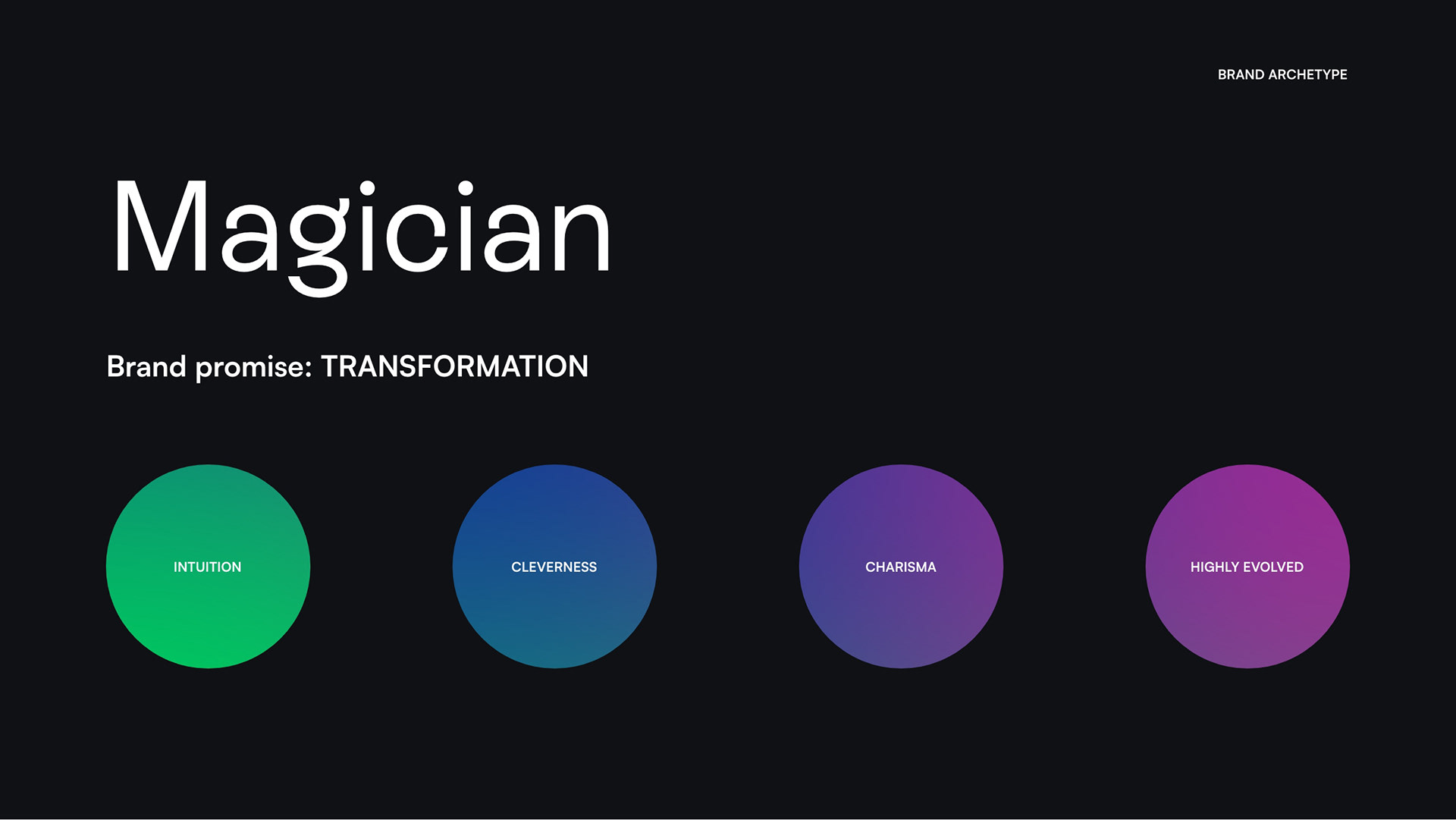
The magician’s role
After analyzing the competition and target audience, I developed a strategy that helped the company stand out in a crowded market. While their competitors stuck to a typical “high-tech” look, the goal was to create a brand that felt both approachable and innovative. The brand narrative was inspired by the age-old role of the Magician as the trusted advisor and strategist—just as kings had their Merlins, Mages Studio is the “wizard” guiding their clients through complex challenges with clever, impactful solutions.
Magical transformation
The brand identity was built around the idea of transformation, drawing inspiration from alchemy and old-school science. The visual direction blends a sense of heritage with modern innovation, combining a serif typeface for experience with a clean, modern symbol. The colors, inspired by the aurora borealis, bring a sense of wonder and energy, perfectly reflecting the company’s creative, forward-thinking approach.
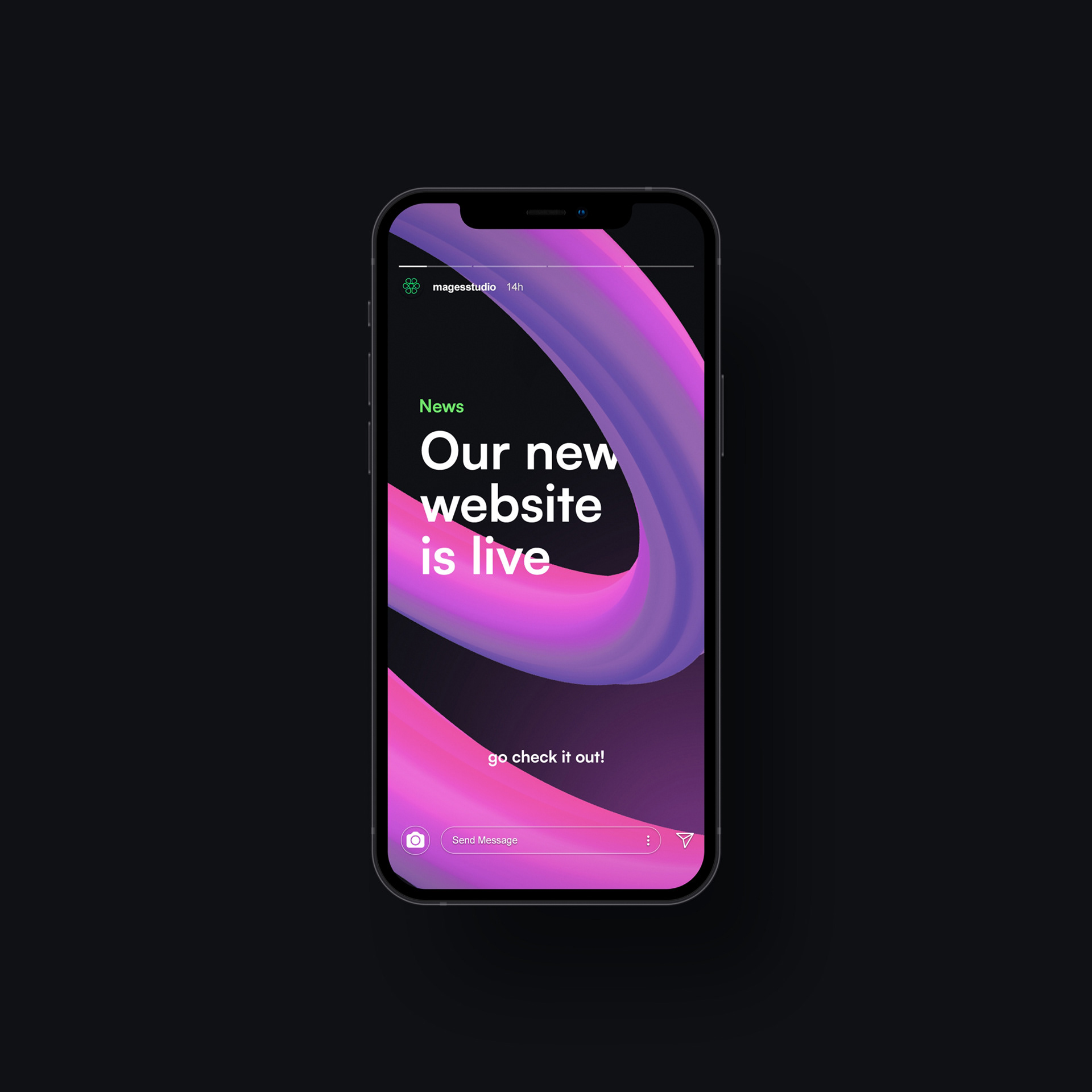


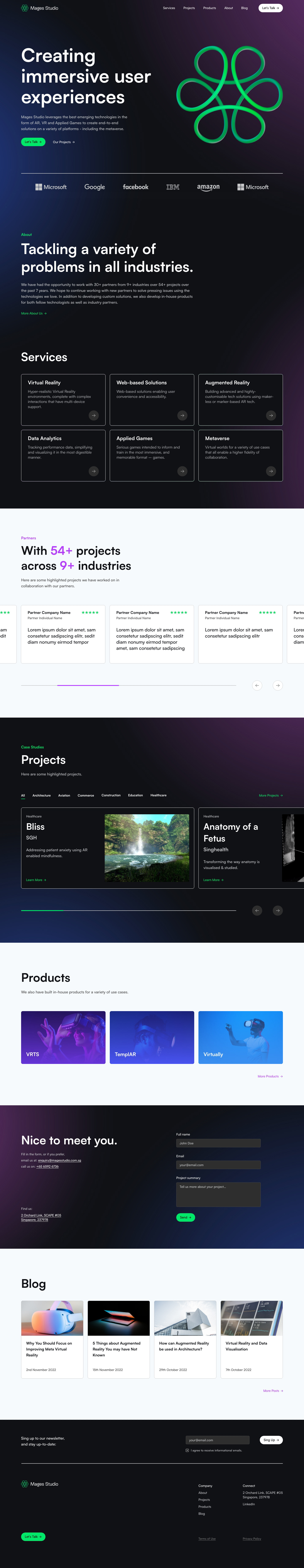
Crafting the digital experience
The website design is all about creating a seamless, user-friendly experience that reflects the brand’s innovative, approachable personality. Below is the landing page design. Scroll to the end to find a link that takes you to the live site.