
Client
Solix AG Robotics
Deliverables
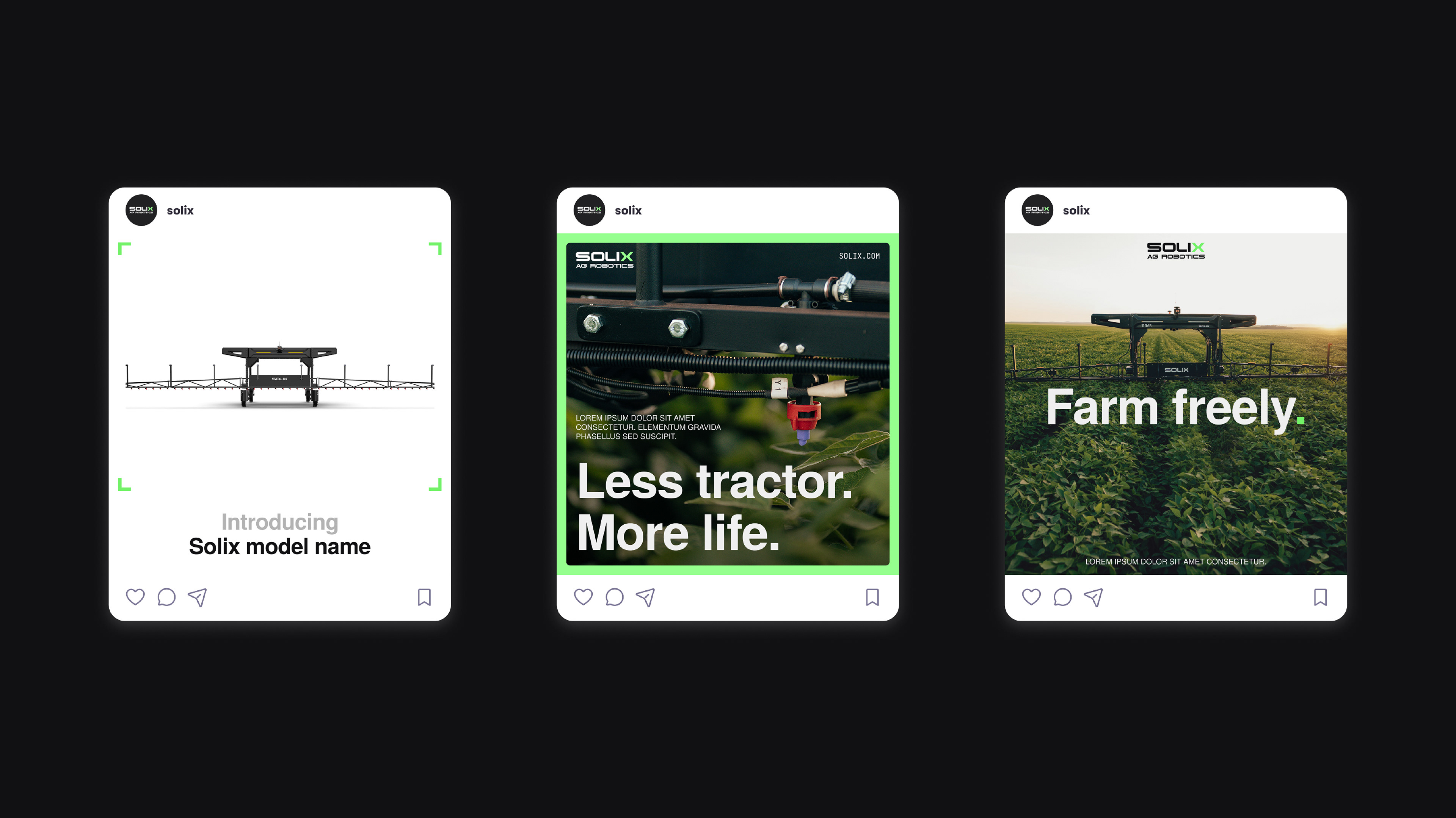
Social media
App UI
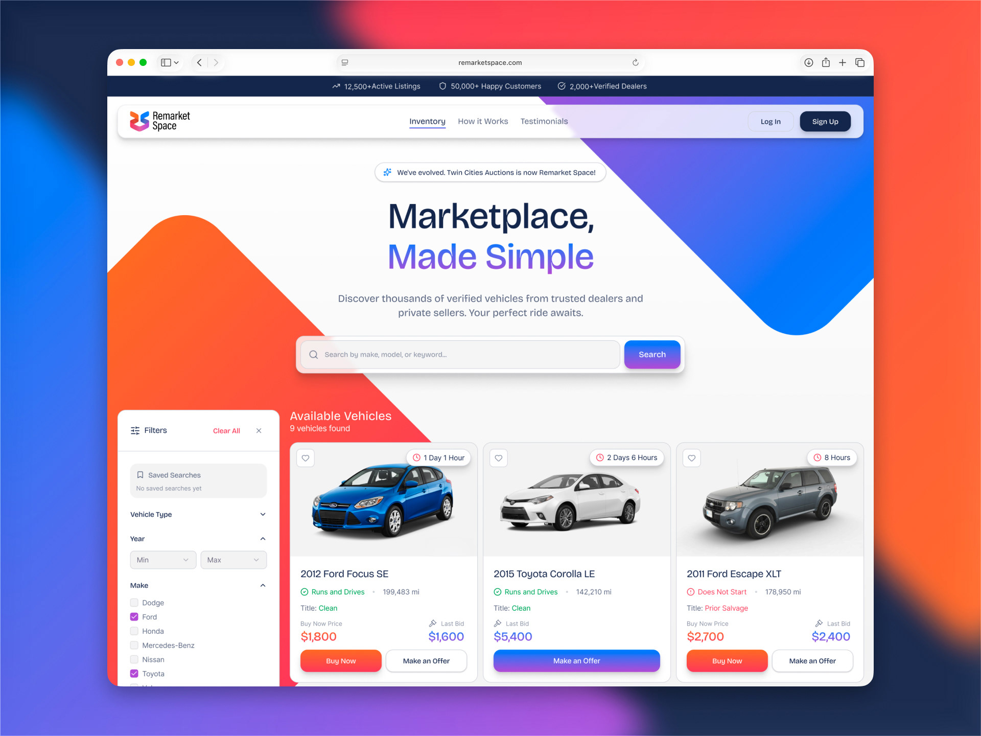
Website UI
Solix already had a strong logo, but the brand needed a cleaner system around it. The goal was to make agricultural robotics feel modern, practical, and tech-forward.
Solix is an agricultural robotics brand built around autonomous field technology. The logo was already in place, so the focus was not on starting from zero. Instead, the identity needed a stronger visual system that could make the brand feel cleaner, more advanced, and more distinct from other robotics and agriculture companies.
The design direction combines sharp layouts, dark industrial tones, bright green accents, and field imagery to balance two sides of the brand: advanced technology and real agricultural use. For the app UI, the goal was simple: reduce clutter, improve hierarchy, and make robot status information easier to read at a glance.
Cleaner system for a sharper presence
Social media posts were designed to make Solix feel more recognizable and confident. Product imagery, field photography, bold type, and the green accent create a visual language that feels modern and technical.
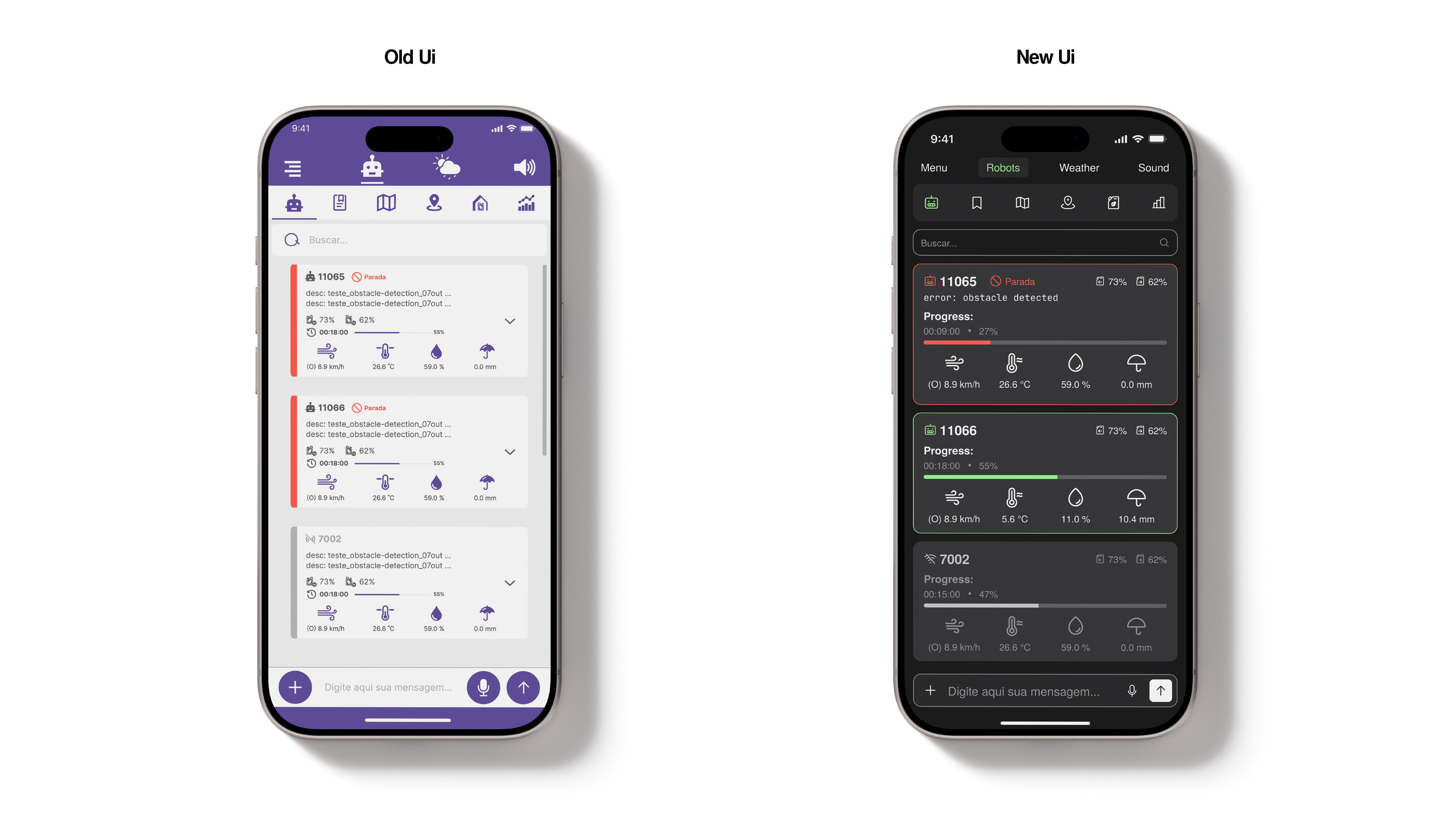
Reducing clutter in a technical interface
The old UI had useful information, but it was hard to scan quickly. The new version uses clearer cards, stronger spacing, dark interface elements, and color-coded status states to make robot progress, errors, weather data, and controls easier to understand.
Technology that still feels grounded
The website direction uses large field video, clean UI elements, and bold messaging to position Solix as advanced but practical. Instead of making the brand feel too futuristic or abstract, the design shows the technology where it actually works: in the field.