
Client
Soil Action
Deliverables
Brand strategy
Brand identity
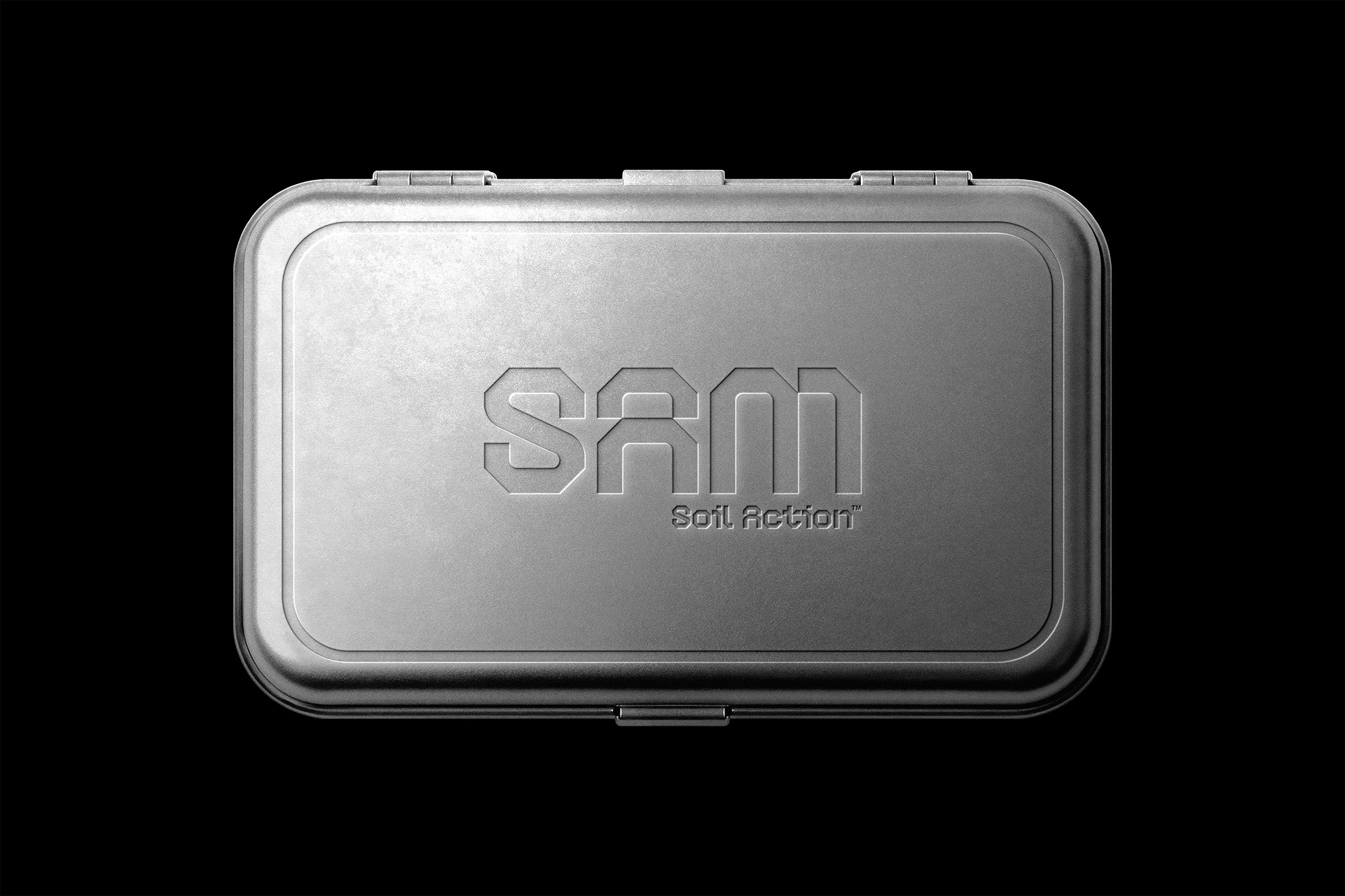
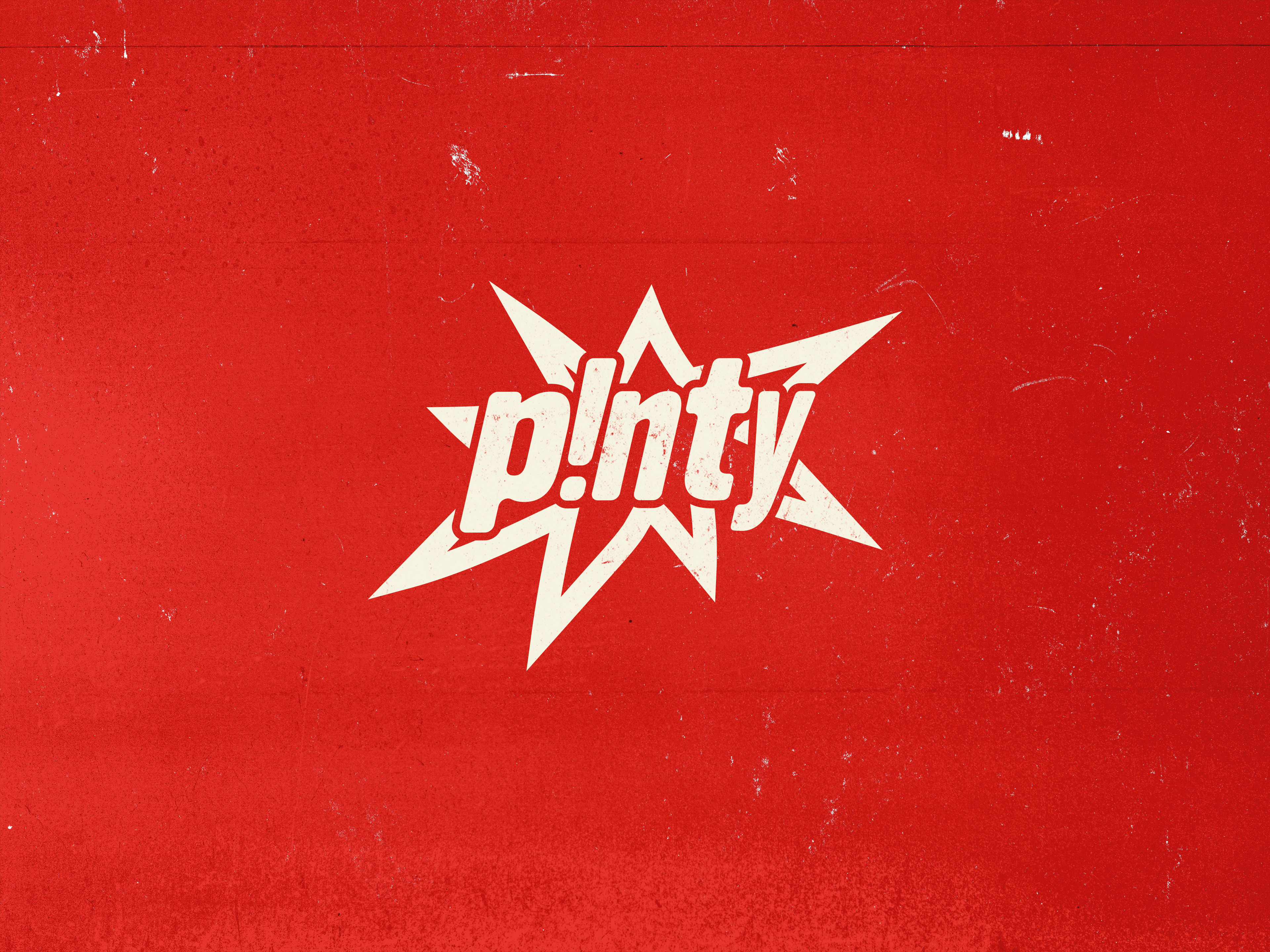
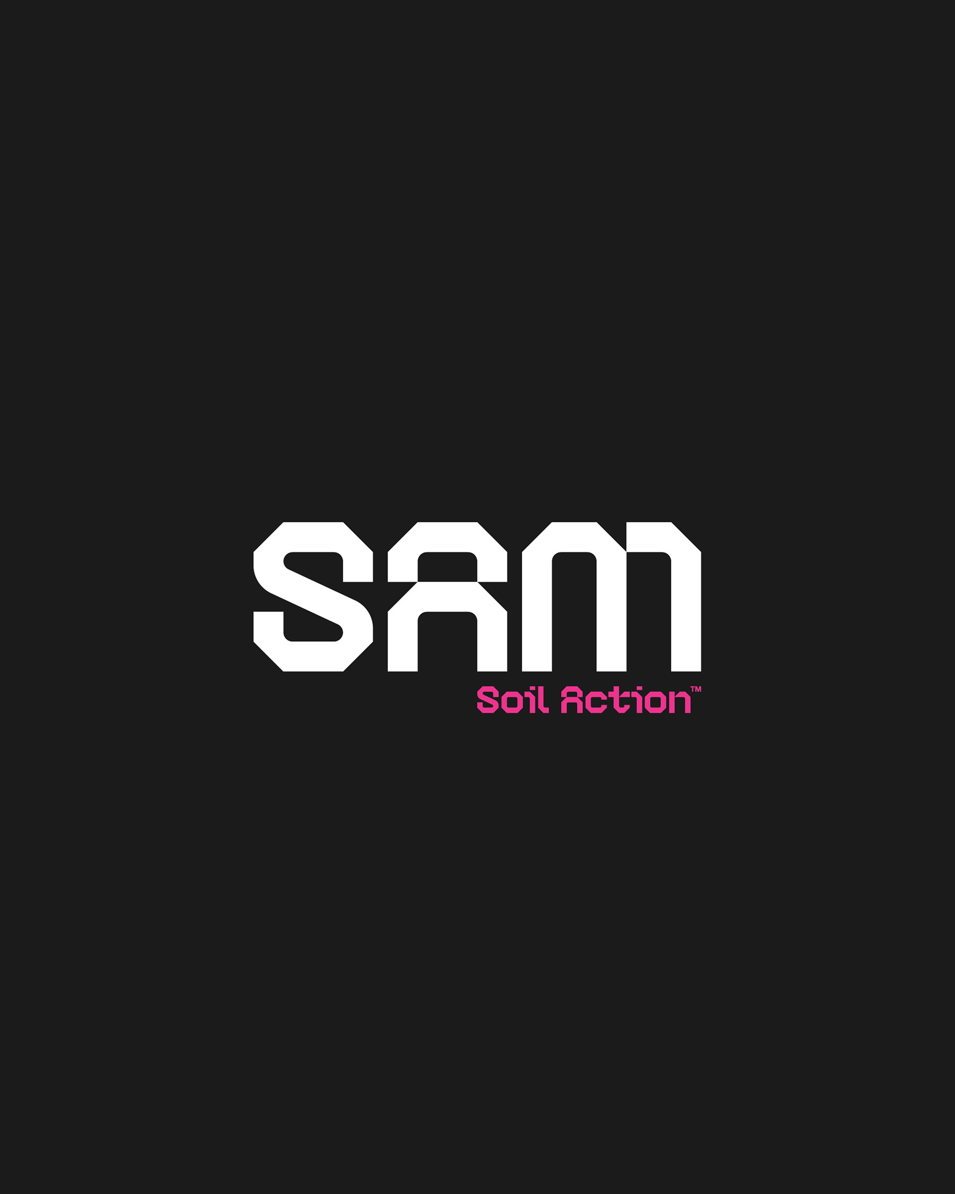
Soil Action needed a connected identity system for its product, SAM. The challenge was to make SAM feel bold, rough, and visible in real agricultural environments, while giving Soil Action a logo that felt part of the same modern industrial world.
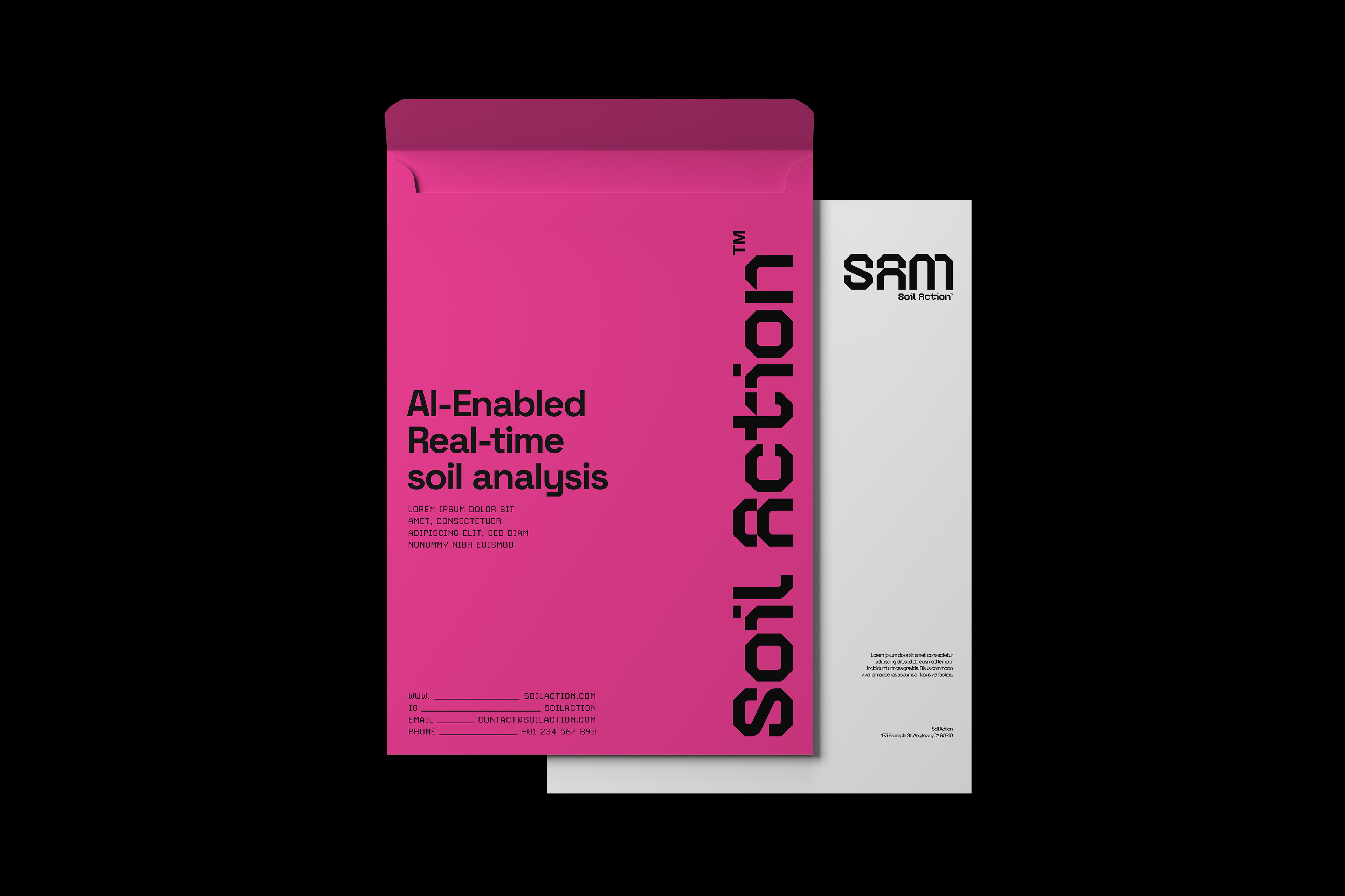
Soil Action needed two logos that could work as one system: a company identity and a product identity for SAM.
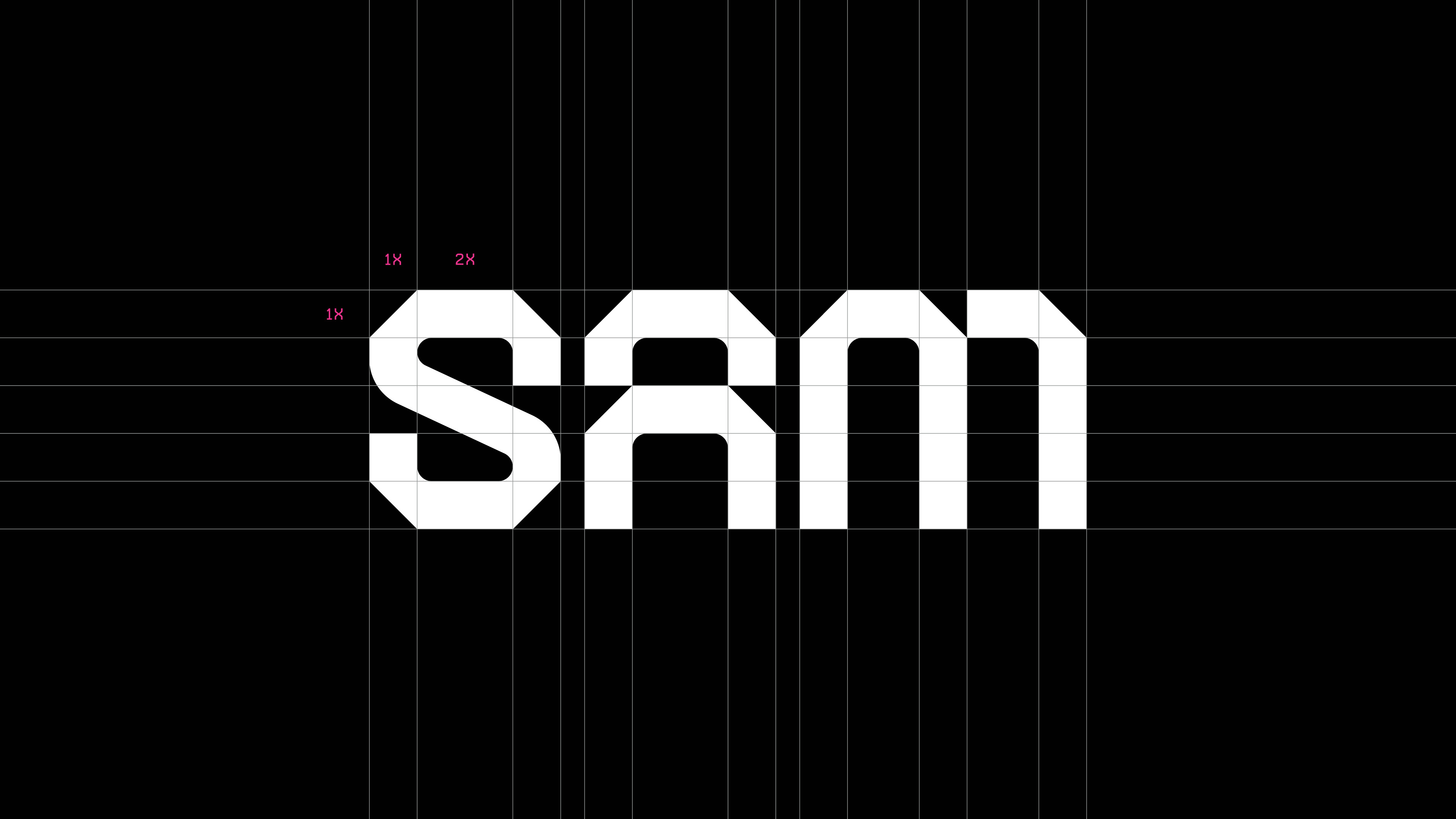
SAM had to carry the stronger presence. It needed to feel rugged, visible, and memorable on equipment, in the field, and in software. Soil Action needed a more balanced company mark that still shared the same industrial DNA.
Sharp outside
The outer parts of the letters are sharp and heavy, giving the logos a tough industrial feel. Inside, the rounded cuts make the forms feel more natural and less mechanical. That contrast helps the identity sit between machinery and agriculture.
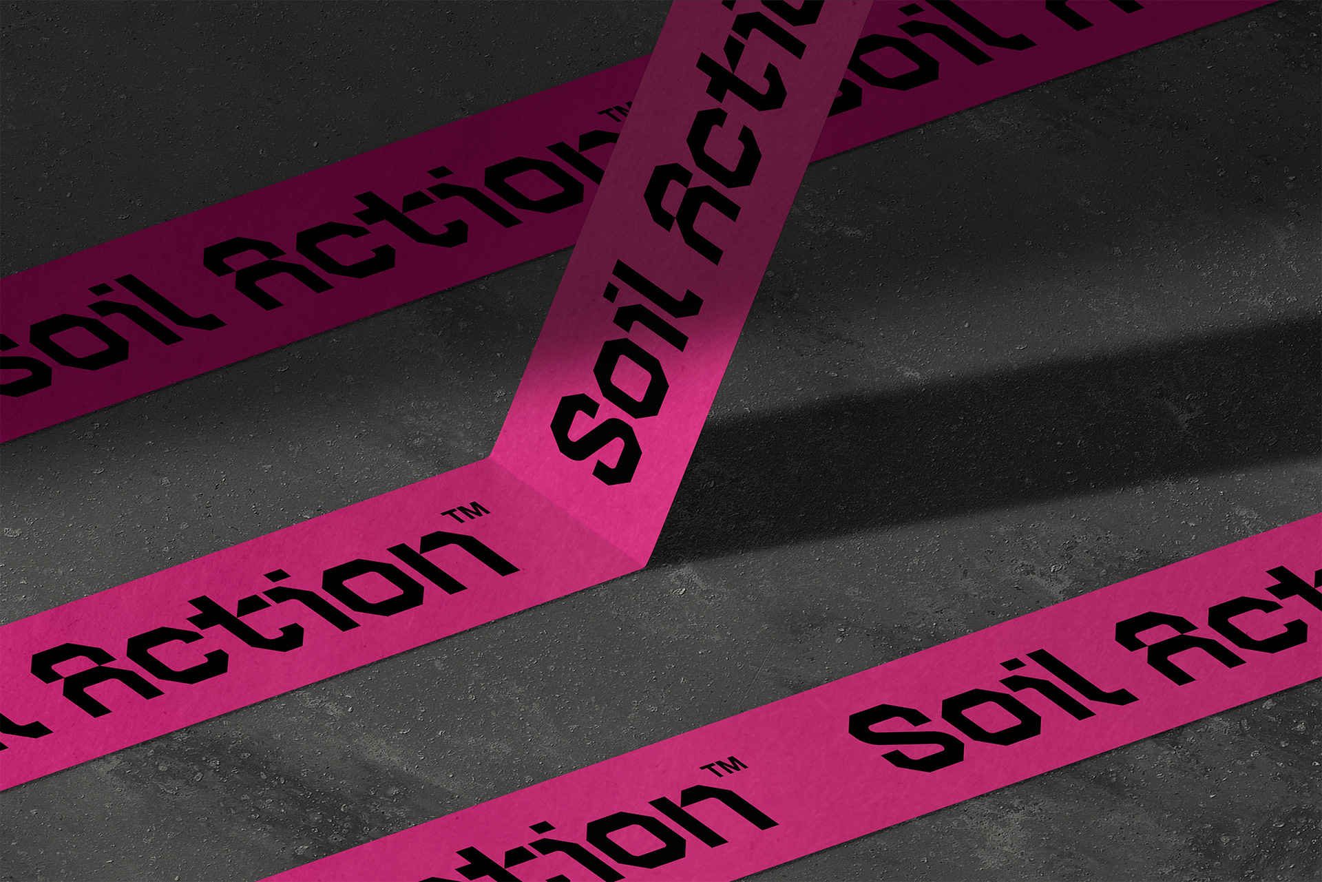
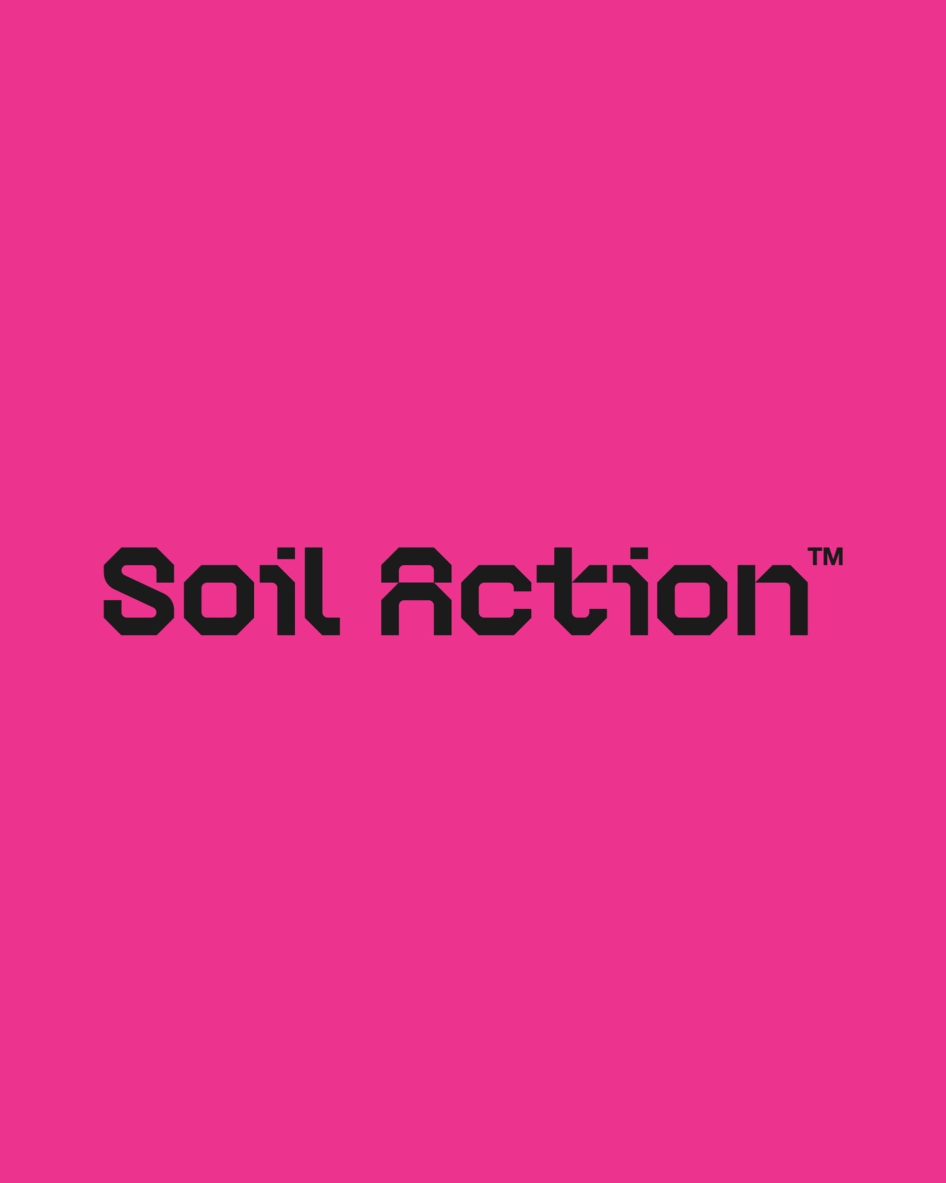
Color that breaks from the category
The magenta direction avoids the usual agricultural and machinery colors. Instead of blending in with green, yellow, orange, or red competitors, the palette gives Soil Action and SAM a more ownable look that can stand out against soil, crops, and equipment.