
Client
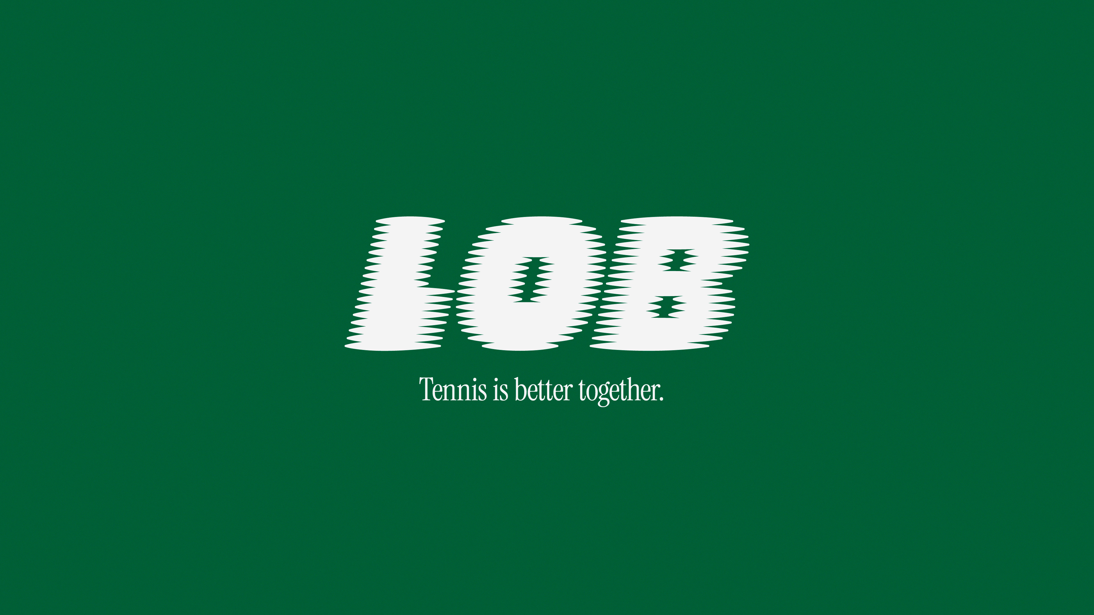
LOB
Deliverables
Brand strategy
Brand identity
Creative direction
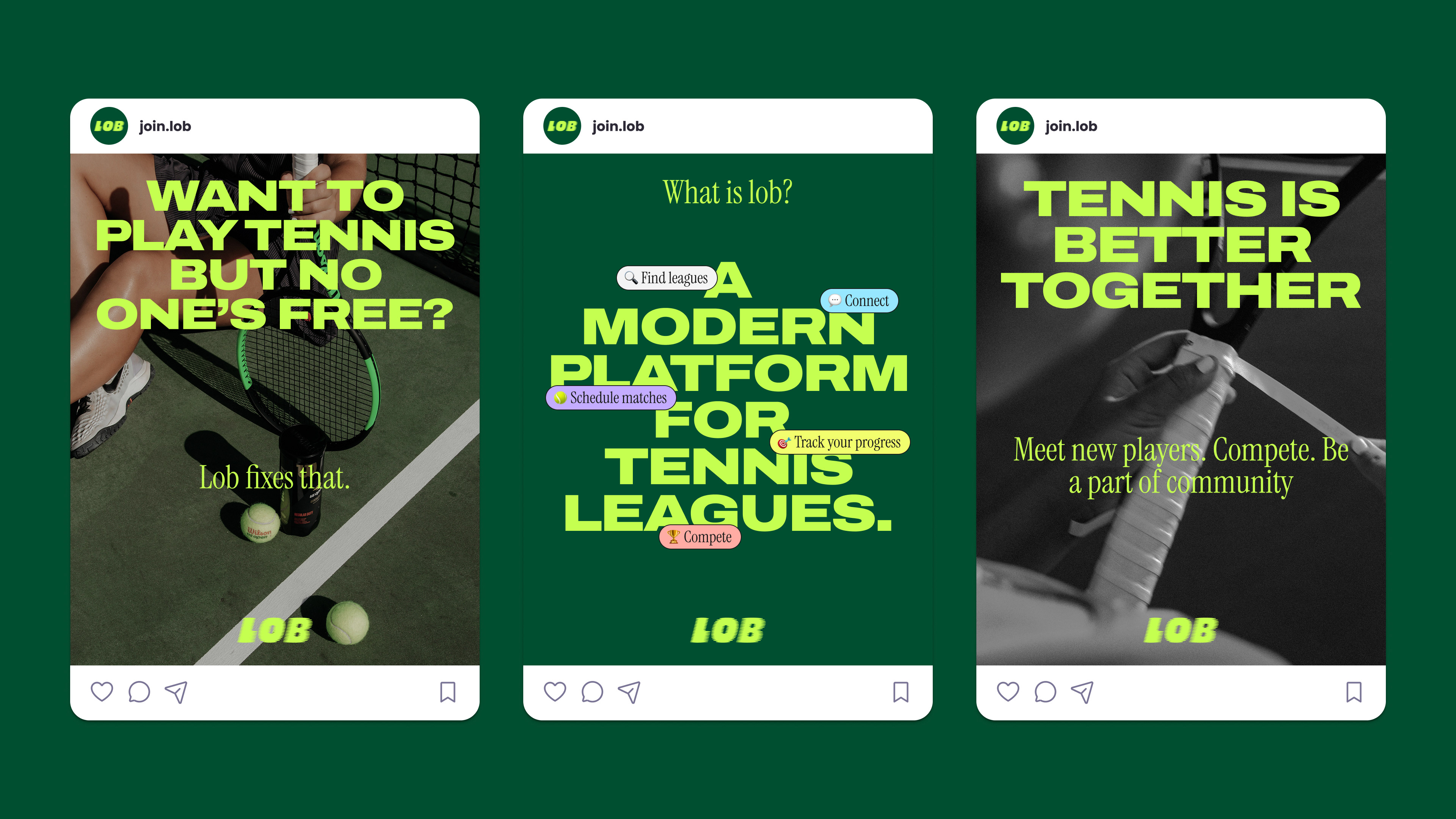
Lob needed a brand that made tennis feel social, energetic, and easy to join. Built like a modern platform for players, the identity combines Gen Z boldness with retro tennis heritage, making league play feel less formal and more shareable.
Lob is a tennis league platform that helps players connect, schedule matches, track scores, and join local leagues. The idea was close to "Strava for tennis", a product that makes casual competition feel more social, motivating, and easy to follow
The brand needed to stand apart from older tennis league platforms with a more energetic and modern identity. The goal was to keep the elegance of tennis, but make it feel younger, faster, and more community-driven.
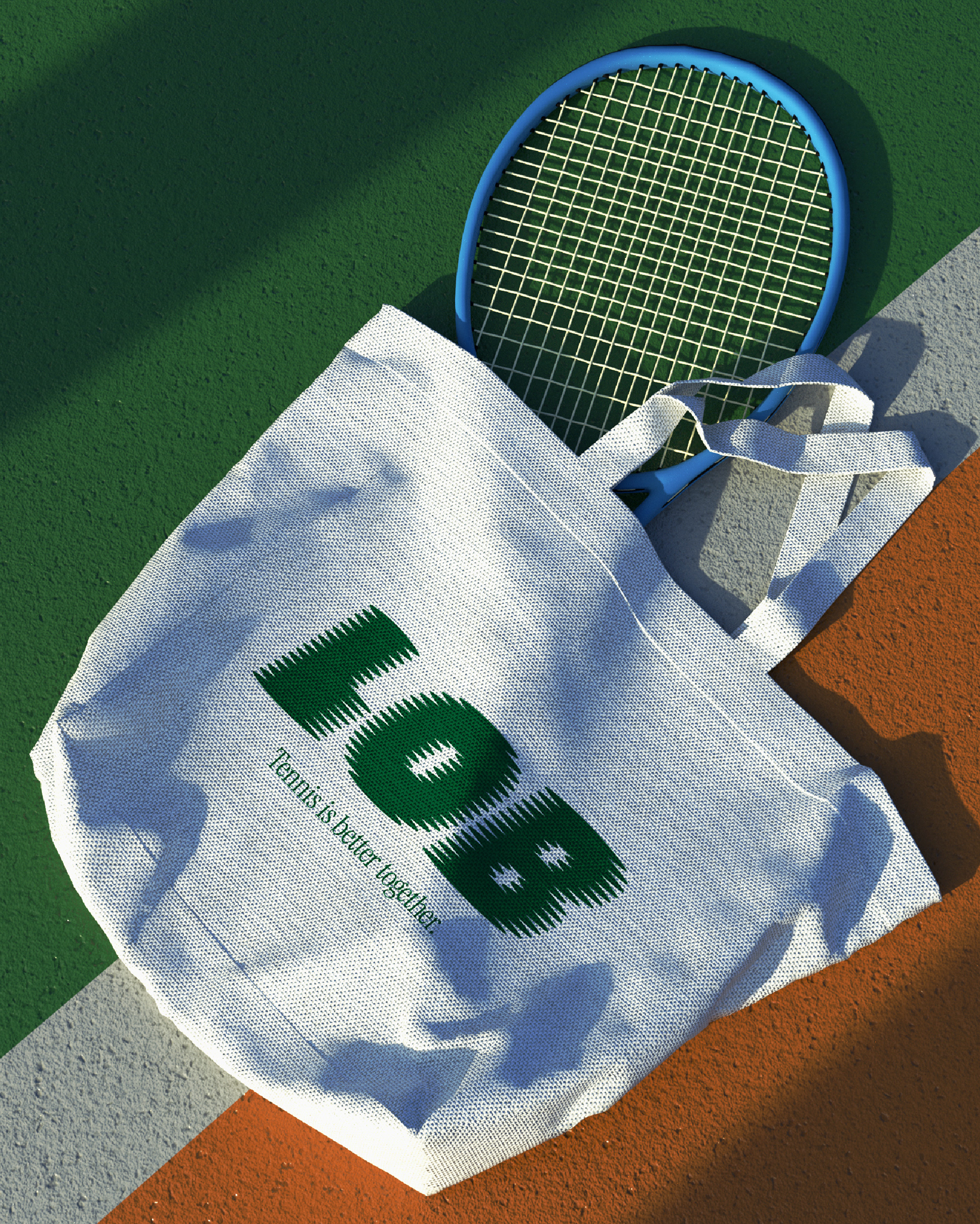
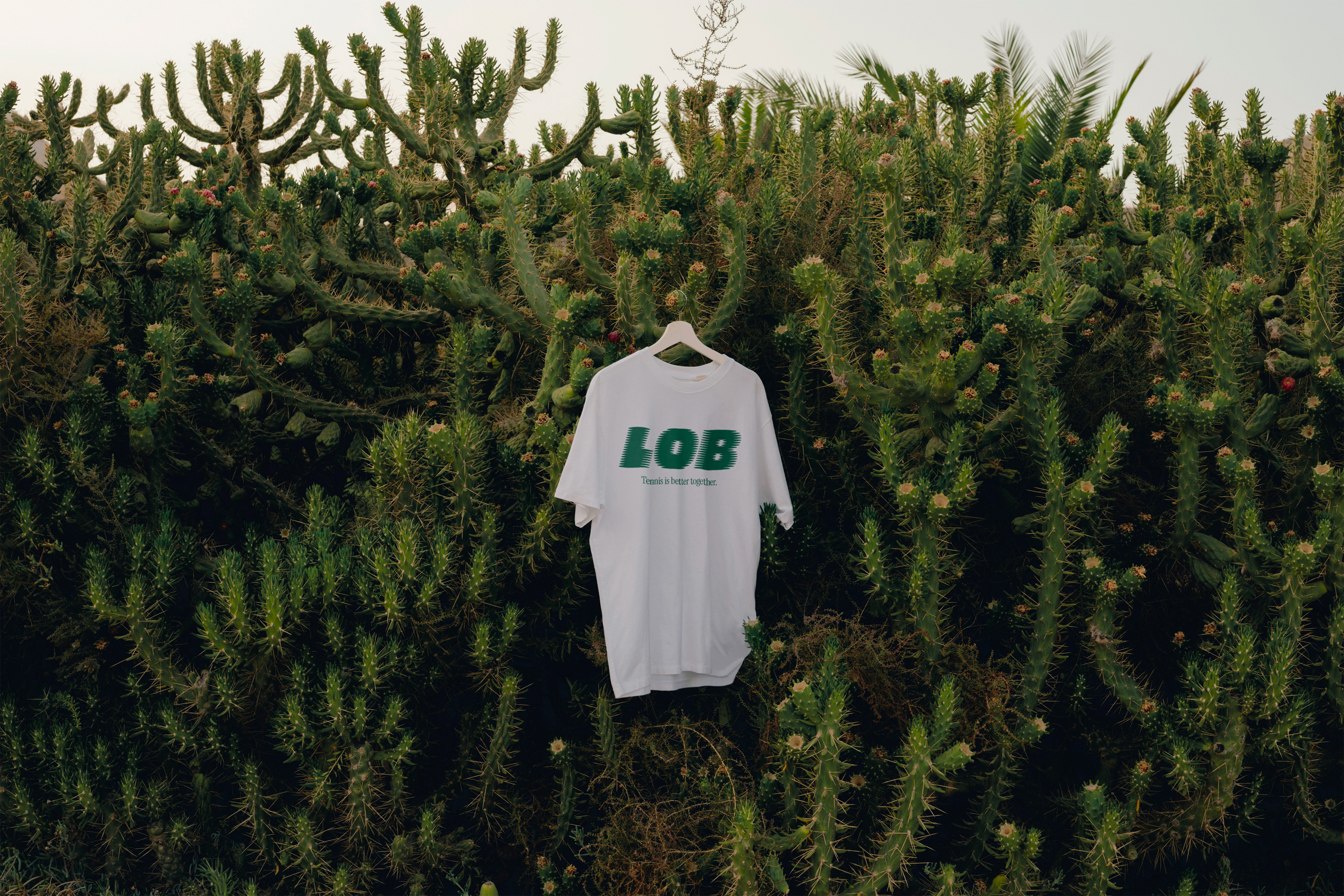
The final direction combines bold typography, retro serif details, analog-style photography, and vibrant colors. It feels sporty and competitive, but still fun enough for amateur players who want to meet people and play more often.
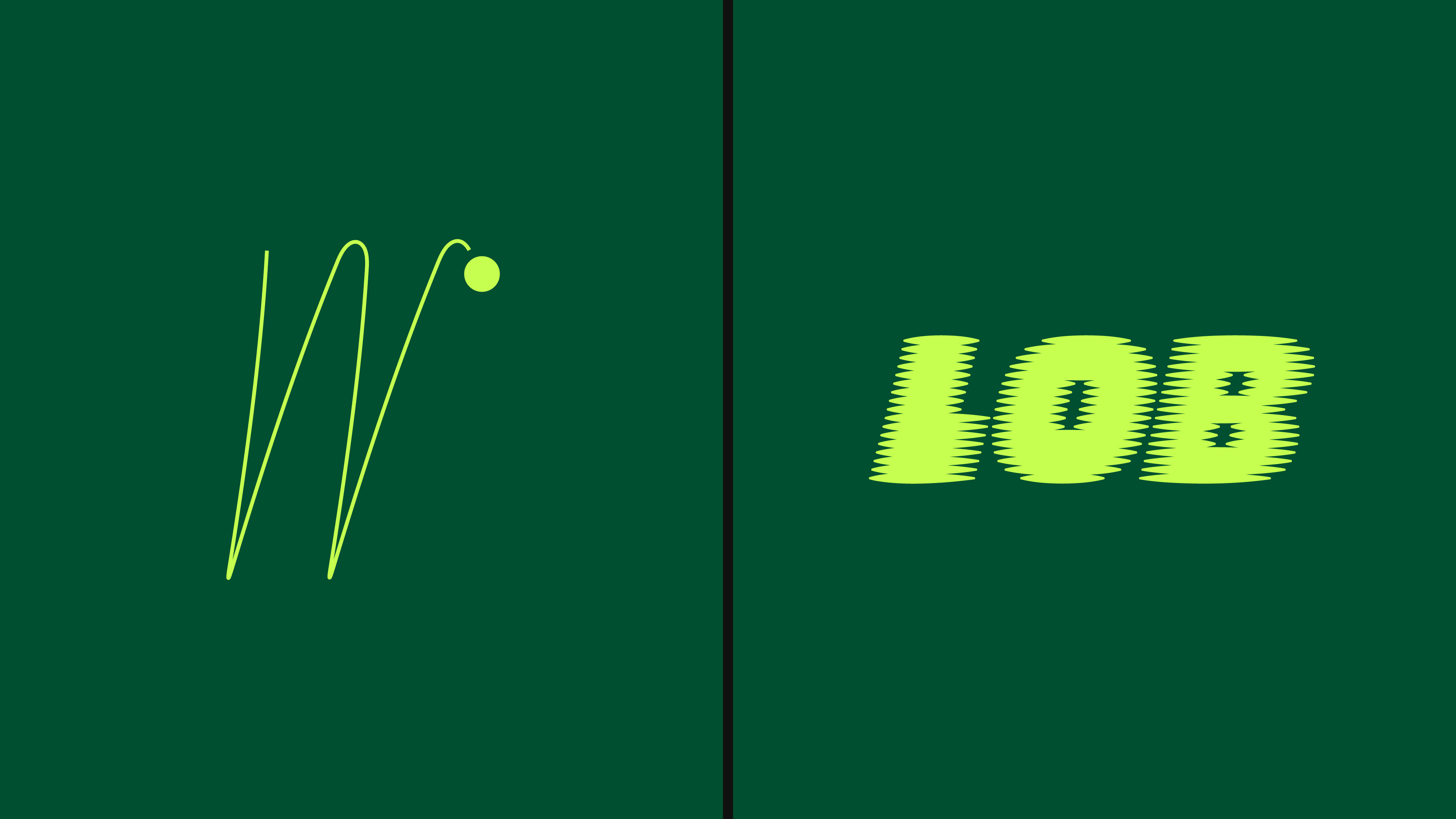
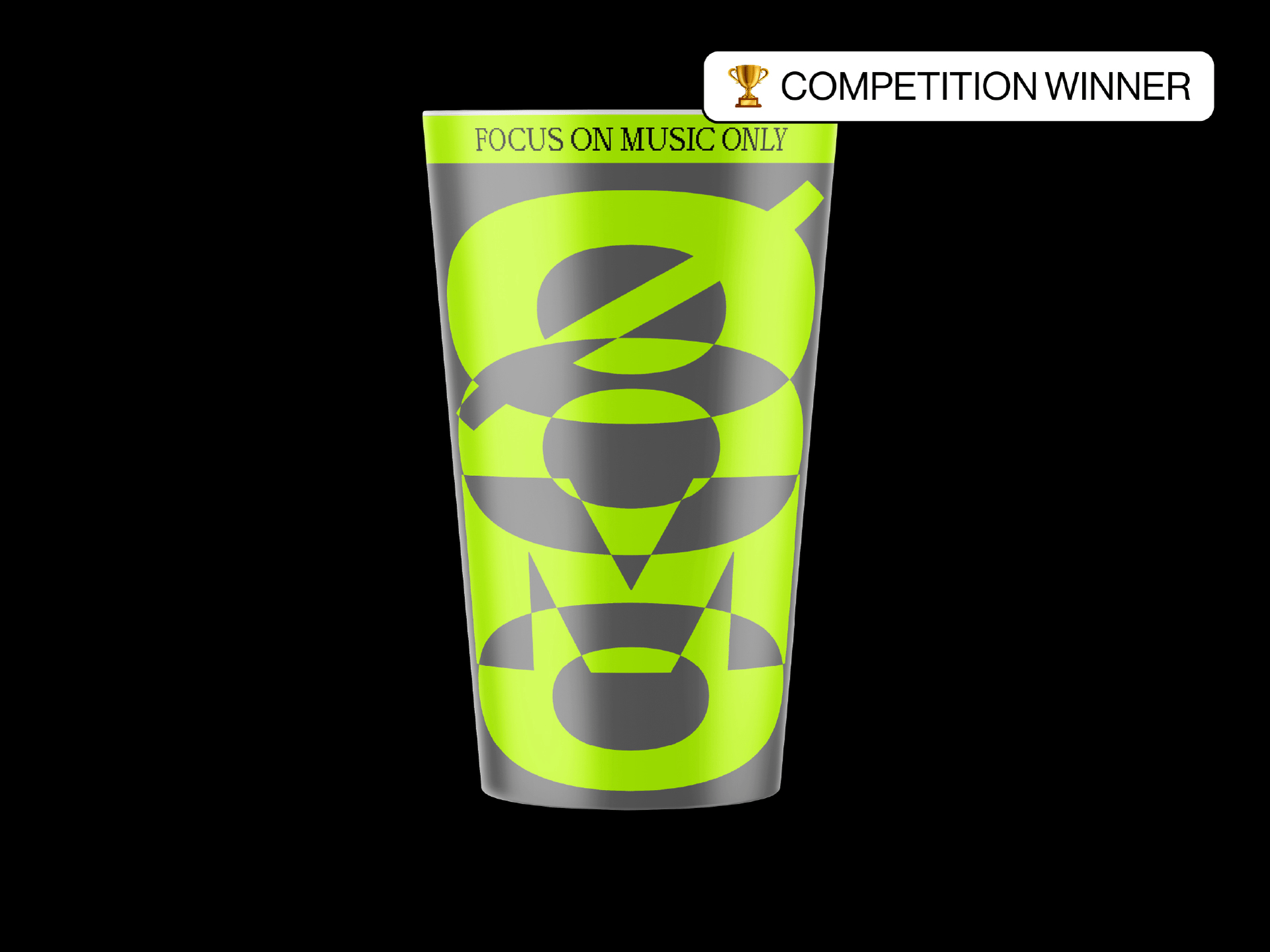
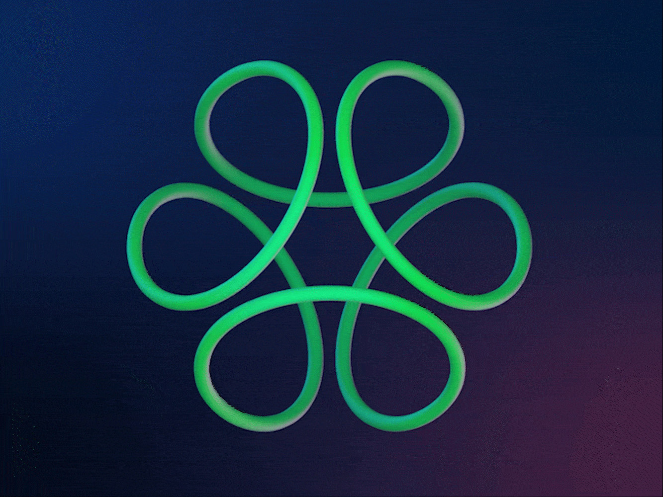
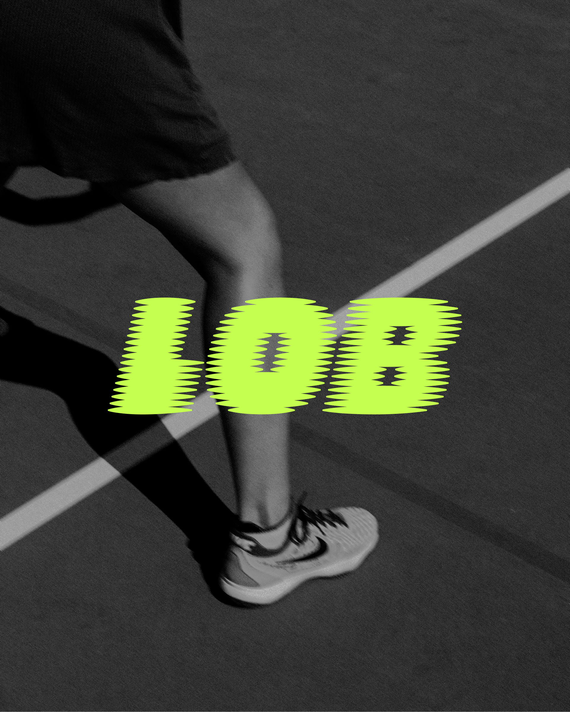
Built around movement
Inspired by the motion of a tennis ball in play. The logos tilted, stretched form gives the wordmark a sense of speed. It turns the name into something energetic and instantly tied to the rhythm of the sport.
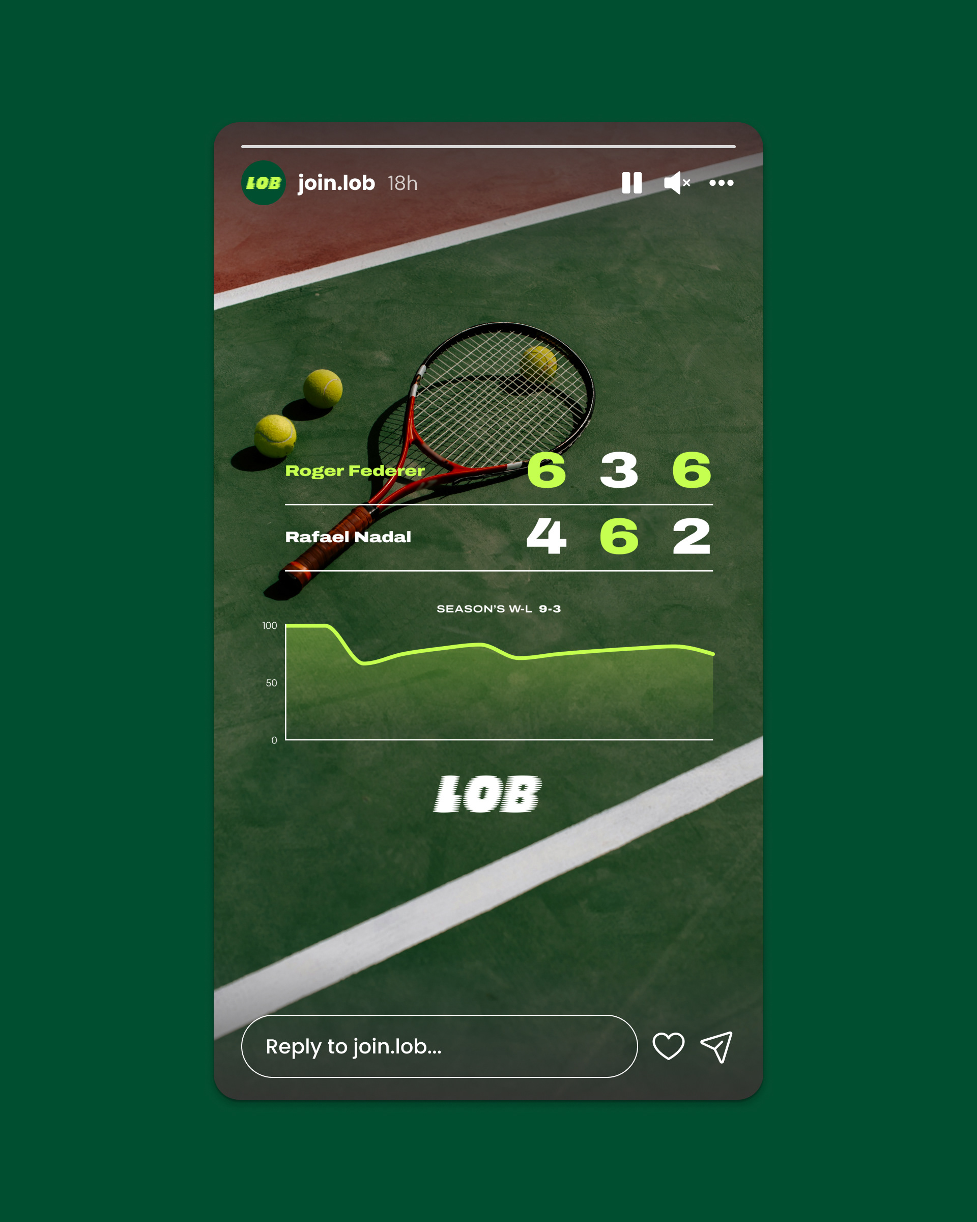
Making progress shareable
I suggested adding shareable story graphics so players could post match results, stats, and progress directly to Instagram. Since Lob works like a social layer for tennis, these graphics turn league activity into something users can show, share, and use to keep the competition moving outside the app.
Tennis elegance, made modern
The social media direction keeps the elegance of tennis, but pushes it into a younger and more energetic space. Retro serif type, analog-style photography, bold layouts, and bright green details make the brand feel connected to the sport’s heritage without looking traditional or outdated.
More than match scheduling
Lob is not just about finding someone to play with. The identity supports a fuller experience around leagues, rankings, progress, profiles, and community. Every visual element was built to make tennis feel easier to join and more exciting to keep playing.
Social platform for the court
Brand strategy focused on making tennis feel more connected, not just more organized. Lob gives players a place to compete, track progress, meet people, and stay involved, creating a community layer without making the sport feel too serious.