

Client
Remarket Space
Deliverables
Brand identity
Website UI/UX
Twin Cities Auctions needed a rebrand that would make the platform feel more modern, tech-forward, and easier to use. The goal was to turn a traditional auction business into Remarket Space, a modern vehicle marketplace with a cleaner identity and UI.
Remarket Space is a used-car auction platform where users can browse vehicles, bid, make offers, or buy directly. The company was previously called Twin Cities Auctions, but the old identity felt too traditional for the direction they wanted to take. They needed a rebrand that felt more modern, colorful, and tech-forward, while still being easy to understand and approachable.
Alongside the identity, the website needed a clearer UI system. Auction pages carry a lot of information, so the focus was on hierarchy, color coding, and making the buying process feel less cluttered.


Leaving the old identity behind
The old logo felt outdated and overly detailed. Built for digital use, the new mark is more abstract and flexible. Built around the idea of two sides meeting in one marketplace. Two forms move toward the same center, creating a sense of exchange, trust, and forward motion without using obvious car or auction symbols.
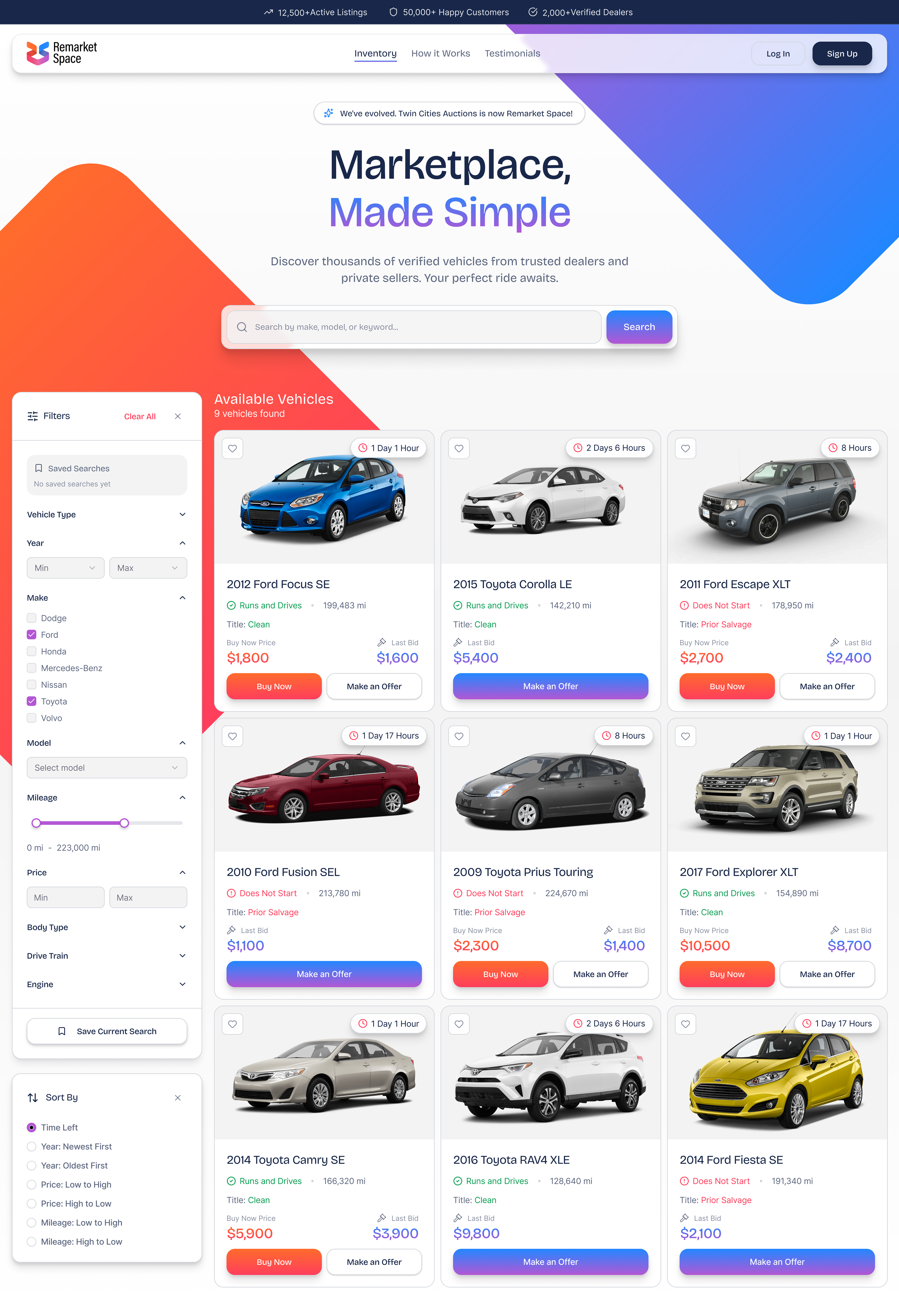
Making auction listings easier to read
Each listing card had to carry a lot of information: condition, title status, mileage, auction time, buy now price, last bid, and multiple actions. Clear spacing, color coding, and hierarchy help users quickly understand which cars run, which ones have issues, what the current bid is, and what they can do next.
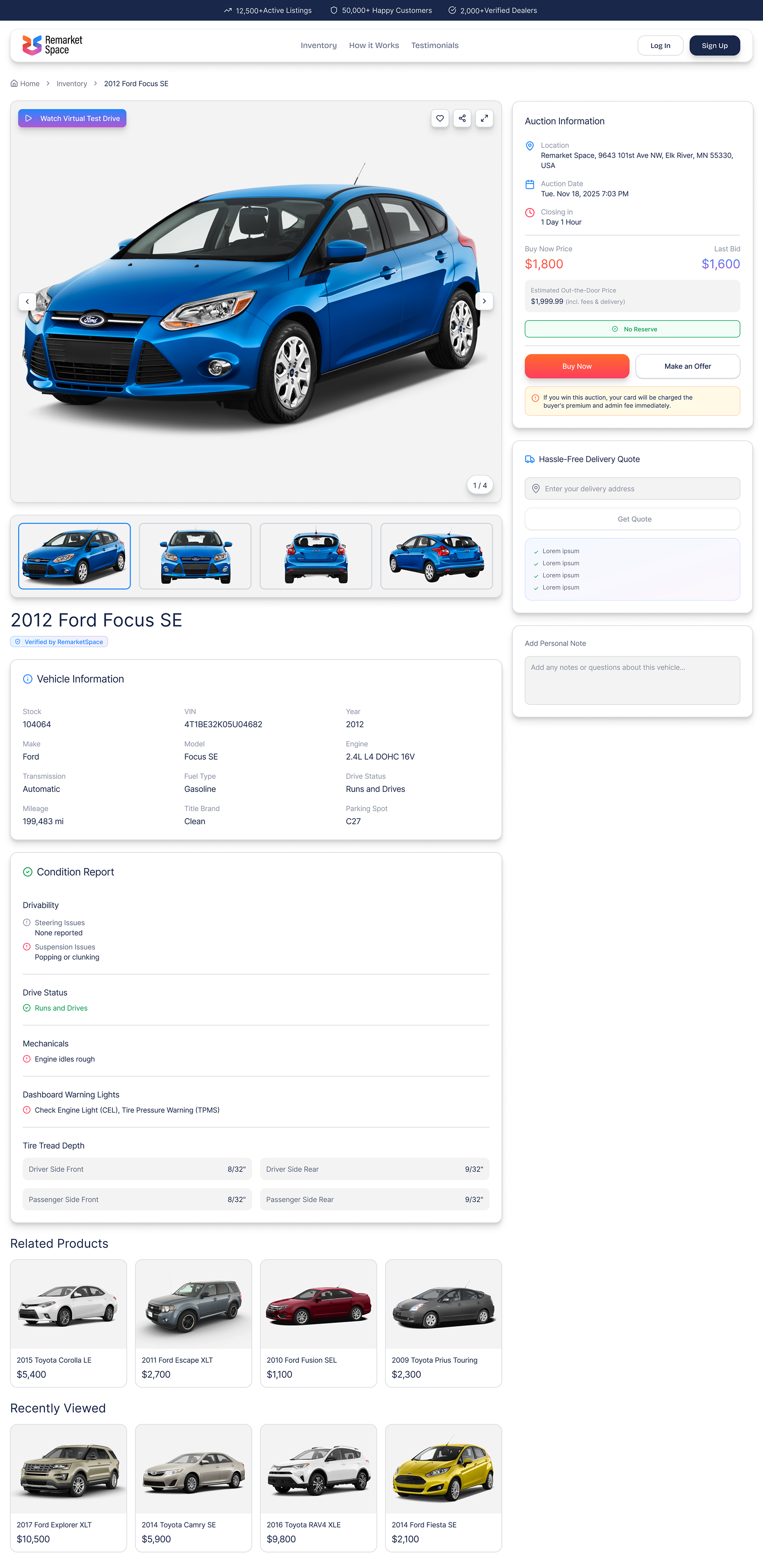
Keeping the car as the main focus
Vehicle pages can easily become cluttered, so the layout puts the car first and organizes auction details into a clear side panel. Price, last bid, location, closing time, delivery quote, and key actions stay easy to find without competing with the main image.