Client
ØOMO

Deliverables
Packaging
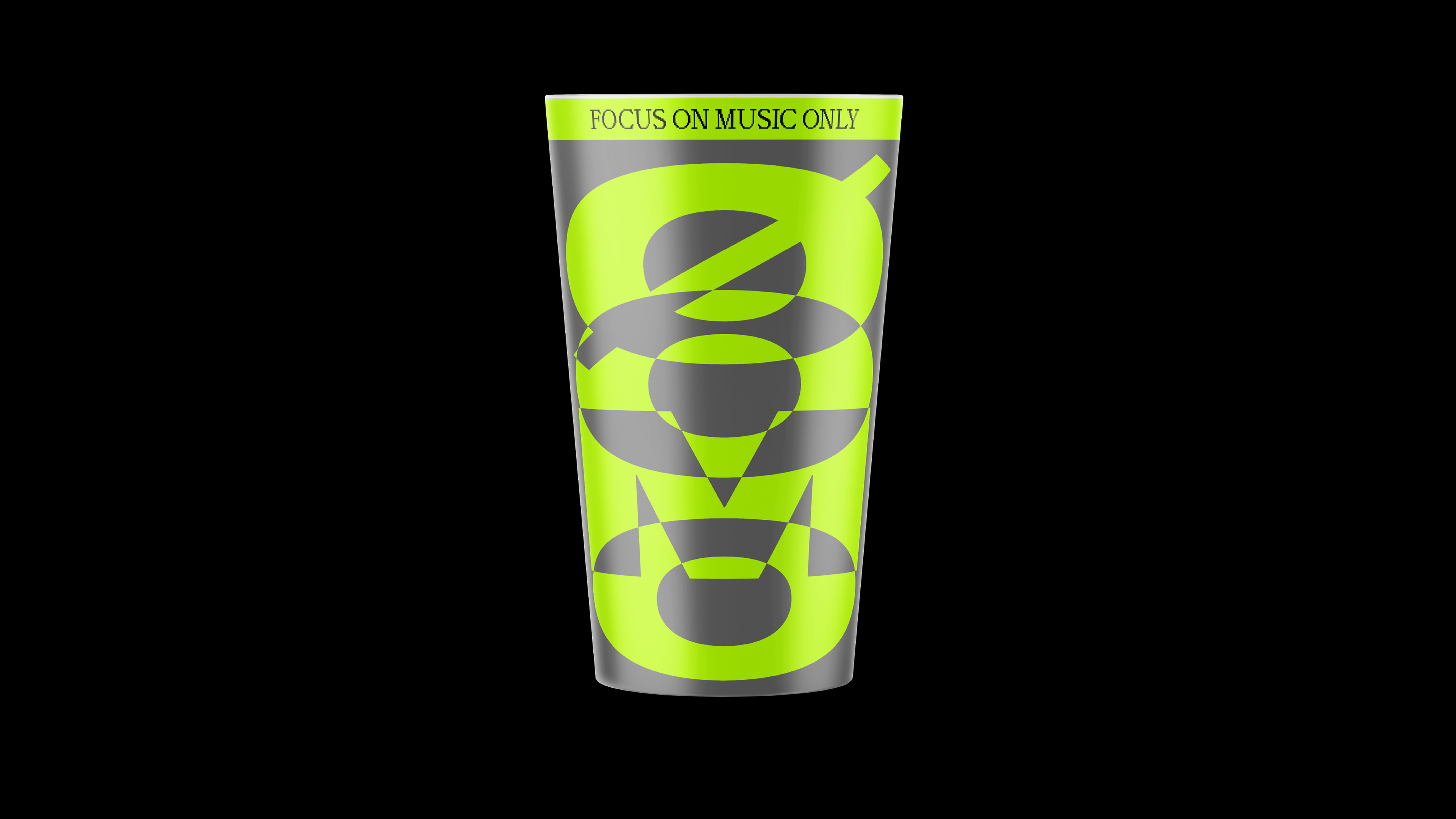
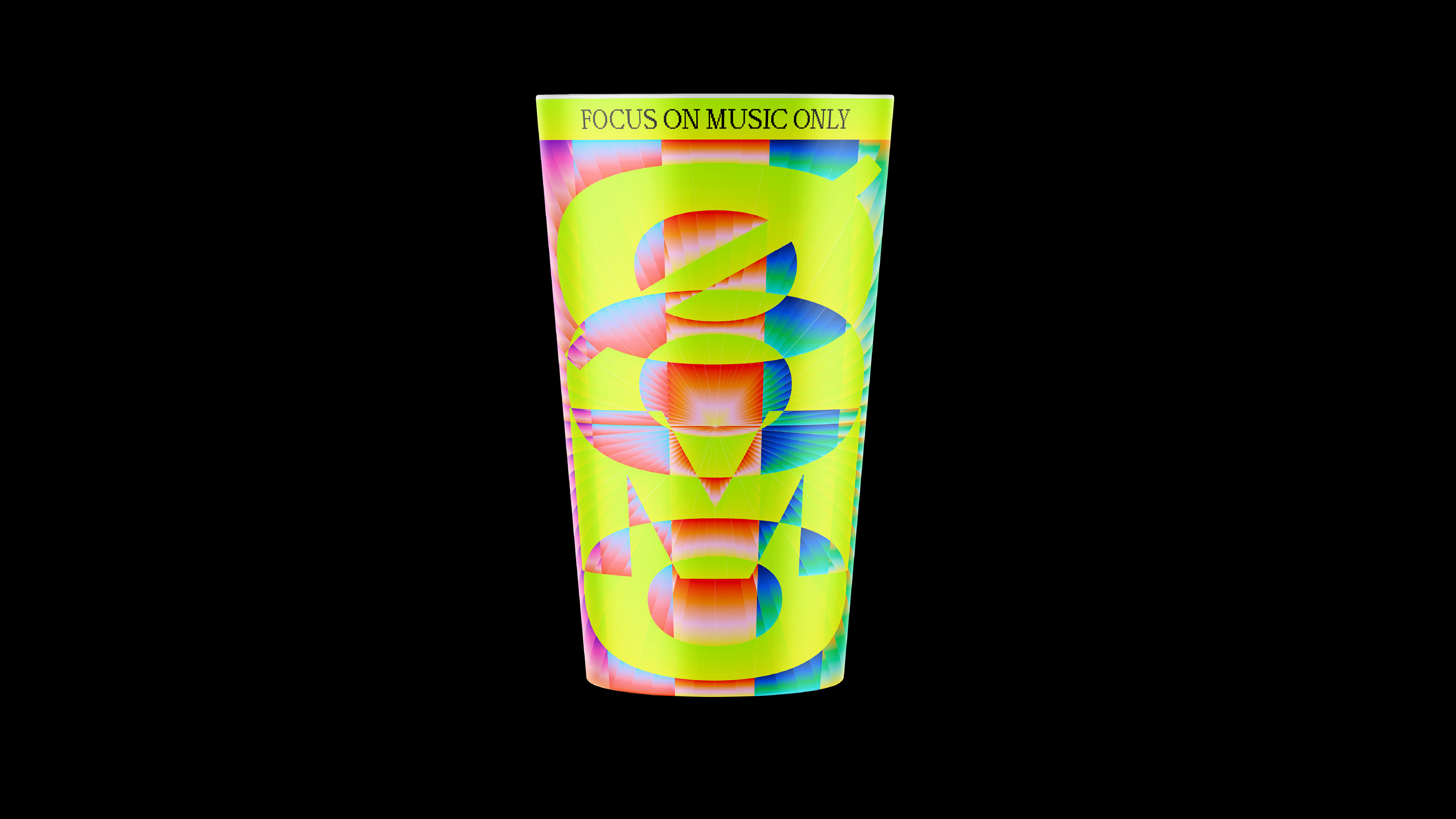
ØOMO launched a cup design contest as part of their move to reusable cups for future events. My winning direction was built around a simple idea: the cup had to feel instantly recognizable in a dark rave environment and carry the same intensity as the music around it.

ØOMO exists in the world of electronic music and rave culture, so I wanted the design to reflect the way I see techno: bold, hypnotic, and impossible to fit into clean visual rules. Instead of treating the cup as a small branded object, I used oversized, stretched typography to turn it into a loud visual piece that moves with the crowd, the lights, and the drink inside.
Winning design
The winning design takes the most direct approach, using oversized letterforms and a stripped-back composition that feels bold without needing too many elements. Since the cup is transparent, the drink becomes part of the design. Its look changes depending on the color of the drink, the lighting, and the movement around it, while the large typography keeps it recognizable from a distance.
Shaped by rhythm and rave energy
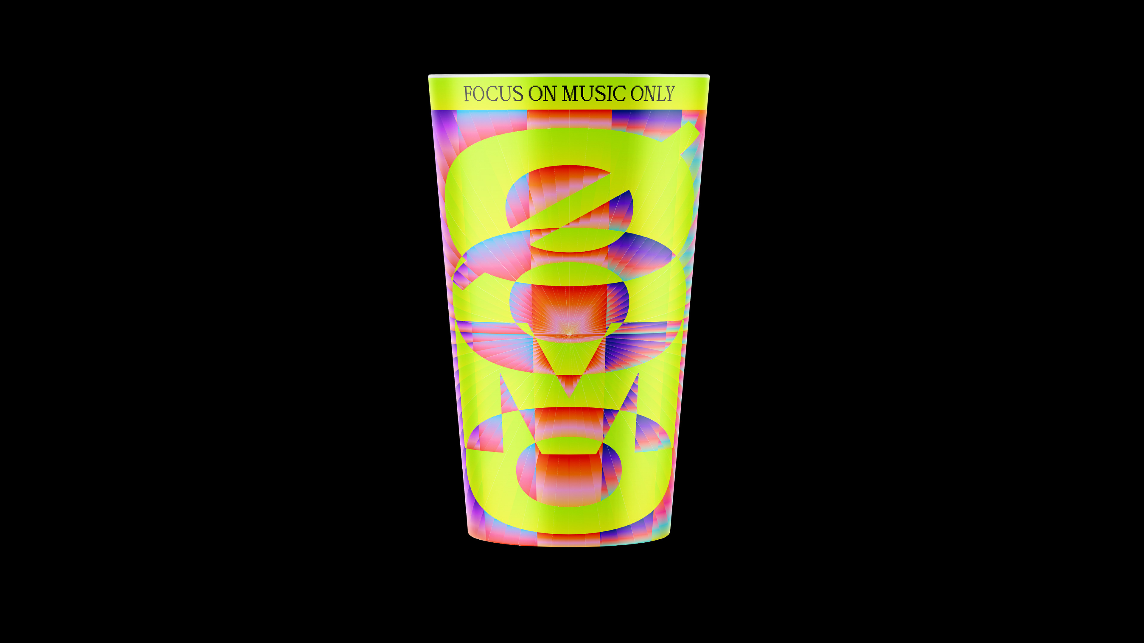
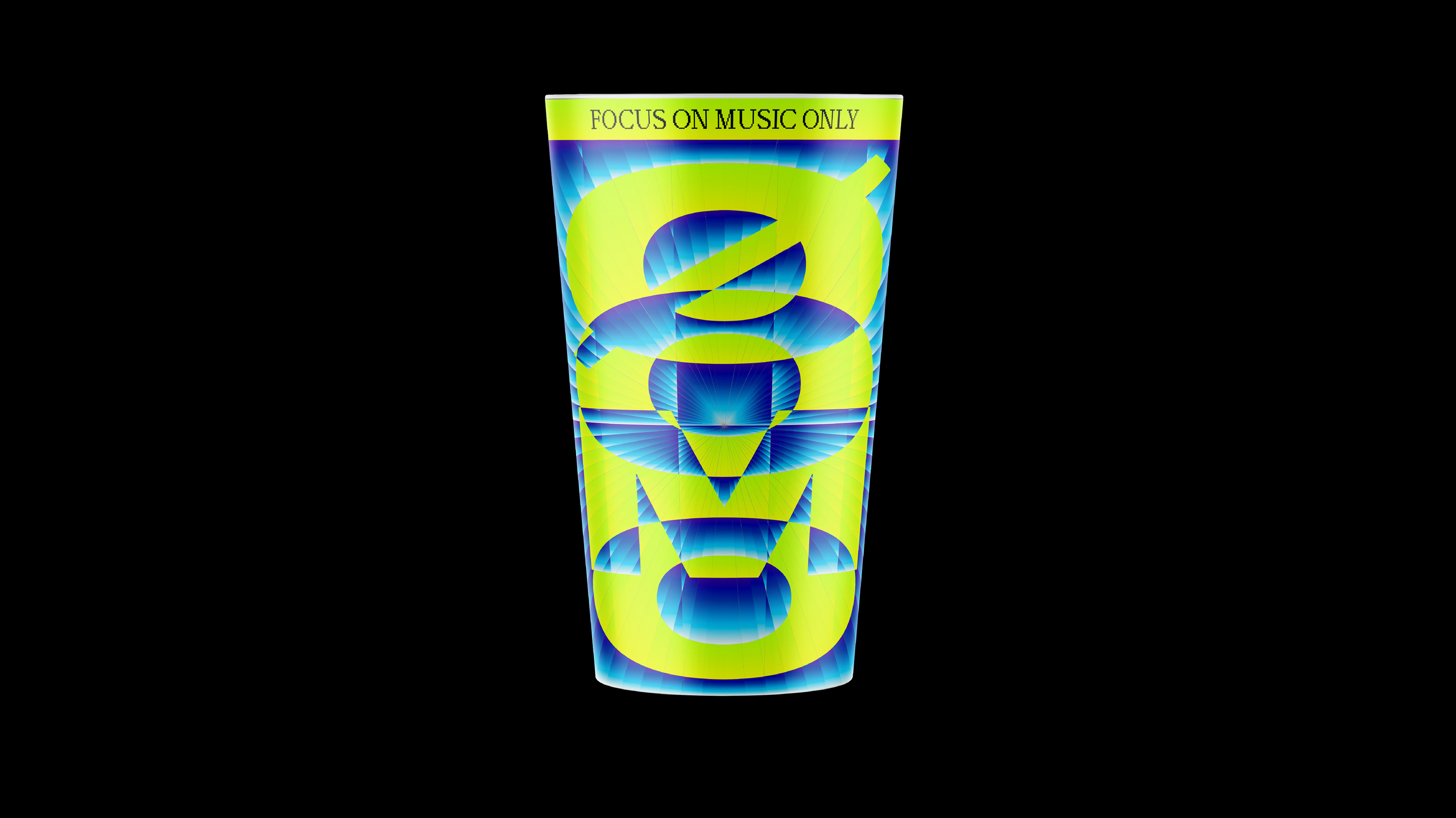
Other variations push the same idea into a more maximalist direction. Gradients, radial movement, and high-contrast color combinations were used to capture the energy of rave culture, from sound waves and flashing lights to the feeling of being inside a constantly moving environment. The stretched typography gave the cup its own visual language, while keeping the ØOMO name loud, recognizable, and central to the design.
You may also like

Mages Studio
Ditching the generic tech look, the rebrand crafts a bold identity that feels as innovative and dynamic as Mages Studio’s work.
Brand strategy, Brand identity, Website UI/UX​​​​​​​
Soil Action & SAM
Creating a rugged industrial identity for Soil Action and SAM, built to stand out in the field, on machinery, and in software.
Brand strategy, Brand identity
Timber Apps
From solid to standout. A brand refresh that keeps its roots but sharpens every detail.
Brand identity
LOB
Creating a bold tennis identity for Lob, a social league platform that mixes movement, competition, retro sports energy, and a modern Gen Z feel.
Brand strategy, Brand identity, Creative direction
Personal brand
A fusion of Swiss modernism and brutalist experimentation that turns minimalism into a statement.
Brand identity
SID Group
The SID Group identity captures the seamless flow of innovation, with a sharp, modern logo and dynamic patterns that reinforce its connection to the rivers that inspired its name.
Brand identity
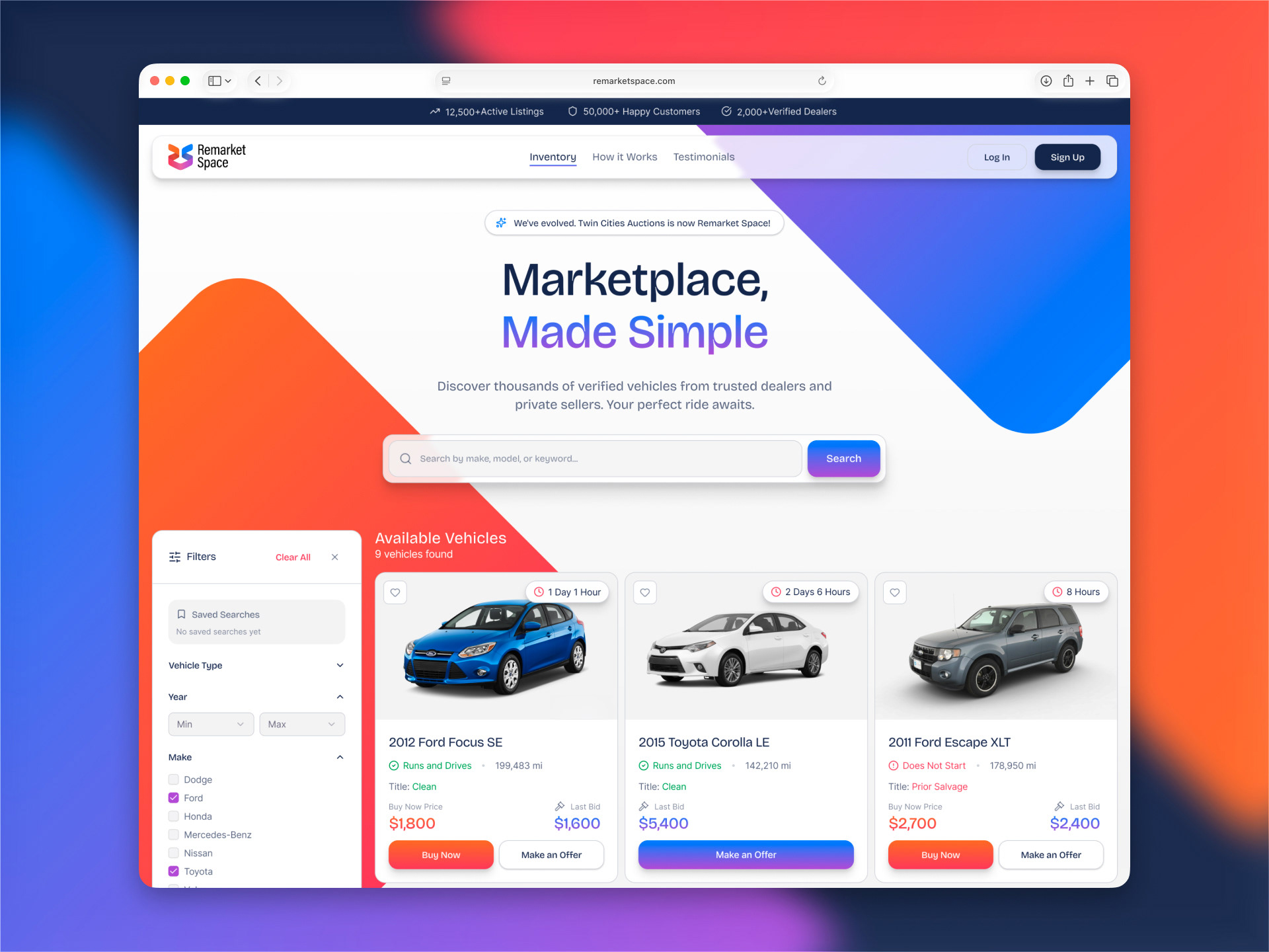
Remarket Space
Rebranding Twin Cities Auctions into Remarket Space, a modern car auction platform with a colorful identity and a cleaner, easier buying experience.
Brand identity, Website UI/UX​​​​​​​
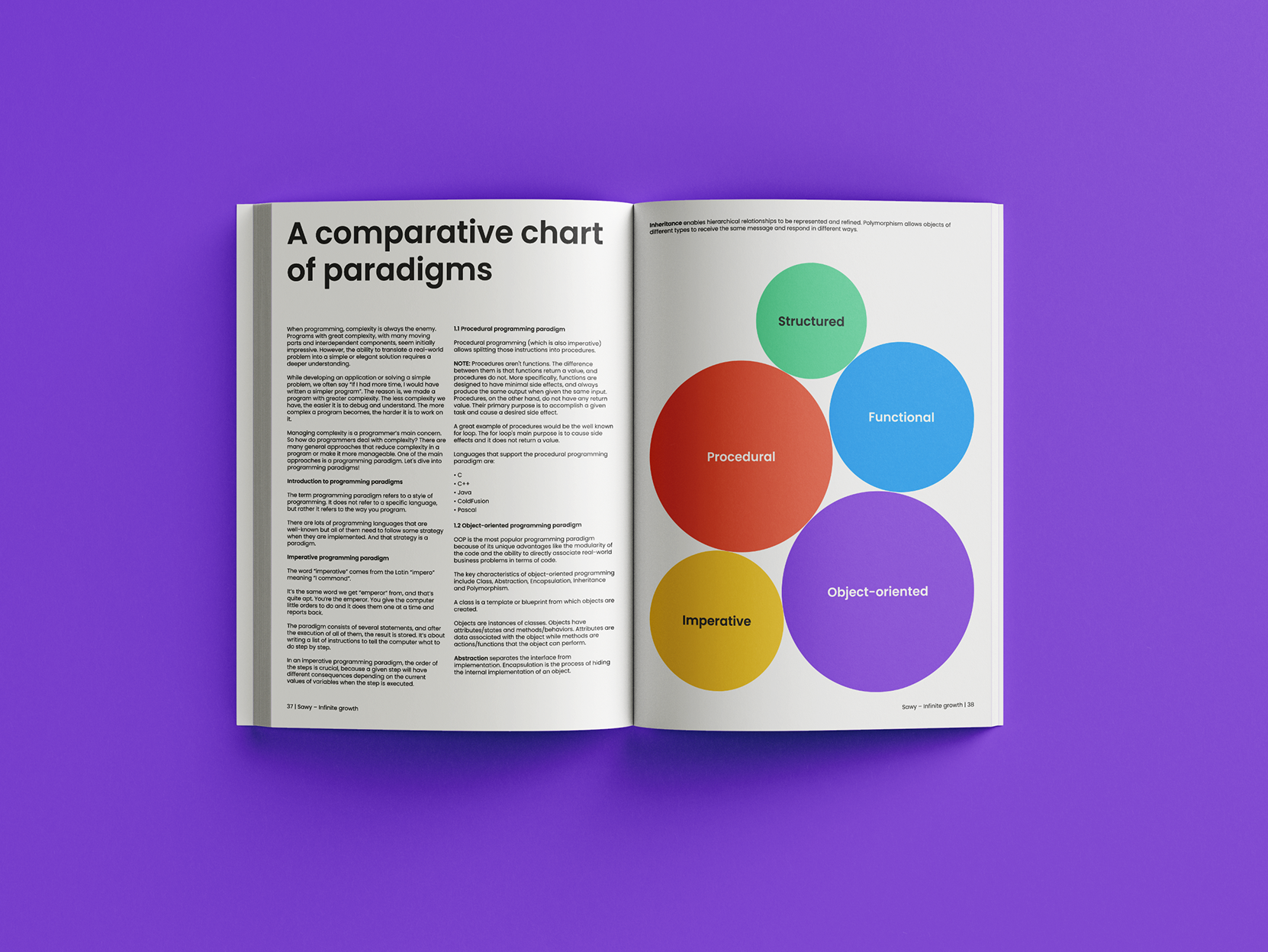
Sawy
Sawy needed a brand that made learning data science feel fun, exciting, and accessible.
Naming, Brand strategy, Brand identity, Website UI/UX​​​​​​​
Pinty
Full case study coming soon!
Brand identity, Packaging
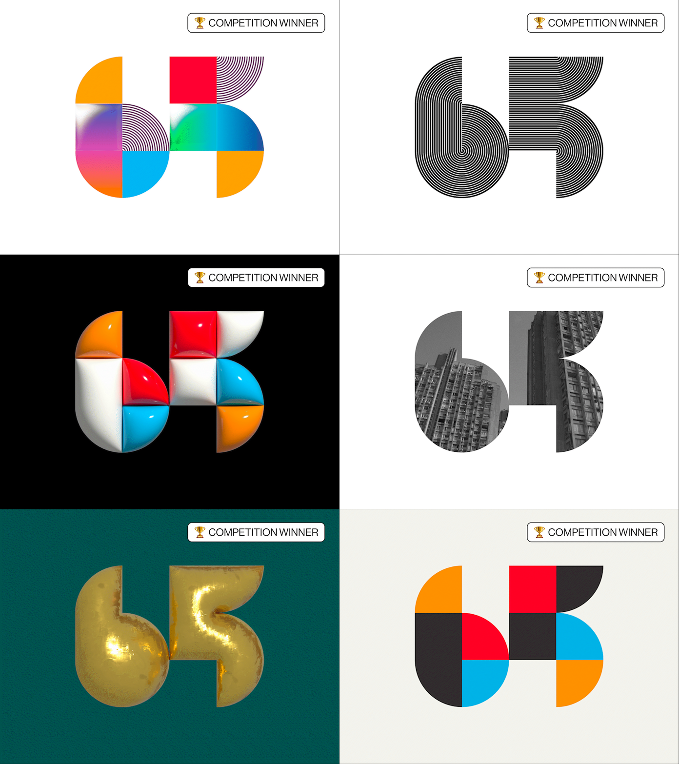
UEPS 65
Awarded first prize, a modular 65 honors UEPS’s past while scaling as a clean, modern system.
Brand identity